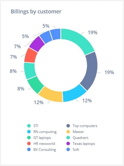
A donut chart is a circular chart similar to a pie chart but with a blank center. This center makes it easier to read and often provides space for labels, KPIs, or contextual information.
Donut charts are best for showing part-to-whole relationships when visual clarity and a modern design are desired.
When to Use a Donut Chart
- Show how categories contribute to a total
- Display simple proportions or market share
- Include KPIs or summaries in the chart center
Best Practices
- Use 3–5 segments maximum for readability
- Avoid comparing multiple donut charts side-by-side
- Label clearly or use a legend to avoid confusion
Donut Charts in ClicData
- Create responsive, color-coded donut charts
- Add central value text (e.g., total revenue)
- Apply filters to show proportions for different segments dynamically
FAQ Donut Chart
When should I choose a donut chart over a pie chart?
Choose a donut chart when you want to include a central value or KPI inside the chart. The blank center improves readability and makes room for contextual data, like total revenue or percentages. It also tends to look cleaner, especially in dashboards with limited space.
Are donut charts good for comparing multiple datasets?
Not really. Donut charts are great for showing proportions within a single dataset, but placing several side-by-side makes comparisons difficult. If your goal is to compare distributions, consider using stacked bar charts or 100% bar charts instead.
Can I use donut charts to show changes over time?
No — donut charts represent a static snapshot. They’re not suited for tracking trends or variations over time. Use them to show the current distribution at a specific moment, not how values evolve.
How do I make donut charts accessible and easy to interpret?
Make sure slices are clearly labeled or include a legend, and avoid using only color to convey meaning — especially for users with visual impairments. If the center includes a KPI, ensure it’s explained with context so the chart tells a complete story at a glance.
Why does my donut chart look unbalanced or hard to read?
This often happens when one slice is significantly larger than the others or when there are too many small segments. It distorts the visual proportion and makes interpretation harder — especially without clear labels. To fix it, try:
- Grouping minor categories into an “Other” slice
- Reordering slices logically (e.g., largest to smallest)
- Reducing the number of segments to 3–5 max
- Using labels or percentages inside or near the chart
Donut charts are highly visual — but without careful design, they can quickly lose their clarity.

