An area chart is a variation of a line chart where the area below the line is filled with color. It highlights not just the trend, but also the volume or total magnitude of the data over time.
When to Use Area Charts
- Show cumulative totals over time
- Compare parts to a whole using stacked areas
- Emphasize growth, volume, or volatility
Types of Area Charts
- Standard area: One metric over time
- Stacked area: Breaks down totals into components
- 100% stacked: Shows proportional contributions
Best Practices
- Limit to 2–3 layers for readability
- Ensure transparency or contrast between layers
- Don’t use when exact values are needed — use line charts instead
Area Charts in ClicData
- Combine with filters to show cumulative performance
- Customize colors, gradient fills, and layering
- Supports both absolute and percentage stacking
Area Chart FAQ
When should I choose an area chart over a line chart?
Use an area chart when you want to show not just the trend of a metric, but also its magnitude — for example, to emphasize volume, cumulative totals, or the weight of a metric over time. Line charts are better when you need to highlight precise changes or focus on individual data points.
Can area charts be misleading in data presentation?
Yes, especially when too many series are layered or when colors lack transparency. Overlapping areas can obscure values or make it hard to compare components. To avoid misinterpretation, limit the number of layers and clearly label each series.
What’s the best way to compare multiple categories using area charts?
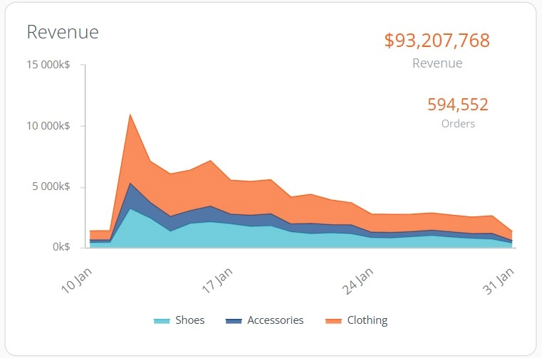
Stacked area charts work well for showing how different components contribute to a whole. For example, you might track revenue sources over time. But to make comparisons easier, stick to a small number of series and use consistent ordering across the time axis.
How do 100% stacked area charts differ from regular stacked charts?
100% stacked area charts show proportions rather than absolute values.
Each time point adds up to 100%, letting you compare relative contributions over time. This is useful when the focus is on distribution changes, not total volume.
Are area charts appropriate for non-time-based data?
Not usually.
Area charts are designed for continuous axes, typically time. Using them for unordered or categorical data (like product names or regions) can mislead the viewer by implying continuity. In those cases, bar or column charts are more appropriate.