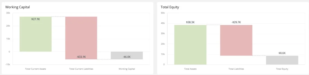
A waterfall chart visualizes how a starting value is affected by a series of positive and negative changes, ending with a final total. It’s perfect for understanding cumulative impacts across categories or time.
Each bar connects sequentially, allowing viewers to see what drives increases or decreases in metrics like revenue, profit, or costs.
When to Use a Waterfall Chart
- Visualize revenue or profit breakdowns
- Explain step-by-step changes in financial metrics
- Track cumulative changes from baseline to result
Components
- Start/End bars: Baseline and final total
- Floating bars: Intermediate changes (additions or subtractions)
- Connecting lines: Show flow of values
Best Practices
- Label each bar to clarify value and source
- Use contrasting colors for increases and decreases
- Don’t overload with too many steps
Waterfall Charts in ClicData
- Build financial and operational breakdowns with ease
- Set data as increasing, decreasing, or totals
- Customize colors and labels for clear storytelling
FAQ Waterfall Chart
What types of data work best with waterfall charts?
Waterfall charts are ideal for sequential, additive/subtractive data — like financial statements, operational breakdowns, or budget variances. Any time you want to show how individual components contribute to a net change, a waterfall chart is a strong choice.
Is a waterfall chart only useful for finance use cases?
Not at all. While it’s commonly used in financial dashboards (revenue, profit, working capital), waterfall charts are also great for tracking inventory changes, HR headcount fluctuations, or project scope variations — anything where step-by-step movement matters.
How do I structure my data to build a waterfall chart correctly?
You’ll typically need:
- A starting value
- A sequence of positive and negative contributions
- A final total
Each row should be labeled with its role (e.g., increase, decrease, total), especially in BI tools that require explicit differentiation. Ordering is also key — changes should appear in logical sequence.
Can I compare multiple categories in a single waterfall chart?
It’s possible, but risky. Waterfall charts are best for showing one linear flow of change. If you try to layer in multiple groups, it can quickly become unreadable. Instead, use small multiples (e.g., one chart per region or product) to preserve clarity without sacrificing granularity.
Why do waterfall charts sometimes mislead or confuse viewers?
Two main reasons:
- Poor color contrast between gains and losses
- No clear labels or context for each step
When these elements are missing, viewers may struggle to interpret what each bar represents. To fix this, use consistent formatting, clear legends, and keep the number of steps manageable.