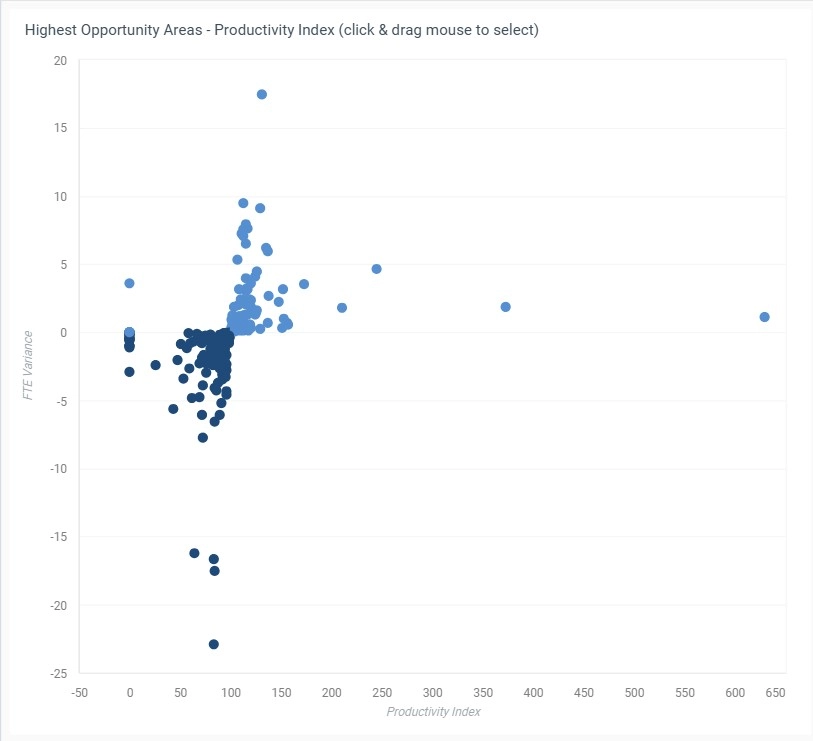
A scatter plot is a graph that displays individual data points on an X and Y axis, helping visualize the relationship between two numerical variables. Each dot represents a single data record.
Scatter plots are used to identify correlations, clusters, and outliers in data sets.
When to Use a Scatter Plot
- Explore relationships between variables (e.g., age vs. income)
- Identify patterns, clusters, or outliers
- Analyze distributions and variable independence
Best Practices
- Limit overlapping points with transparency or jittering
- Use color or size for a third dimension if needed
- Label axes clearly to show variable context
Scatter Plots in ClicData
- Create scatter plots with customizable axes and point colors
- Highlight clusters with conditional formatting or filters
- Layer metrics such as trend lines or confidence intervals
FAQ Scatter Plot
When should I avoid using a scatter plot?
Scatter plots are only useful when both variables are numerical and continuous. They’re not suitable for categorical comparisons or time series data. Also, if your dataset is too small, patterns may be misleading or statistically irrelevant.
How can I make dense scatter plots easier to read?
You can apply transparency, jittering (slight random positioning), or aggregate similar points using color intensity or bubble size. These techniques help reduce overlap and make clusters or trends more visible.
Can I use scatter plots to detect outliers?
Yes — one of their strengths is revealing data points that fall far outside the normal cluster. These outliers can indicate data entry errors, exceptional cases, or hidden patterns worth exploring further.
What’s the best way to show more than two variables in a scatter plot?
You can add a third variable by using color, size, or shape of the points. For example, you might show revenue vs. cost on X and Y axes, while bubble size represents customer count, and color shows region. Just avoid overloading the chart — clarity comes first.