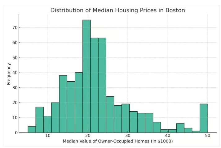
A histogram is a chart that displays the distribution of a numeric variable by grouping values into intervals or “bins.” It helps reveal the shape, spread, and central tendency of a data set.
Unlike bar charts (which compare categories), histograms focus on how data is distributed along a continuous scale.
When to Use a Histogram
- Analyze data distribution (e.g., normal, skewed, bimodal)
- Detect outliers or data anomalies
- Understand customer behavior (e.g., order sizes, session durations)
Best Practices
- Choose bin width carefully — not too wide or narrow
- Label axes clearly to indicate ranges and frequency
- Avoid overlapping histograms unless color-separated
Histograms in ClicData
- Create histograms by defining numerical bins
- Overlay mean or median reference lines
- Use to segment customers, analyze sensor data, or study performance patterns
FAQ Histogram
What’s the difference between a histogram and a bar chart?
A histogram shows how values are distributed over intervals on a continuous axis, while a bar chart compares distinct categories.
How do I choose the right number of bins for a histogram?
You can start with the square root of the number of data points, but fine-tune the width depending on the spread and shape you want to reveal.
How can histograms help with customer segmentation?
By visualizing purchase frequency, order sizes, or session duration distributions, histograms help detect behavioral patterns and segment users accordingly.
Which KPIs are best explored using histograms in operations or finance?
Histograms are useful to explore delivery delays, ticket resolution times, sales cycle duration, or invoice values across large datasets.
How do overlapping histograms distort insights in multivariate analysis?
If not color-separated or semi-transparent, overlapping histograms can obscure trends and mislead interpretation — especially with uneven sample sizes or skewed data.