A gauge chart (or dial chart) visualizes a single value within a range, typically using a semicircular scale and a needle or arc. It’s commonly used to represent KPIs or performance metrics at a glance.
Think of it as a dashboard speedometer — ideal for quickly assessing how well you’re doing against a target.
When to Use a Gauge Chart
- Display progress toward a goal (e.g., 75% to sales target)
- Show performance against thresholds (e.g., poor, average, good)
- Highlight a single metric’s current status
Best Practices
- Use gauges for 1 or 2 metrics max — not for comparisons
- Define clear color-coded zones for fast interpretation
- Use numeric values and labels to avoid misreading
Gauge Charts in ClicData
- Design multiple gauge styles (dial, arc, digital)
- Customize thresholds, ranges, and colors
- Display live performance metrics with real-time updates
FAQ Gauge Chart
What type of data works best with a gauge chart?
Gauge charts are ideal for single KPIs or real-time performance metrics — like progress toward a goal, system health, or capacity utilization. They’re best used when you want a quick visual snapshot rather than detailed analysis.
How is a gauge chart different from other KPI visualizations?
Unlike bar or line charts, a gauge chart focuses on one value within a defined range, often segmented by color (e.g., red-yellow-green). It doesn’t show trends or comparisons, but it excels at delivering instant clarity on whether you’re within target.
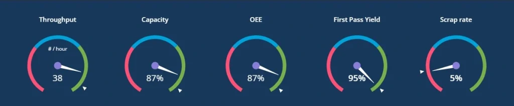
Can I use multiple gauges in the same dashboard?
Yes, but with caution. Gauges are space-intensive and designed for singular focus. Displaying more than two or three at once can overwhelm the layout and reduce their impact. If you’re tracking several KPIs, consider combining gauges with compact visuals like bullet charts or scorecards.
What’s the best way to define thresholds in a gauge chart?
Start by identifying key performance zones — for example:
- 0–50%: Low (red)
- 51–80%: Average (yellow)
- 81–100%: Good (green)
Make sure these zones align with real-world targets or benchmarks, not arbitrary splits. Clear segmentation helps users instantly interpret what the gauge is telling them.
Why do gauge charts sometimes give a false sense of precision?
Because they simplify complex performance into a single visual, viewers may assume that the needle is highly precise — even when the underlying data fluctuates or isn’t updated in real time. To avoid misinterpretation:
- Add numeric values alongside the needle
- Indicate the data refresh rate if applicable
- Use tooltips or context text for nuance
Gauge charts are effective, but they work best with proper framing.