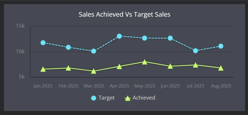
A line chart is a type of data visualization that displays information as a series of data points connected by straight lines. It’s commonly used to show trends over time — making it a go-to chart for time series analysis, forecasting, and performance tracking.
Line charts are simple yet powerful. By visualizing how values change across a continuous axis (usually time), they help uncover patterns, trends, and anomalies quickly and clearly.
When to Use a Line Chart
- Time-based trends: Track performance over days, months, or years
- Comparing multiple series: Show how two or more metrics evolve over time
- Forecasting: Visualize future trends using projected data
- Monitoring KPIs: Plot metric evolution to catch deviations early
Line Chart Structure
- X-axis: Usually represents time (e.g., months, days, quarters)
- Y-axis: Represents the variable being measured (e.g., revenue, traffic)
- Lines: Each series is shown as a connected path of data points
Best Practices for Line Charts
- Always use a time-based scale for the X-axis to ensure readability
- Limit the number of lines to 4–5 for clarity
- Use distinct colors or labels for each data series
- Start the Y-axis at zero unless it distorts interpretation
Common Use Cases
- Monthly revenue or expense trends
- Website traffic growth over time
- Sales performance by region
- Customer churn rate evolution
Line Chart in ClicData
ClicData makes it easy to create and customize line charts directly within your dashboards:
- Connect your time-based data from any source (Excel, SQL, APIs, etc.)
- Drag and drop fields to define X and Y axes
- Customize colors, labels, tooltips, and legends for clarity
- Add dynamic filters to explore trends by product, region, or user segment
With scheduled refreshes and real-time data integration, your line charts in ClicData stay current — helping you monitor performance and respond faster.
Line Charts FAQ
How do I choose between a line chart and other time-based charts like area or bar charts?
Line charts are ideal for showing precise value changes over time and comparing trends across multiple series. If you want to emphasize total volume (e.g., cumulative revenue), area charts may be more appropriate. For comparing categories at a single point in time, bar charts often work better. Think about what you want to highlight: trend vs. quantity vs. distribution.
What are common mistakes to avoid when building a line chart?
Some mistakes include overloading the chart with too many series (causing visual clutter), using inconsistent time intervals (which distorts trends), and manipulating the Y-axis scale in a way that exaggerates changes. Also, avoid using a line chart when the X-axis is categorical — use a bar chart instead.
Can I use a line chart with non-time-based data?
Technically yes, if your X-axis represents an ordered numerical scale (e.g., age, temperature).
But if your categories are unordered (e.g., product types), line charts can mislead viewers by implying continuity. In those cases, bar or column charts are usually better suited.
How do I make line charts easier to interpret for stakeholders?
Use annotations to call out key events, apply consistent colors for recurring metrics, and provide tooltips for context. If you’re presenting trends to non-technical teams, add narrative captions or pair the chart with a short insight summary. Clear titles and axis labels also go a long way.
What’s the best way to handle missing data points in a line chart?
It depends on the context.
You can connect the lines (interpolation), leave a gap, or explicitly mark missing data with a placeholder (like “N/A”). The key is to stay transparent about what’s missing — especially if the gap could impact interpretation of a trend.

