The beauty of executive or operational dashboards is that you can squeeze large amounts of business data and results of analysis into a relatively small visual container.
And the challenge of executive dashboards is that you are squeezing large amounts of data and results of analysis…. Well, you get the idea.
An effective dashboard adopts an efficient design that takes into account the concerns, priorities and tasks that the user will perform on a daily or weekly basis. Ideally, each element of your dashboard should earn its share of screen real estate from the value of the insights and information it is delivering. Here are some tips to make that happen:
Getting started
Elements of dashboard visualization fall into two main categories key performance indicators (KPIs), and supporting analytics.
KPIs are chosen based on the metrics the user needs to manage, respond to or be aware of.
Supporting analytics provide the information a user may want to see in order to drill down and diagnose the condition of a KPI. They provide context and diagnostic information that helps explain why a KPI is in a given state.
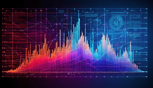
Visualization elements for supporting analytics include charts, graphs, tables or even animated what-if or predictive analysis scenarios.
Visualization elements for KPIs are usually more dynamic and more sophisticated.
KPI visualization elements
There are four commonly-used KPI visualization elements for dashboard solutions.
Alert Icons
Perhaps the simplest visualization element, alert icons use simple shape and color to convey a state. For example, green and red circles can indicate a ‘Online/Offline’ state. However, since 10% of the male population is color-blind, it is wise to incorporate the use of unique shapes as well.
Trend Icons
Representing how a metric behaves over time, trend icons like arrows and numbers can be combined with alert icons to express two dimensions of data by placing the trend icon within a color- or shape-coded alert icon.
Progress Bars
A progress bar can provide a visual representation of progress towards a goal along a one-dimensional axis. If you add color and alert levels, you can also indicate when you have crossed specific target thresholds as well as how close you are to a specific limit.
Gauges
Gauges quickly communicate performance along a spectrum. They lend themselves well to dynamic data that can change over time in relationship to underlying variables. Additionally, the use of embedded alert levels allows you to quickly see how close or far away you are from a specific threshold.
ClcData has easy and sophisticated widgets to help you get the most out of your dashboards. Talk to one of our business analysts today to optimize your dashboards!