You’re managing 400 SKUs. You treat every product the same, same reorder triggers, same attention, same safety stock logic. Then one of your top-10 revenue products runs out on a Tuesday, and the slow-moving items nobody orders pile up in the warehouse. That’s the problem ABC analysis solves.
ABC analysis classifies every item in your inventory into three tiers (A, B, and C) based on the revenue or consumption value each represents. Your A items are the ones where a stockout costs you real money. Your C items are the ones where over-ordering just ties up cash you could use elsewhere. The classification tells you exactly how much attention, capital, and control each group deserves.
It’s built on the Pareto Principle: roughly 20% of your SKUs generate 80% of your revenue. ABC analysis makes that 20% visible, so you can stop treating every product equally and start managing by actual impact.
What Are the Three ABC Categories?
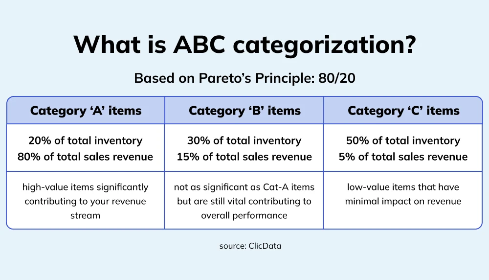
| Category | % of SKUs | % of revenue | Management level | Example |
|---|---|---|---|---|
| A | 20% | 80% | Tight — daily/weekly monitoring | Premium infant formula, flagship product line |
| B | 30% | 15% | Moderate — monthly review | Stage-specific baby foods, accessories |
| C | 50% | 5% | Light — quarterly or triggered review | Bibs, feeding utensils, storage containers |
These percentages are starting points, not rules. A wholesale distributor might find that its A items represent only 10% of SKUs. A specialty retailer might have a flatter curve. Run the numbers for your actual data before assigning categories.
How to Do ABC Analysis: Step-by-Step
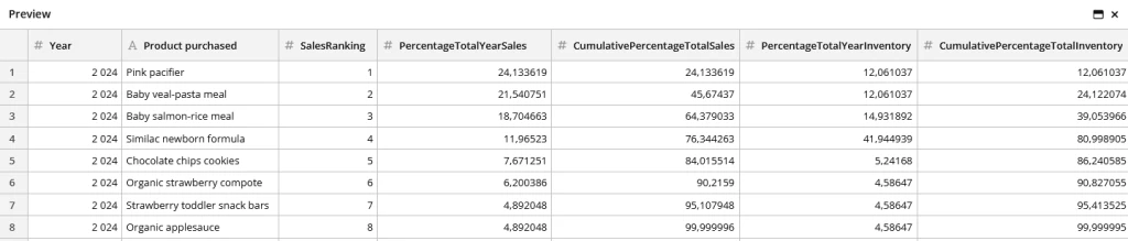
The baby food example runs through every step below same data, same math, so you can follow the logic and apply it to your own SKUs.
Step 1: Collect your data
Pull three columns for every SKU in your inventory:
- Unit selling price — what you charge the customer
- Annual sales volume — how many units sold in the last 12 months
- Annual sales value — calculated: unit price × annual volume
If you don’t have 12 months of data, use whatever you have and annualize it. Newly launched SKUs with no history are a known limitation of ABC analysis; handle them separately.
Step 2: Calculate annual sales value per SKU
The core formula:
Annual Sales Value = Unit Selling Price × Annual Sales Volume
For example, a premium infant formula priced at $28.99 that sells 1,200 units per year has an annual sales value of $34,788. A silicone bib at $6.99 selling 200 units is $1,398. Run this for every SKU.
Step 3: Rank SKUs by annual sales value
Sort all items from highest to lowest annual sales value. The ranking tells you the revenue order, not the margin order, not the volume order. Just revenue impact.
Step 4: Calculate cumulative percentages
Add two columns to your ranked list:
- Cumulative % of total revenue — what share of total annual sales the top N items represent
- Cumulative % of total SKUs — what share of your total product count do those N items represent
When you plot these against each other, the 80/20 curve becomes visible. The inflection point where a small percentage of SKUs tips past 70–80% of revenue is where the A/B threshold sits.
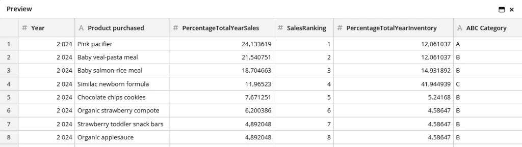
Step 5: Define your thresholds and assign categories
Apply these standard starting thresholds, then adjust based on your data:
- A items: top 20% of SKUs contributing 80% of total annual sales value
- B items: next 30% of SKUs contributing 15% of total annual sales value
- C items: remaining 50% of SKUs contributing 5% of total annual sales value
Once categories are assigned, the real work begins. Each tier gets a different management strategy.
Step 6: Apply differentiated management by category
| A items | B items | C items | |
|---|---|---|---|
| Cycle counts | Weekly or monthly | Quarterly | Every 6 months |
| Safety stock | High stockouts are costly | Moderate | Low — tie up minimal capital |
| Supplier terms | Negotiate hard — volume justifies it | Standard terms | Simplify or automate |
| Reorder logic | Demand-driven, reviewed frequently | Periodic review | Triggered by the minimum stock level |
| Forecasting | Detailed, product-level | Category-level | Minimal — often auto-replenished |
Step 7: Review and update regularly
ABC classification is not a one-time exercise. A product’s category can change as demand shifts, as you launch new lines, or as seasonal patterns evolve. Build a review cycle into your operations:
- Review A and B categorizations quarterly
- Run a full re-classification annually or after major assortment changes
- Adjust thresholds if your category distribution changes significantly
Businesses with strong seasonality, where a C item in January becomes an A item in December, need to build seasonal override rules rather than relying solely on annual averages.
ABC Analysis in Procurement
In a purchasing context, ABC analysis shifts from revenue to spend. Instead of sorting by annual sales value, you sort by annual purchase spend per supplier or commodity. The same logic applies:
- A supplier accounts for ~80% of your total purchase spend. Warrant formal contracts, dedicated relationships, and active performance management.
- B suppliers — mid-tier spend. Manage with standard terms and periodic reviews.
- C suppliers — many suppliers, low individual spend. Streamline ordering, consider consolidation or catalogue purchasing to reduce admin overhead.
Procurement teams use this to direct negotiation efforts where they actually move spend, rather than spreading it across hundreds of suppliers equally. A manufacturing company buying from 200 suppliers might find that 15 of them account for 80% of total spend. Those 15 get quarterly business reviews, dedicated buyer relationships, and negotiated volume discounts. The remaining 185 get consolidated into a catalogue or automated via EDI, freeing your procurement team to focus where the money actually is.
Limitations of ABC Analysis
Every limitation below has a workaround. The goal isn’t to avoid the method — it’s to know when to add a layer on top of it.
- No account for demand variability. Two items can have identical annual sales values, but one is perfectly stable while the other swings wildly from week to week. ABC treats them identically — it only measures value, not predictability. That’s what XYZ analysis is for: a complementary method that classifies items by how consistent their demand is, from X (stable) to Z (erratic). More on combining the two below.
- New SKUs have no history. You can’t classify a product you just launched. Handle new items outside the ABC model until they have at least a quarter of sales data.
- Seasonal products distort annual averages. A product that drives 90% of its sales in December will appear lower in the ranking than its peak-period importance warrants. Use rolling 90-day windows or seasonal flags.
- Doesn’t capture strategic items. Some C items are critical for compliance, safety, or customer experience, even if their revenue contribution is negligible. Flag these manually.
- Multi-variant items can be undercounted. A sweater in 12 size/colour combinations may look like 12 low-volume C items individually, but when aggregated, it’s an A item. Group variants before classifying.
ABC vs. XYZ Analysis: When to Combine Them
ABC analysis answers one question: which items are most valuable to your business? XYZ answers the one ABC can’t: which of those items can you actually forecast?
| Method | What it classifies | What does it tell you |
|---|---|---|
| ABC | Items by revenue/consumption value | Which 20% of your SKUs can you not afford to mismanage |
| XYZ | Items by demand predictability (coefficient of variation) | Where your demand plan will hold and where it’ll break |
| ABC + XYZ | Both dimensions combined — e.g. AX, AY, AZ, BX, BY… | Exactly which items need both tight stock control and high safety buffers |
An AX item is a high-value and predictable A item to manage. An AZ item is high-value but unpredictable, your most dangerous: critical to revenue yet hard to forecast. That distinction doesn’t exist in ABC alone.
Automate Your ABC Analysis With ClicData
At 50 SKUs, a spreadsheet works fine. At 5,000 SKUs with multiple data sources, manual ABC classification becomes the bottleneck it’s supposed to eliminate.
ClicData connects directly to your inventory system, eCommerce platform, or data warehouse and automates the calculation pipeline:
- Data integration: pull sales and cost data from your existing systems — no CSV exports or copy-paste
- Automated calculation: annual sales value, cumulative percentages, and category thresholds calculated automatically across your full SKU list
- Dynamic classification: as sales data updates, your ABC categories re-rank without manual re-runs
- Dashboard visibility: see your A, B, and C inventory distribution in a live dashboard, with drill-down by category, supplier, or product line
The result is an ABC classification that stays current rather than becoming stale between quarterly reviews. When demand shifts, your categories automatically shift with it.
If you’re ready to run your first ABC classification on live data, book a demo, and we’ll show you how it works with your actual inventory sources.
FAQ: ABC Analysis
What does ABC stand for in inventory management?
ABC stands for Always Better Control. It refers to the three-tier classification system — A, B, and C — that groups inventory items by their revenue contribution and management priority.
What is the ABC analysis formula?
Annual Sales Value = Unit Selling Price × Annual Sales Volume. You calculate this for every SKU, then rank from highest to lowest and apply cumulative percentage thresholds to assign categories.
What percentage is A in the ABC analysis?
Typically, A items represent 20% of SKUs and 80% of revenue. B items represent 30% of SKUs and 15% of revenue. C items represent the remaining 50% of SKUs and 5% of revenue. These are starting thresholds that adjust based on your actual data distribution.
What is the difference between ABC analysis and XYZ analysis?
ABC classifies items by value, and SKUs generate the most revenue. XYZ classifies items by demand predictability, which SKUs have stable vs volatile sales patterns. Combined, they give you a two-dimensional view of your inventory.