A Sankey diagram is a flow diagram where the width of each connection is proportional to the flow quantity. It’s ideal for visualizing the distribution of data from one set of categories to another.
It emphasizes how values are divided, merged, or transformed across a system, making it perfect for process analysis and resource tracking.
Common Use Cases
- Website traffic source and destination paths
- Marketing or sales conversion funnels
- Energy flow or cost breakdowns
- Customer journey visualization
Best Practices
- Limit the number of stages to 4–5 for readability
- Use distinct colors for each source or target group
- Label key paths or use tooltips to explain flows
Sankey Diagrams in ClicData
- Visualize flow between source-target pairs
- Customize node colors and alignment
- Use hover effects to reveal volumes and details
FAQ Sankey Diagram
What types of data work best with Sankey diagrams?
Sankey diagrams are best suited for flow-based datasets, where you track how something moves, splits, or accumulates. Think of:
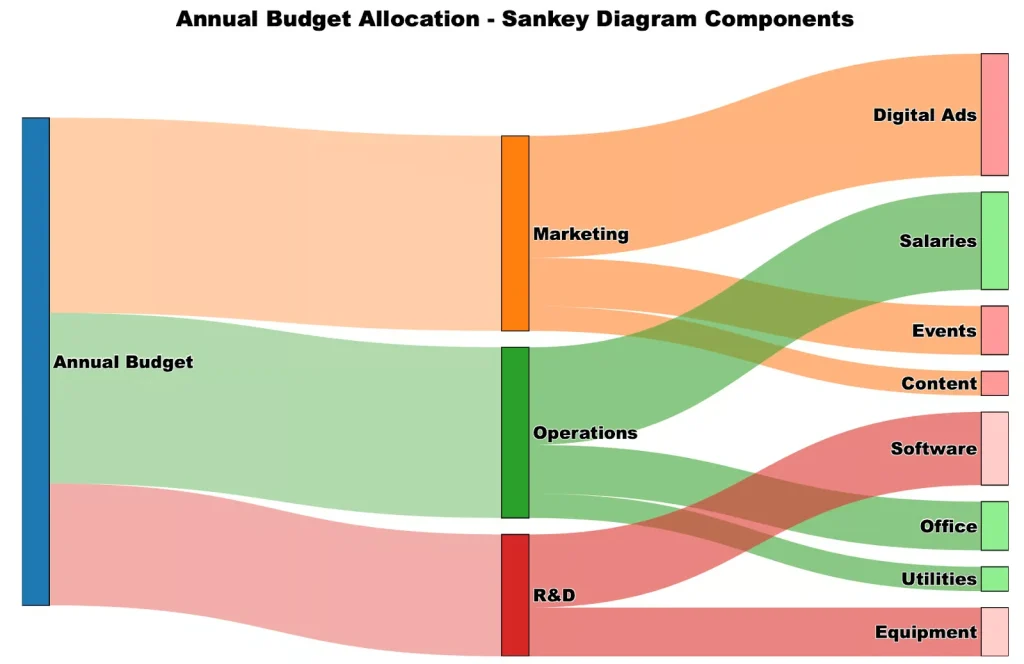
- Budget allocations by department
- Website visitor flows between pages
- Energy consumption from source to usage
Each “link” in the chart represents a quantity flowing between two categories.
How is a Sankey diagram different from a flowchart?
Flowcharts show the sequence of steps in a process, often with decisions and logic. Sankey diagrams, on the other hand, focus on volume and proportion — where the width of the links matters. It’s not about order or conditions, but about where and how much data flows.
Can I include more than two levels in a Sankey diagram?
Yes, you can include multiple stages, such as Source → Intermediate → Destination.
However, for clarity:
- Limit to 4–5 levels max
- Keep node and label spacing wide enough
- Group small flows together when needed
More layers mean more complexity, and clutter can quickly become an issue.
What’s the best way to read a Sankey diagram?
Start by identifying source nodes on the left, then follow the flow of each stream to its target(s). Thicker lines = larger values. Colors and hover tooltips can help you quickly:
- Spot dominant flows
- Understand how values split
- See where bottlenecks or drops occur
How do I handle circular or bidirectional flows in Sankey diagrams?
Sankey diagrams are designed for unidirectional, acyclic flows. If your data includes loops (e.g., recycling processes, returns, re-allocations), you can’t represent them natively without distorting the structure.
To handle this:
- Break loops into separate stages or time steps.
- Duplicate nodes to simulate feedback without overlap.
- Or consider using a chord diagram if flows are bidirectional and cyclic by nature.
This limitation makes Sankey diagrams less suitable for systems with heavy recursion or feedback, unless carefully transformed.