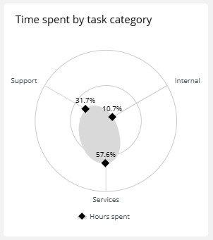
A radar chart (or spider chart) is used to display multivariate data in a circular format. Each variable has its own axis starting from the center, and data points are connected to form a polygon.
Radar charts are ideal for comparing attributes across multiple items — especially when values vary widely in multiple dimensions.
When to Use a Radar Chart
- Compare performance across categories (e.g., skills, KPIs)
- Show profile strengths and weaknesses visually
- Analyze multivariate metrics for individuals, teams, or products
Best Practices
- Limit to 5–10 axes for readability
- Use consistent scales for fair comparison
- Label axes clearly and use tooltips for precision
Radar Charts in ClicData
- Create radar/spider charts for KPI comparison or skill matrices
- Display multiple profiles on the same chart
- Customize axis scales, colors, and filled or unfilled styles
FAQ Radar Chart
What’s the difference between a radar chart and a polar chart?
While both use circular layouts, radar charts connect values across multiple axes to form a polygon, ideal for category-based comparisons. Polar charts, on the other hand, plot data in angles and distances — typically for cyclical trends or time-based data like temperature over seasons.
When should I avoid using radar charts?
Avoid radar charts when:
- You have more than 10 variables (it becomes unreadable)
- You need precise value comparison between axes
- The variables are on very different scales and not normalized
In those cases, a grouped bar chart or parallel coordinates chart might offer better clarity.
How do I normalize or scale data for radar charts?
Radar charts require that all variables use the same scale to allow meaningful shape comparisons. To do this:
- Normalize values between 0 and 100 (or 0–1)
- Use z-scores or min-max scaling
Otherwise, one variable with a large magnitude can visually dominate the chart and distort interpretation.
Can I compare multiple profiles in the same radar chart?
Yes — radar charts are great for showing 2–3 profiles on the same axes (e.g., performance of 3 sales reps across 7 KPIs). But you should:
- Use distinct colors or line styles
- Keep the number of comparisons low (max 3–4)
Too many profiles lead to overlapping lines and visual noise.
Why does my radar chart mislead users even when the data is correct?
One common issue is the distortion caused by axis layout. In radar charts, the distance between points varies depending on their position, especially when axes aren’t equidistant or values spike at sharp angles.
This can create the illusion that certain dimensions are stronger or weaker than they are. To mitigate this:
- Ensure consistent spacing between axes
- Add value labels or tooltips for precision
- Consider an alternative layout (like a bar or spider area chart) for critical decisions