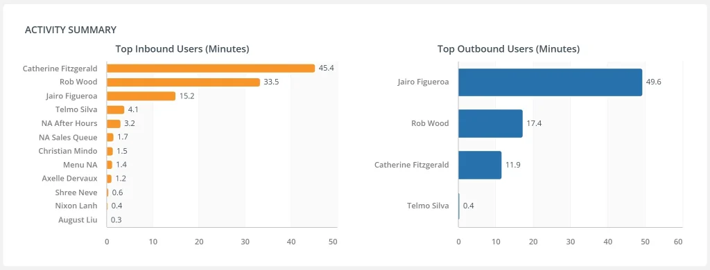
A bar chart is a classic visualization that represents categorical data with rectangular bars. Each bar’s height or length corresponds to the value of the category it represents. It’s ideal for comparing discrete items across dimensions like product, location, or department.
When to Use Bar Charts
- Compare categories (e.g., sales by region)
- Display ranking (e.g., top-performing campaigns)
- Visualize survey responses or frequency counts
- Support horizontal layouts for long labels
Types of Bar Charts
- Simple bar chart: One series across categories
- Stacked bar chart: Segments each bar by subcategory
- Grouped bar chart: Compares multiple series side by side
Best Practices
- Use horizontal orientation for readability
- Order bars by value or logical sequence
- Avoid cluttering with too many categories
Bar Charts in ClicData
- Drag-and-drop creation with auto-sorting
- Customizable labels, color coding, and legends
- Responsive layouts for horizontal or vertical bars
- Apply filters for dynamic comparisons
Bar Chart FAQ
When should I use a bar chart instead of a column chart?
Bar charts (horizontal) are preferred when your category labels are long or when you have many categories to display. Column charts (vertical) work well when comparing fewer categories or when tracking data over time. If readability is your concern, especially on dashboards or mobile, horizontal bars are often the safer choice.
What’s the difference between stacked and grouped bar charts, and when should I use each?
Stacked bar charts show how individual components contribute to a total within each category — ideal for showing part-to-whole relationships (e.g., revenue by product within each region). Grouped bar charts place bars side-by-side for each category and are better when comparing multiple series directly (e.g., sales this year vs. last year by product).
How do I avoid visual clutter when there are too many categories?
Try filtering or aggregating categories (e.g., “Others” group), limiting to top N items, or using interactive dashboards with slicers. If many categories are essential, consider breaking the data into multiple smaller charts or using a scrollable chart component like in ClicData.
Can I use bar charts for time-based data?
Technically yes, but it’s not always ideal. Bar charts are good for comparing discrete time periods (e.g., revenue by quarter), but line charts are better for showing continuous trends. Use bar charts if the emphasis is on comparing the size of values, not the flow over time.
What are common design mistakes in bar chart creation?
A few to watch out for: using inconsistent scales between charts, displaying data in random order, overloading colors, or omitting axis labels. Also, avoid 3D effects — they distort perception without adding value. Stick to clean, readable visuals that highlight comparisons.

