Ever feel like your dashboards are more confusing than helpful? As data analysts, we’re tasked with transforming complex data into clear, actionable insights. But in the process, we often add layers of complexity that can overwhelm decision-makers instead of guiding them. So, how do we create visualizations that lead to better, faster decisions?
The secret lies in minimalism. Removing clutter helps create dashboards focusing on key insights and reducing cognitive load. Research shows that simpler, more focused visualizations lead to better pattern recognition, faster decision-making, and improved retention of critical information.
This guide will take you through how minimalism in data visualization can elevate your dashboards. You’ll learn how to prioritize clarity, simplify design, and emphasize the most important data, ensuring your dashboards are intuitive and impactful.
You will learn:
- The power of minimalism in data visualization
- How simplified visualizations enhance pattern recognition
- Best practices for creating dashboards that drive decisions
The Cognitive Load Principle: How Complexity Obscures Insights
Cognitive load theory, developed by John Sweller in the 1980s, explains why some visualizations are effective and others fail. The brain can only handle 4-7 pieces of information at a time, so any extra details, like unnecessary gridlines or too many colors, can overwhelm the viewer. This added complexity pulls focus away from the insights you want to highlight.
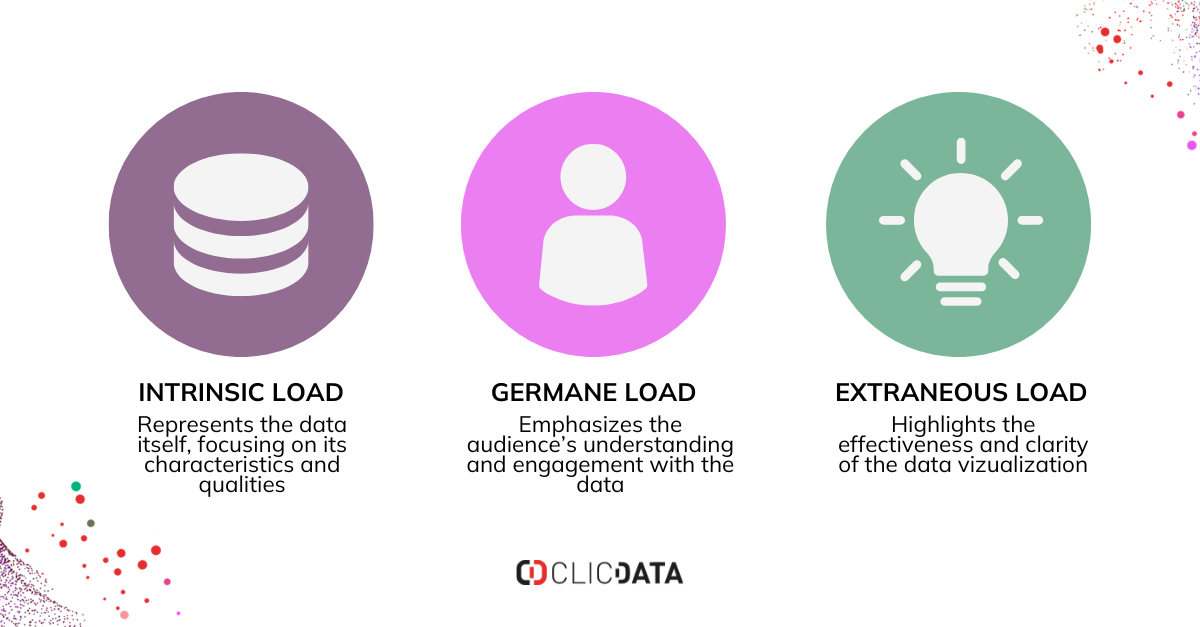
The cognitive load framework divides challenges into three categories:
- Intrinsic load (the complexity of the data)
- Germane load (how well the audience can engage with it)
- Extraneous load (how the visualization is designed)
While we can’t control the complexity of the data, we can control how it’s presented. Minimizing non-essential elements allows users to focus on what matters most.
In practical terms, decision-makers are often under pressure with limited time and multiple tasks. When faced with a cluttered visualization, they take longer to process the information and are more likely to make mistakes.
Keeping things simple helps reduce decision-making time and increases accuracy. Gestalt principles help reduce cognitive load and improve understanding:
- Proximity: Nearby elements seem grouped together
- Similarity: Objects with shared traits (color, shape, size) appear related
- Continuity: The eye follows the smoothest visual path
- Closure: The mind fills in missing parts of incomplete shapes
- Figure/Ground: We distinguish objects from their background
Minimalist data visualization embraces these principles instead of resisting them. Deliberately applying Gestalt principles helps create visualizations that align with human perception.
How to Apply Cognitive Load Principle to your dashboards?
Stripping away distracting visuals from your design can help create powerful, actionable dashboards. Let’s look at some practical steps to simplify your visualizations:
Choose the Right Chart Type
Start by selecting a chart that aligns with the data and the insights you want to convey. Stick to simple, easy-to-interpret charts:
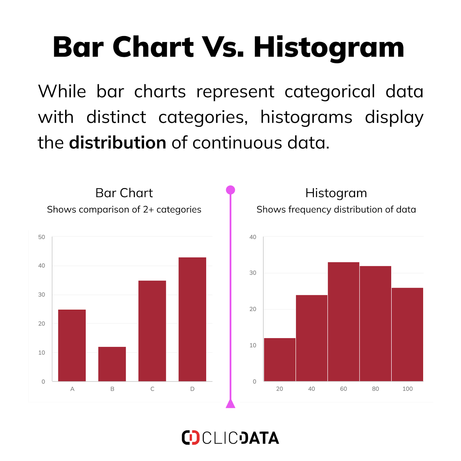
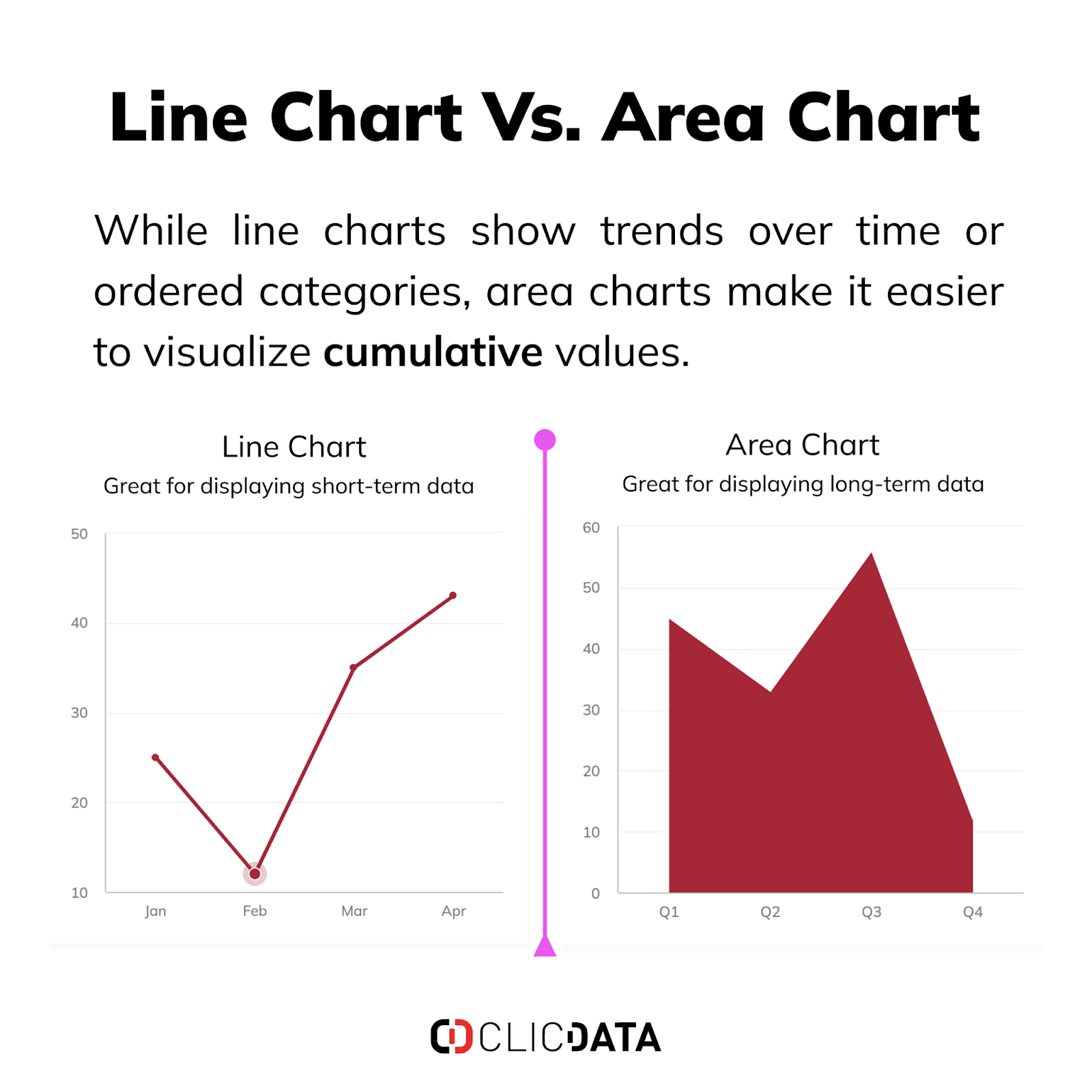
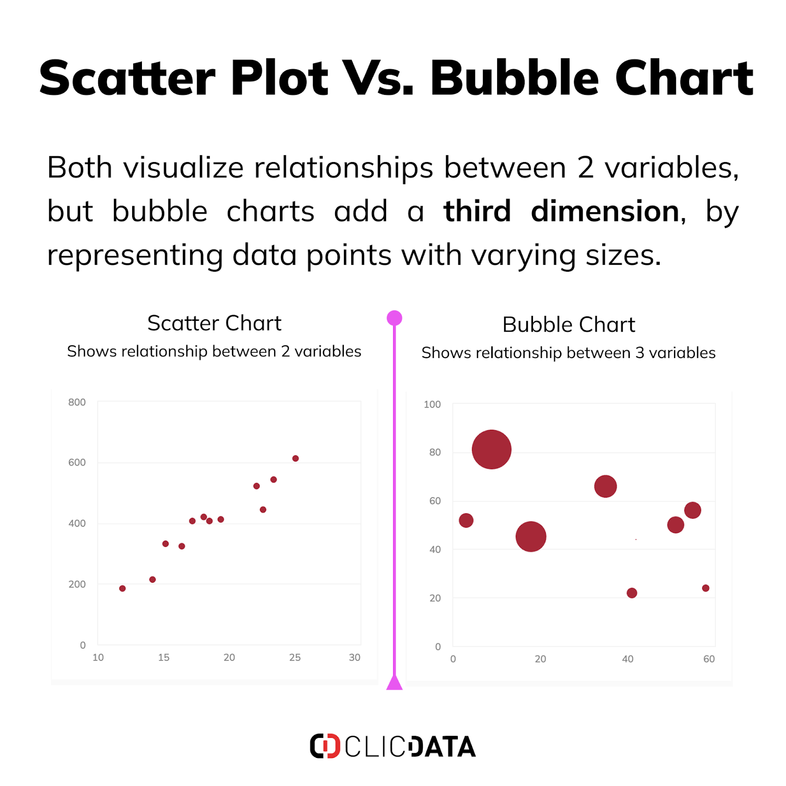
Avoid complex charts like 3D visuals or dual-axis plots, as they can mislead the viewer and add unnecessary complexity. Using straightforward charts helps decision-makers extract insights quickly and reduces cognitive load.
Minimize Non-Essential Ink
Apply Edward Tufte’s “data-ink ratio” to your visualizations, removing anything that doesn’t directly contribute to understanding. Eliminate gridlines, redundant labels, excessive borders, and decorative elements.
This focus on essential elements ensures that the viewer’s attention stays on the data, making the visualization more effective. Simplifying the chart leads to a clearer message and improves decision-making.
Use Whitespace Effectively
Whitespace is an essential design tool that improves readability. It separates different sections and provides breathing room between elements, which helps guide the viewer’s eye to the most important data.
Consistent margin spacing and alignment create a clear visual hierarchy, making navigation easier and reducing cognitive strain. Properly used whitespace enhances comprehension and directs attention where it’s needed.
Limit the Use of Color
Use color sparingly and strategically. Start with a neutral color scheme and add color only to emphasize key data points. Limit your palette to a few shades to avoid overwhelming the viewer. Ensure that colors have enough contrast for readability and are accessible to colorblind users. The purpose of color is to guide attention to key insights, not to decorate the chart.
Choose appropriate color schemes for different types of data:
- Qualitative Palettes: Separate categories (e.g., blue for electronics, orange for furniture).
- Sequential Palettes: Show intensity with varying shades of a single color (e.g., light blue for low values, dark blue for high values).
- Diverging Palettes: Highlight extremes around a midpoint (e.g., green for profit, red for loss).
Use a limited color palette, no more than 3 to 5 colors in a single visualization. If you have too many categories, group them into broader categories or display only the most significant ones.
Streamline Text and Labels
The text should provide context but must be concise and focused on the most important data points. Avoid cluttering the visualization with excessive text or complex terms.
Use clear, readable fonts at appropriate sizes, and place labels where they are easily visible without unnecessary movement. Label data points directly instead of relying on legends to simplify the chart and make it easier to interpret.
Create a Consistent Design System
Develop a design system with standardized templates, color palettes, fonts, and spacing rules. A consistent layout reduces cognitive load, helping users focus on the data and make decisions more easily. A well-defined design system ensures that visualizations remain cohesive and user-friendly, streamlining the user experience across different dashboards.
Enable Interactivity Without Overloading
Modern dashboards benefit from interactive elements that allow users to explore data more dynamically. These features can help increase user engagement and reveal deeper insights. However, too much interactivity can become overwhelming, making it harder for users to focus on the insights they need. The key to success is balance.
Common issues with interactive dashboards include too many drop-down menus or filters, which require users to set parameters before seeing any results. Additionally, overloaded tooltips can clutter the visualization by providing excessive information, while unnecessary animations or transitions slow down the experience and detract from the focus.
To maintain simplicity, use pre-set filters that offer flexibility while providing a clear structure. Keep interactive features intuitive, such as hover tooltips that show only relevant details when necessary. Avoid animations that do not directly contribute to extracting meaningful insights.
When interactivity is well-balanced, users can explore data effectively while the design remains clean and focused on the most important insights. This streamlined approach ensures a better experience and more efficient decision-making.
A Comparison of Cluttered vs. Minimalist Dashboards
Let’s see how his step-by-step approach to simplifying the dashboard improved usability, enhanced data communication, and enabled faster, more informed decision-making.
Suboptimal Dashboard Design
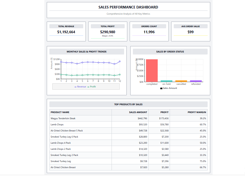
The suboptimal dashboard is filled with excessive elements that hinder usability and slow the process of extracting valuable insights. Several design flaws contribute to this visual overload.
- Visual Clutter: The dashboard is overwhelmed with borders, background colors, and decorative elements, which divert attention away from the data. Multiple borders and background colors around the charts create an environment of visual noise, making it harder for users to focus on the essential information.
- Poor Color Usage: Randomly applied bright colors overwhelm the viewer and make it difficult to understand the data. The rainbow color scheme creates confusion and detracts from the key metrics, while unnecessary color bars under KPIs add no value and only contribute to the visual clutter.
- Typography Issues: The use of all caps for section headers and excessive bold text reduces readability and creates visual strain. Centered text, especially for metrics, hampers quick scanning and makes it harder for users to efficiently process the information.
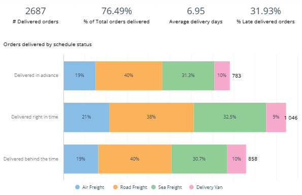
- Ineffective Chart Design: The charts are overly decorated, with dots on every data point in the line chart, thick axis lines, and a complex legend that adds to the visual weight without providing meaningful insights. This design choice distorts the focus and leads to confusion.
- Layout and Space Usage: The dashboard’s layout is crowded, with minimal spacing between elements. This cramped design makes it difficult to navigate and find key data points. Additionally, non-essential details, such as data refresh times and support contacts, are placed in the footer, making the design unnecessarily cluttered.
Optimized Minimalist Dashboard Design
In contrast, the minimalist design focuses on essential elements, eliminating unnecessary components to improve clarity and ease of use. This approach is centered around simplification and functionality, resulting in a user-friendly dashboard.
- Clean Visual Hierarchy: Minimalist design removes unnecessary borders and uses subtle section dividers to create a clean visual flow. Adequate whitespace between elements allows for a spacious layout that doesn’t feel overcrowded, guiding the viewer’s attention toward the important data.
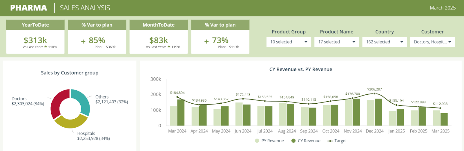
- Strategic Color Usage: The color palette is limited to brand colors, with specific shades used to indicate meaning, such as red for refunded orders, gray for canceled, and amber for on-hold orders. This intentional use of color helps users easily understand the status of items without confusion.
- Effective Typography: Proper capitalization for section headers and consistent text hierarchy improves readability. Left-aligned text ensures that key data points are easy to scan and interpret. This design choice enhances the user’s ability to quickly navigate the dashboard.
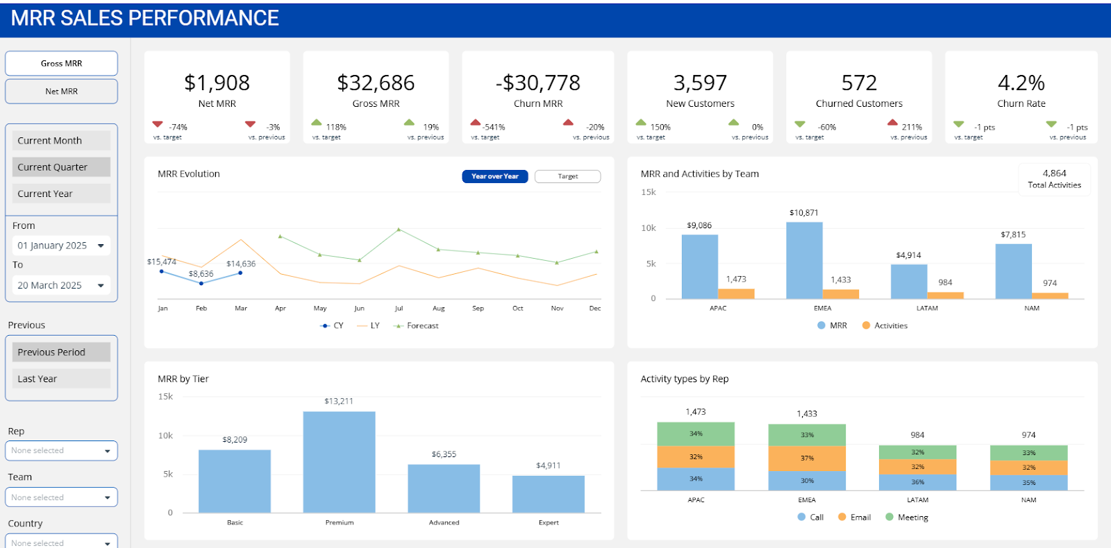
- Refined Chart Design: Simplified charts with cleaner axis lines and the removal of unnecessary data points help focus attention on the overall trend. A cleaner line chart and a vertical status chart make comparisons easier, improving the clarity of data representation.
- Interactive Elements: The dashboard includes interactive features like product selection and hover tooltips, allowing users to access additional details when needed without cluttering the view. This progressive disclosure of information keeps the interface clean and intuitive.
- Data Enrichment: Icons next to product names provide helpful context without adding visual clutter. Consistent formatting and customized tooltips make the data more readable and accessible, further enhancing the user experience.
Less is More, but Strategy is Key
In a world of data overload, clarity is a competitive advantage. Dashboards designed with minimalism in mind don’t just look cleaner—they perform better. They reduce cognitive strain, improve retention of insights, and enhance stakeholder trust in the data presented.
Before publishing your next dashboard, ask:
- Does this visualization support a specific decision?
- Is every element serving a clear purpose?
- Can someone unfamiliar with the data understand it instantly?
To help you implement minimalist principles, here’s a final checklist:
- Reduce unnecessary borders and background colors
- Limit color usage to convey meaning, not decoration
- Ensure the text is legible and uses consistent formatting
- Minimize gridlines and axis labels to emphasize the data
- Remove redundant information and focus on key insights
By consistently applying minimalist principles—thoughtful chart selection, restrained color usage, streamlined typography, and effective whitespace—you’ll move beyond functional dashboards to create insight engines that drive real business value.Ready to bring minimalist intelligence to your data?
Start your free trial with ClicData or book a 1:1 with our product experts to see how you can turn cluttered dashboards into clear, high-impact tools that deliver results.