A heat map is a data visualization that uses color gradients to represent values within a matrix. It’s ideal for comparing data density or intensity across dimensions such as time, location, or category.
When to Use a Heat Map
- Identify high/low intensity areas (hotspots)
- Visualize frequency or value distribution
- Track performance over two dimensions (e.g., day and hour)
Common Use Cases
- Website click tracking or session heat
- Sales performance by region and product
- Employee attendance by week and department
Best Practices
- Use a clear and intuitive color gradient
- Avoid more than 2–3 dimensions in one chart
- Include a color legend to explain intensity levels
Heat Maps in ClicData
- Create matrix-style heat maps with flexible axes
- Customize color palettes and conditional rules
- Enable filtering to focus on specific timeframes or groups
FAQ Heat Map
What types of data are best suited for a heat map?
Heat maps work best with dense, structured data where you want to compare values across two dimensions — like time vs. metric, or category vs. region. If your data has a natural matrix layout or you’re looking for value intensity, heat maps are ideal.
How is a heat map different from a choropleth or treemap?
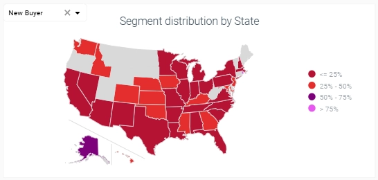
A heat map uses a grid or matrix, where color intensity directly reflects value. A choropleth map applies colors to geographic areas (like countries or states), while a treemap uses rectangle size (and sometimes color) to show hierarchical proportions. They share visual goals but apply to different data structures.
Can I use heat maps with more than two dimensions?
Technically yes — you can encode a third dimension with color shades, saturation, or tooltips, but going beyond that risks overwhelming the viewer. Stick to two key dimensions and use filters or interactive layers if you need more flexibility.
How do I choose an effective color palette for a heat map?
Avoid extreme gradients (like bright red to green) unless contrast is critical. Choose color scales that align with the data’s logic — sequential scales for continuous data, diverging scales for positive/negative values. Always include a legend for interpretation, and make sure it’s accessible to users with color vision deficiency.
Why do some heat maps make patterns hard to interpret?
This often happens when:
- The color scale is too subtle or too aggressive
- The chart is overloaded with dimensions
- There’s no clear legend
- Values are too close together, making contrast meaningless
To fix it, simplify your chart, test color palettes, and always focus on highlighting insights, not just data density.