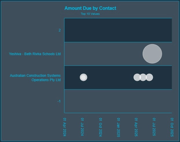
A bubble chart is an extension of a scatter plot where a third variable is represented by the size of the data points (bubbles). It enables multidimensional analysis by showing relationships between three numerical variables.
When to Use a Bubble Chart
- Compare and correlate three variables at once
- Visualize economic data (e.g., GDP, population, life expectancy)
- Spot outliers and clusters in multivariate data
Best Practices
- Use proportional scaling for bubble size
- Avoid too many bubbles — limit to 20–30 max for clarity
- Label with tooltips instead of permanent labels
Bubble Charts in ClicData
- Define X, Y, and size dimensions easily
- Customize bubble color based on categories
- Add hover tooltips to show additional metrics
FAQ Bubble Chart
What’s the difference between a bubble chart and a scatter plot?
A scatter plot shows two variables along X and Y axes. A bubble chart adds a third variable by adjusting the size of each data point, creating a more dynamic visual. It’s ideal when you want to go beyond two-dimensional analysis without using separate charts.
When should I use a bubble chart instead of other visualizations?
Use a bubble chart when you want to compare three numerical dimensions at once — for example, revenue (X), growth rate (Y), and market size (bubble size). It’s especially helpful for spotting patterns in economic, financial, or operational datasets.
How should I scale bubble sizes to avoid distortion?
Make sure bubbles are sized using area, not diameter, to reflect value proportions accurately. Using raw values for radius can exaggerate differences visually. Most modern tools handle this automatically, but it’s worth verifying when accuracy matters.
Can I use categories or groups in a bubble chart?
Yes — you can assign color to represent a fourth dimension, like region or product category. This lets you group bubbles visually while still comparing size, position, and distribution. Just don’t overuse color: limit to 4–6 categories for readability.
Why do bubble charts sometimes become unreadable or overwhelming?
Bubble charts can quickly get cluttered if:
- You use too many data points (over ~30)
- Bubbles overlap too much
- Colors are poorly chosen or not meaningful
To fix this, reduce the dataset, enable tooltips, and avoid unnecessary labels. Simplicity improves insight.