Businesses have access to more data than ever, yet making sense of it has never been more challenging. With growing datasets, decision-makers often struggle to identify key takeaways, as well as complex reports. Visualizations can also make insights harder to grasp instead of clearer. Hence, without the right context, data can quickly become overwhelming, leaving businesses without a clear direction.
Raw numbers alone don’t offer much value. The real power of data comes from interpreting it. This is why data analysts must shape data into meaningful narratives that connect insights to business decisions.
With businesses relying more on data-driven strategies, the ability to tell a compelling data story is becoming a critical skill. Research shows that demand for analysts is rising, with the Bureau of Labor Statistics projecting a 23% increase in research analyst roles between 2021 and 2031. As data continues to shape business decisions, analysts must go beyond technical skills and master storytelling techniques that turn raw numbers into actionable insights.
What Is Data Storytelling?
Data storytelling is a structured way of turning raw data into meaningful insights that decision-makers can act on. A single chart can highlight trends, but a complete data story connects those trends to real-world decisions.
Instead of presenting numbers without context, it frames findings as a narrative. A well-structured data story provides background information, defines objectives, presents trends, and highlights actionable insights in a clear and engaging way.
Understanding the User’s Needs
A strong data story starts with knowing who will use the insights and what they need to make informed decisions. Stakeholders need clear takeaways that help them act. A well-structured analysis answers three essential questions:
- What happened?
- Why did it happen?
- What should happen next?
The more aligned your insights are with your audience’s goals, the more valuable your analysis becomes.
Today, we will examine the Telco Customer Churn dataset to understand how to structure a data story effectively. It represents a fictional telecommunications company offering home phone and internet services to 7,043 customers in California during the third quarter.
Customer retention is a priority for the business, as studies indicate that acquiring a new customer can cost up to 25 times more than keeping an existing one.
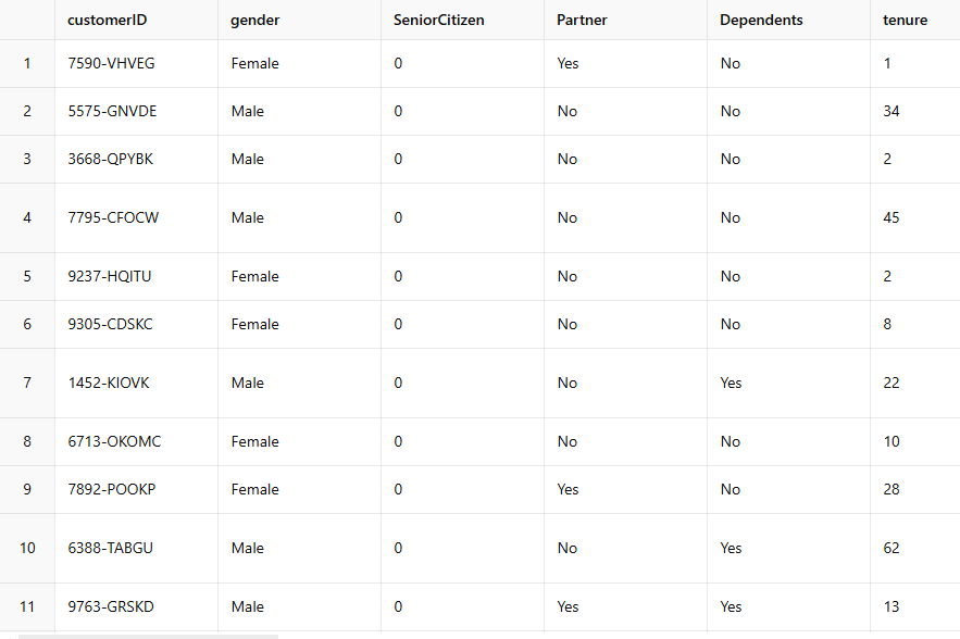
The Raw Data Contains 21 Customer Attributes for 7043 Customers
Know Your Subject Matter
A strong data story starts with a clear understanding of the topic. As an analyst, you should study how experts present findings, observe how they communicate insights and break down complex data into clear, actionable takeaways. The ability to explain a concept simply is a sign of true understanding. Removing unnecessary complexity keeps the focus on what matters most.
When analyzing customer churn, you must understand customer behavior, engagement trends, and competitive factors. Your stakeholders need insights that help them develop effective retention strategies, not an explanation of how complex statistical models helped you extract those insights. The goal must be to provide data-driven recommendations instead of diving into technical details.
Breaking Down Churn Insights for Your Audience
Focus on presenting practical takeaways rather than overwhelming stakeholders with technical details to make churn analysis meaningful.
- Study Best Practices: Review case studies from leading brands to see how they reduce churn. Look at their use of segmentation, loyalty programs, and proactive customer engagement.
- Simplify the Findings: Instead of presenting raw statistical outputs, highlight trends, key risk factors, and effective strategies.
- Prioritize Actionable Insights: Structure your findings around essential questions:
- Which customer segments are most likely to churn?
- Why are they leaving? (pricing, service issues, competitor offers)
- What has worked in past retention efforts?
Making Insights Accessible for Different Audiences
As a data analyst, you’ll work with stakeholders with varying technical expertise. Some will need detailed reports, while others prefer quick summaries. Tailoring how you present insights is key:
- For Technical Teams: Include in-depth analysis, trends, and methodology.
- For Decision-Makers: Focus on high-level summaries, key takeaways, and visualizations.
- For Customer Engagement Teams: Provide clear action steps to improve retention efforts.
You also need to consider to whom you will be reporting customer churn analysis. Different roles within a company require different levels of insight. Adapting your data story to your audience increases its impact.
- CMO (Chief Marketing Officer): Require a broad view of churn trends and retention strategies.
- Marketing Managers: Need detailed insights into customer segments and churn drivers.
- Customer Engagement Teams: Demand clear action steps to improve retention rates.
Decoding and Understanding the Brief
A well-defined brief is essential for any data project. It sets expectations, defines objectives, and helps analysts stay focused. A vague or unclear brief can lead to misaligned goals, wasted time, and unnecessary revisions. Analyzing and clarifying the brief before starting ensures that the final insights align with stakeholder needs.
This analysis focuses on month-to-month customers, who show significantly higher churn rates than those on longer-term contracts. Understanding why this group is more likely to leave is key to improving retention strategies.
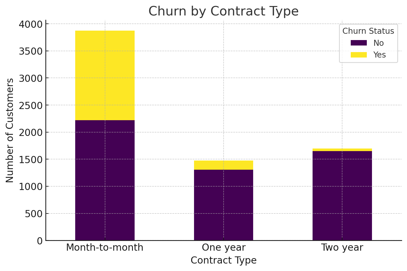
Customer Churn Rate by Each Contract Type
Keeping It Concise
A clear and direct narrative makes data easier to understand. Long explanations can make key insights harder to grasp. Focus on what matters most and avoid unnecessary details. If technical information is required, it can be included in separate documentation.
People remember a few key points better than a long list of details, so keeping takeaways brief improves retention. In our example, customers on monthly contracts leave at a higher rate than those on one-year or two-year plans.
Prioritizing Clarity
Clarity is essential in data storytelling. If the message isn’t clear, it loses impact. Anticipating stakeholder questions can help address concerns before they arise. Encouraging interaction, such as discussions or follow-ups, improves engagement and makes it easier for stakeholders to act on the insights.
The analysis answers three key questions to keep the findings clear and actionable:
- Who is affected? → Customers on month-to-month contracts.
- What is happening? → They are churning at a higher rate than long-term subscribers.
- What does this mean? → This group may require targeted retention efforts based on underlying churn factors.
Operational vs. Strategic Insights
Data-driven insights fall into two main categories: operational and strategic. Operational insights focus on technical performance and process efficiency, and they are useful for teams handling day-to-day operations.
Strategic insights influence high-level decision-making and guide long-term plans. A good data story considers both, ensuring the right information reaches the right audience.
- Operational Insights: Tracking churn rates in real time helps teams monitor performance and adjust short-term engagement efforts. Customer support, product teams, and retention specialists can use this data to identify customers at risk of leaving and take immediate action.
- Strategic Insights: A deeper understanding of why month-to-month customer churn allows for long-term improvements in business strategy. Competitive pricing models could be explored if pricing sensitivity is a major factor. If engagement is an issue, marketing, and product teams may need to rethink how they communicate value to short-term customers.
Setting the Context
Every data story needs context. The introduction should define the issue, explain its importance, and set the stage for deeper analysis. Some insights require urgency, while others need a more measured approach. If stakeholders don’t see why the data matters, they won’t engage with it.
In this case, customer churn impacts business stability and revenue predictability. A high churn rate among short-term customers raises key business questions:
- Is pricing a factor? Do customers see more value in longer-term contracts due to discounts?
- Are month-to-month customers less engaged? Do they interact less with the product or service?
- Does service quality influence retention? Are there specific issues leading to dissatisfaction?
Defining the Problem Clearly
A clear problem statement keeps the analysis focused. It should outline the issue and provide a logical direction toward a solution. Being specific about the scope prevents misinterpretation and keeps discussions relevant.
The brief on this customer churn will focus specifically on why month-to-month customers are more likely to leave. The problem can be outlined in two steps:
- What is happening? → Customers on month-to-month contracts have higher churn rates.
- What are we investigating? → The factors driving this behavior, whether it’s pricing, engagement, or another influence.
Focusing on One Problem at a Time
Addressing too many problems at once can make insights harder to follow. A good analysis defines the problem in one or two sentences and avoids broad investigations that dilute the message.
This data story will only examine churn patterns in month-to-month customers to keep this analysis focused. It will not cover broader causes of churn, such as seasonal trends or industry-wide factors. Narrowing the scope allows for a more detailed and actionable analysis.
Analyzing the Same Problem from Different Angles
Diving into the details of the data from various perspectives helps you build a stronger, more nuanced, and data-driven narrative. Breaking down the problem into specific dimensions will help identify which elements are most strongly linked to churn, enabling you to tell a clearer, more actionable story.
Monthly Charges
In our example, month-to-month customers churn more often than those with longer contracts. Churn is rarely caused by just one factor. It’s often the result of several things happening together. We can look at this problem from another angle to paint a more complete picture. This gives you a clearer picture and a stronger foundation for retention strategies.
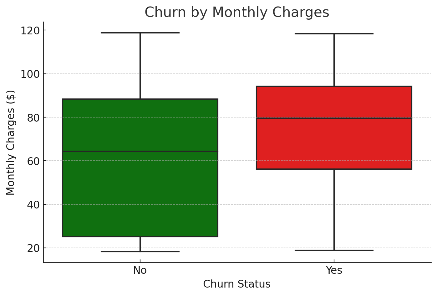
Customer Churn Status by Monthly Charges
Here are a few key insights to focus on:
- Customers who churned generally had higher monthly charges compared to those who stayed.
- The median monthly charge for churned customers is notably higher.
- The spread (variance) is larger for churned customers, suggesting pricing sensitivity.
The data reveals that churned customers tend to have higher and more inconsistent monthly charges. It suggests that cost may be a significant factor in their decision to leave. The absence of discounts, which long-term customers enjoy, could also make the service feel overpriced for those on month-to-month contracts.
Internet Service Type
The churn rates among month-to-month customers vary depending on the type of internet service they use. Understanding these differences helps pinpoint which customer groups are most likely to cancel and why.
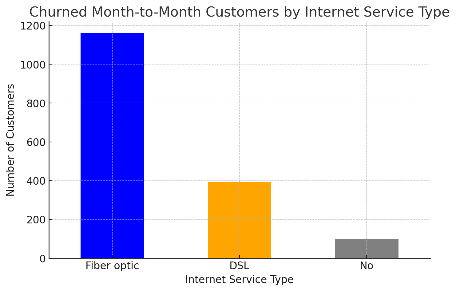
The Internet Service Type Used by Each Churned Month-to-Month Customer
For instance, fiber optic users make up the largest portion of churned customers, which is unexpected given that fiber optic is known for its speed and reliability. However, there are a few factors at play here.
The higher cost of fiber optic service may drive price-sensitive customers to seek more affordable alternatives. Additionally, despite its reputation for speed, fiber optic service could have issues that affect customer satisfaction, leading to frustration. Lastly, aggressive offers from competing providers might make fiber optic customers question the value they’re getting, especially when long-term contracts don’t bind them.
While these insights point to potential reasons behind churn, they are just possibilities that can help the marketing manager develop more targeted retention strategies. Further investigation into customer behavior could confirm or refine these findings to create more effective solutions.
Delivering Actionable Insights
Data analysis aims to turn raw data into clear, actionable steps. For decision-makers, this means understanding how data can directly impact business goals and providing easy-to-act-on recommendations.
Link Insights to Business Goals
When working with data, connecting each insight to a clear business goal is essential. For example, if churn is rising, it can lead to higher customer acquisition costs and lower profits. Identifying the cause of churn helps businesses create strategies to reduce it and keep revenue stable.
Addressing high churn among month-to-month customers can disrupt steady cash flow, so it is critical to focus on customer retention. Focusing on customer retention, particularly through adjusting pricing and addressing service dissatisfaction, can improve financial stability.
Use Visuals to Make Data Easy to Understand
Visual aids like charts and graphs help simplify complex data. They make it easier to spot trends, patterns, and areas that need attention. For example, a stacked bar chart can reveal how churn varies across different pricing tiers. It shows how customer churn correlates with different pricing tiers. It makes it easier to identify which group needs the most attention.
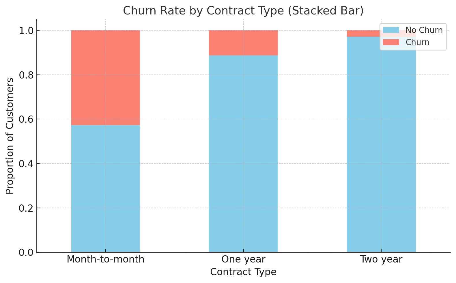
Customer Churn Rate by Each Contract Type
Keep Insights Simple
Keep insights clear and to the point. Overloading decision-makers with details can distract from the main message. In the case of month-to-month churn, the key issue is that these customers are leaving due to high costs and lack of discounts. Introducing loyalty programs or discounts can address this issue. This simple action can help reduce churn and keep revenue steady.
Prioritize Clear Communication
Communication is key to making sure stakeholders understand the data. When presenting insights, make it easy for decision-makers to grasp:
- Who is affected?
- What is happening?
- What actions need to be taken?
For example, if month-to-month customers are churning at a higher rate, the next step could be to target this group with retention strategies, such as offering discounts.
Operational vs. Strategic Insights
Data insights can serve both short-term and long-term needs. Operational insights focus on immediate actions, while strategic insights guide future decisions. For example, monitoring churn in real-time allows teams to act quickly to prevent customer loss. Meanwhile, understanding why customers are churning, like pricing issues or dissatisfaction with the service, helps develop long-term strategies like adjusting pricing or creating loyalty programs.
Tell a Story with the Data
Data should always tell a story that leads to action. Presenting numbers in a narrative format makes the problem and solution clear. For example, if month-to-month customers leave due to high prices and no discounts, offering loyalty programs or discounts could help retain more customers.
Leverage Tools Like ClicData
ClicData is a powerful, no-code platform that helps analysts manage and visualize data more effectively. It simplifies reporting and enhances collaboration, making it an ideal tool for various data-related tasks. Here’s how it meets key business needs:
- Consolidate Data from Multiple Sources with Ease: ClicData makes it simple to bring data from different sources together. With over 200 native connectors, users can pull information from cloud applications, on-premise databases, and various storage systems.
- Create Easy-to-understand Dashboards and Visuals: The platform offers a drag-and-drop interface that makes building interactive dashboards and charts easy, even for those without technical backgrounds. With more than 70 visualization options, such as tables, charts, and maps, users can create clear and engaging dashboards for both technical and non-technical team members.
- Simplify Reporting with Automation and Real-Time Collaboration:
ClicData allows for automated data refreshes, so reports and dashboards are always up-to-date. Users can schedule these updates to run at specific times, keeping everything accurate and relevant. The platform also makes collaboration easier by letting users share live links to dashboards.
Ensuring Successful Delivery
The effectiveness of your data story lies in how well it is communicated. Even the most insightful findings can fall flat if they aren’t presented in a way that connects with your audience. A successful delivery ensures that stakeholders not only grasp the insights but also understand the actions they should take based on them.
Iterative Feedback
Getting input from stakeholders throughout the analytical process is crucial. This helps align expectations and allows for adjustments along the way. For example, when working on a churn analysis, share an early version of the dashboard with key stakeholders. This will enable them to suggest changes or improvements before the final version is completed.
You can also check in halfway through the process to discuss preliminary findings, like churn rates or customer segments. This helps you stay on track and ensures the analysis is focused on what matters most.
Adapt Presentation Style
How you present the data matters just as much as what you present. Depending on your audience, you may need to adjust the format. Dashboards are great for data-driven teams like marketing or product managers. These teams can interact with the data, drill down into different segments, and explore trends in real time.
A report or presentation with clear recommendations is more suitable for executive teams, like the CEO or CMO. In these cases, provide a high-level overview and actionable steps, such as suggesting targeted retention strategies for at-risk customer segments. For non-technical audiences, like customer engagement teams, use simple visuals and clear trends to help them understand the data without overwhelming them.
Highlight Key Actions
When you present your findings, focus on the key actions that need to be taken. Don’t bog down your stakeholders with unnecessary details. Instead, highlight the most important insights and suggest practical steps. For example, if churn is 15%, don’t just present the statistic. Explain what should be done next.
For instance, month-to-month customers have a churn rate of 42%, which is much higher than other contract types. We recommend offering loyalty programs or discounts for long-term commitments to reduce this. This makes it easier for teams to act on the insights right away.
Building a Feedback Loop
After delivering your analysis, ask for feedback to improve your future work. You can ask stakeholders questions like, “Which parts of the analysis were most useful?” and “What areas need more clarity?”
This feedback helps you refine your storytelling approach and improve future presentations. It also ensures that your analysis continues to meet the needs of your audience. Use the feedback to make adjustments and enhance how you present data next time, ensuring your insights are as valuable as possible.
Document Learnings
After completing an analysis, note what worked well and what could be improved. Documenting these insights can help you refine your approach for future projects. For example, you might discover that certain visualizations, like bar charts showing churn rates by contract type, resonate well with stakeholders.
On the other hand, if you struggled to explain why churn happens, you can identify areas for improvement, such as focusing on pricing or contract types. Documenting what you have learned can help you improve your process and make each analysis better and more efficient. Over time, this helps you consistently deliver high-quality insights that are more aligned with stakeholder expectations.
Conclusion
Data storytelling is crucial for turning complex data into insights that help drive decisions. Data must be communicated in a way that’s clear and meaningful to your audience.
Whether you’re presenting to executives, marketing teams, or product managers, how you present your data can influence the decisions that follow. That’s where the right tools come into play.
ClicData offers a range of features that simplify data storytelling:
- Interactive Dashboards: With over 70 ways to visualize data, you can build dashboards that are easy to explore. This lets your audience engage with the data and discover the insights that matter most.
- Data Integration and Transformation: ClicData connects with over 250 data sources. It helps clean, standardize, and transform your data, keeping it consistent and reliable.
- Automated Reporting: Generate reports that automatically update with the latest data. These reports are structured and ready to present, saving you time while communicating insights clearly.
- Real-Time Collaboration: Share live dashboards and reports with your team to collaborate easily. Everyone has access to the most current data, helping everyone stay on the same page.
- Customizable Visualizations: Adjust the look of your visualizations and reports with custom CSS. This allows you to align them with your company’s branding and storytelling style.
ClicData allows you to present your data in a way that’s easy to understand and act on. Ready to take your data analysis to the next level? Contact our data experts today!