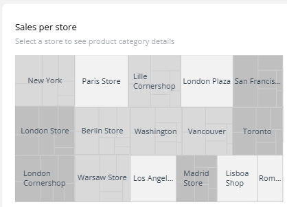
A tree map is a space-filling visualization that represents hierarchical data using nested rectangles. The size of each rectangle reflects a numeric value, making it ideal for visualizing proportions within categories and subcategories.
When to Use a Tree Map
- Visualize proportions within a hierarchy
- Compare nested categories or business units
- Explore product or segment contribution to overall value
Common Use Cases
- Sales by product category and subcategory
- Expenses by department and team
- Portfolio breakdown by asset class
Best Practices
- Use clear labels or tooltips — rectangles may be small
- Limit hierarchy depth to 2–3 levels
- Use color to differentiate categories or indicate performance
Tree Maps in ClicData
- Visualize category contribution to totals with dynamic sizing
- Customize color by dimension or KPI performance
- Add interactive drill-downs for deeper exploration
FAQ Tree Map
What type of data works best with a treemap?
Treemaps are best suited for hierarchical data where you want to compare proportions across categories and subcategories. It’s ideal when you have a total value to break down — for example, total revenue split by department, then by product line.
How does a treemap differ from a bar or pie chart?
While bar and pie charts compare values across flat categories, treemaps allow you to explore nested relationships (e.g., brand → product → variant). They also make better use of space, especially when visualizing many categories at once.
How many levels of hierarchy should I include in a treemap?
Ideally, no more than 2 to 3 levels. Going deeper makes individual rectangles too small to interpret. If more detail is needed, consider using interactive drill-downs or breaking the treemap into multiple views.
Can I use color in treemaps for more than just categories?
Yes — color can encode a second variable, such as performance, growth, or deviation from target. For example, rectangle size might represent sales volume, while color shows year-over-year growth. Just make sure your color scale is clear and your legend visible.
Why do some categories disappear or look too small in a treemap?
Treemaps are size-driven — if a category has a very low value compared to others, its rectangle may appear extremely small or not be visible at all. This can be misleading, especially when stakeholders expect to “see everything.” To handle this:
- Group small values under an “Other” category
- Apply a minimum size threshold
- Add tooltips to ensure no value goes completely unnoticed
Treemaps are powerful, but they work best when category sizes vary moderately.