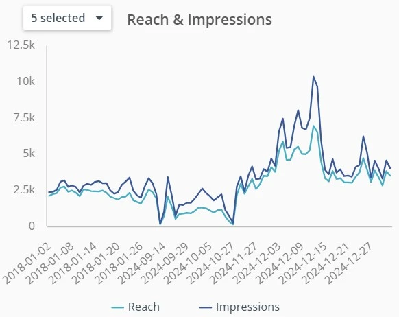
A time series chart is a specialized form of line chart used to visualize data points indexed in time order. It’s ideal for detecting patterns, trends, seasonality, and anomalies over a continuous time axis.
While line charts often show simple trends, time series charts are built for deeper temporal analysis — supporting hourly, daily, monthly, or even millisecond-level insights.
Key Features
- Time-based X-axis: Uses continuous, chronological intervals
- Multiple series support: Allows comparison of related metrics
- Granularity control: Zoom into specific time frames or aggregate over periods
Use Cases
- Stock price movements
- Server or application monitoring
- Website traffic by hour/day/week
- Sensor or IoT data streams
Time Series in BI and Forecasting
Time series charts form the basis for predictive analytics and forecasting models like ARIMA or exponential smoothing. They reveal seasonality (e.g., sales spikes in December) or lag effects between variables.
Time Series Charts in ClicData
- Support for timestamped data in real time or scheduled intervals
- Drill-down capabilities to explore data at different granularities
- Blend multiple time-based metrics in one visualization
- Use filters or slicers to explore ranges or compare periods
Time Series Charts FAQ
How do I choose the right time granularity for my analysis?
It depends on the business question and data frequency.
If you’re monitoring website traffic, hourly data may reveal usage peaks. For sales trends, daily or monthly views are often more meaningful. Always start broad (monthly/yearly) to spot high-level trends, then zoom in for anomalies or short-term patterns.
When should I use a time series chart instead of a regular line chart?
Use a time series chart when your data is timestamped and time intervals matter — especially if your dataset includes irregular spacing or high-frequency events (like IoT or log data).
Unlike simple line charts, time series charts ensure time continuity, highlight missing data, and allow dynamic granularity like zooming from monthly to hourly views. This makes them essential for performance monitoring, forecasting, or anomaly detection.
How can I detect seasonality or trends in a time series chart?
Look for recurring patterns at fixed intervals — like traffic spikes every Monday or sales increases in Q4. To highlight seasonality, overlay a moving average or use year-over-year comparisons. Tools like ClicData let you apply filters and visual aids (e.g., trend lines) to surface these patterns easily.
Can time series charts be used for forecasting?
Yes, but not alone.
They’re useful for visual inspection of past trends and seasonality. For actual forecasting, you’ll need to apply time series models such as ARIMA, exponential smoothing, or machine learning models. The chart helps validate the model’s accuracy by comparing predicted vs. actual results.
What are common pitfalls when working with time series data?
Some common issues include:
- Missing time intervals: Gaps can distort trends.
- Incorrect date parsing: Misformatted timestamps can break chart logic.
- Timezone mismatches: Especially with global data sources.
- Over-aggregation: Aggregating too early can hide valuable volatility or seasonality.
Pro tips : Always clean and inspect your timestamps before visualizing.