A column chart is a vertical bar chart that displays categorical data using vertical columns. It is one of the most intuitive and widely used visualizations for comparing data across categories or time periods.
When to Use Column Charts
- Compare values across different groups (e.g., sales per product)
- Track change over time (monthly revenue or expenses)
- Highlight differences in proportions or totals
Column vs Bar Chart
While both compare categories, bar charts are horizontal and better for long labels, whereas column charts are vertical and excel at emphasizing temporal changes or rankings.
Variants
- Stacked column: Shows total plus breakdown
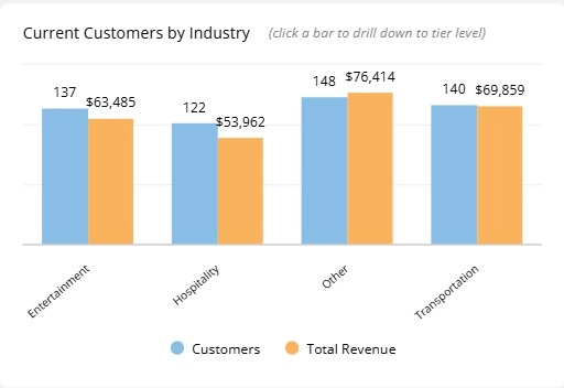
- Grouped column: Compares multiple series side-by-side
Column Charts in ClicData
- Create interactive column charts with multiple metrics
- Use data labels and hover tooltips for more context
- Apply sorting, filtering, and drill-downs on click
Column Chart FAQ
When should I use a column chart instead of a bar or line chart?
Use column charts when you want to emphasize change over time or compare categories across consistent periods. Bar charts work better with long category labels, while line charts are ideal for showing continuous trends or subtle fluctuations.
How do I handle missing time periods or data gaps in column charts?
Missing periods can break the visual flow or distort the trend. It’s good practice to fill in empty periods with zeros or null values, depending on the context. This ensures the timeline is preserved and viewers aren’t misled by visual inconsistencies.
What’s the best way to compare multiple metrics or series in a column chart?
Use grouped columns for 2–3 series max. More than that becomes visually noisy. For more complex comparisons, consider small multiples (one chart per KPI) or normalized line overlays to keep things readable.
Can I use column charts for percentage-based comparisons?
Yes — stacked column charts work well to show parts of a whole. If you need to compare percentages across categories, normalize your data to 100% and make sure to label clearly. Just avoid mixing percentages and absolute values in the same chart.
How do I spot seasonality or recurring patterns using column charts?
You can group your data by month or quarter across multiple years to highlight repeating peaks or drops. For example, placing January-to-December values side by side year over year makes seasonal patterns stand out clearly.