A dashboard is more than a collection of charts and numbers. It is a tool that empowers businesses to track key metrics, analyze trends, manage operations, and keep real-time insights at the heart of strategic decision-making.
When designed well, it presents critical data in a structured, easy-to-read format, reducing the time users spend searching for insights. On the other hand, a cluttered layout makes even the best data hard to use. Users need a clean design that highlights what matters without unnecessary distractions. Clear organization makes it easier to spot trends and act on them quickly.
Customization is just as important. Research shows that 60% of business users prefer dashboards they can personalize and interact with. When users can filter and adjust their views, they engage more and extract insights that are relevant to them.
This guide walks through practical strategies for building dashboards that are simple, intuitive, and tailored to user needs.
Why User-Friendly Dashboards Matter
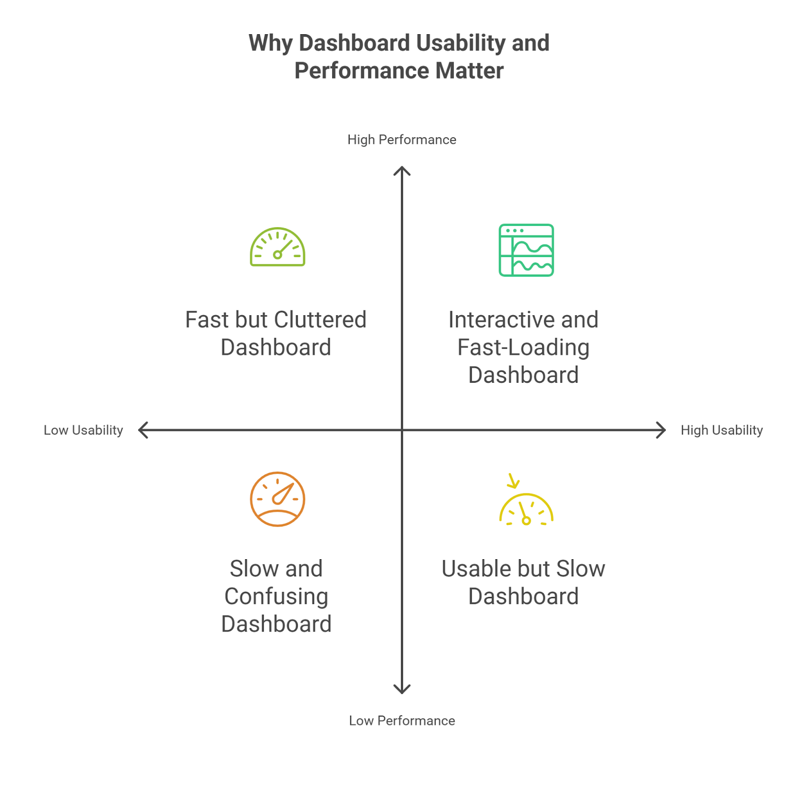
A dashboard’s value lies in its usability. A well-designed dashboard allows senior analysts to extract insights quickly, spot trends, and make informed decisions without unnecessary friction. Poor usability, whether due to cluttered design, slow performance, or limited interactivity, disrupts workflows and reduces the dashboard’s effectiveness.
Streamlining Insight Discovery and Self-Service Analytics
A user-friendly dashboard enhances how analysts interact with data. Features like filters, drill-downs, and customizable views allow users to focus on the most relevant metrics. Companies using interactive dashboards are 28% more likely to find timely insights than those relying on static reports. When dashboards provide self-service capabilities, users can explore data independently. Reducing reliance on technical teams speeds up decision-making and makes insights more accessible.
Driving Adoption and Engagement
A dashboard must be more than functional. It should also be intuitive. Research from Gartner shows that dashboard tools have the lowest abandonment rates among marketing technologies.
Customizable views and interactive filters keep users engaged by allowing them to tailor dashboards to their specific needs. When users can access data in a way that aligns with their workflows, they are more likely to use the tool consistently.
Performance as a Critical Factor in Usability
In modern business settings, speed is non-negotiable. Users expect dashboards to load in seconds. According to a study by NNGroup, a 1-second response time keeps interactions smooth, while a 10-second delay is often the tipping point for frustration.
Business users expect near-instant access to data for decision-making. Research from Think with Google shows that when page load times increase from 1 to 3 seconds, the probability of users leaving rises by 32%. While this data applies to websites, the same principle applies to dashboards. Delays frustrate users, making them less likely to rely on the tool for daily tasks.
Beyond frustration, slow dashboards erode trust in the data itself. In business intelligence projects, slow query performance is the most frequently reported issue and impacts how often dashboards are used. Optimizing dashboards to load faster and offer real-time insights is crucial for engagement and long-term adoption.
16 Tips to Make Your Dashboards User-Friendly
Creating a dashboard requires ensuring that users quickly understand and act on the insights presented. From choosing the right visual elements to optimizing navigation, every design decision impacts usability and engagement. The following techniques focus on improving readability, accessibility, and interactivity, helping you build dashboards that provide real value:
Know Your Audience: Design Dashboards That Fit User Needs
A well-structured dashboard should provide the right insights to the right users without adding unnecessary complexity. When tailored correctly, dashboards enhance decision-making rather than overwhelming users with excessive data. The right mix of layout, KPIs, and interactivity ensures that each user extracts relevant insights efficiently.
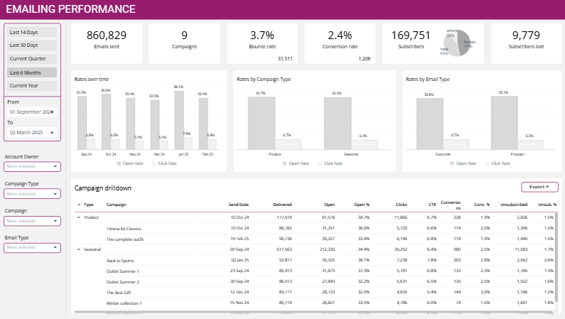
1. Operational Dashboards: Real-Time Decision-Making
Primary Users: Operational Teams, Managers
Secondary Users: Department Heads, Executives (for Quick Overviews)
Operational dashboards deliver real-time metrics to teams that need up-to-the-minute data to act fast. They are essential for roles in customer service, logistics, or sales, where quick responses directly impact business performance.
- Operational teams track live data to address immediate challenges.
- Managers monitor ongoing performance and adjust strategies in real time.
- Executives refer to these dashboards for high-level real-time insights.
A well-structured operational dashboard keeps teams proactive by ensuring quick, informed actions without delays.
2. Strategic Dashboards: Big-Picture Performance Tracking
Primary Users: Executives, C-Suite, Business Owners
Secondary Users: Department Heads, Senior Managers
Strategic dashboards focus on high-level KPIs like revenue growth, profitability, and market trends. They offer a concise snapshot of business health without overwhelming executives with excessive details.
- Executives and C-suite track top-level business metrics for strategic planning.
- Business owners assess company-wide performance to guide long-term decisions.
- Department heads align team goals with corporate objectives.
These dashboards prioritize clarity, ensuring that leaders stay focused on company goals while identifying areas that need attention.
3. Analytical Dashboards: Deep Data Exploration
Primary Users: Data Analysts, Data Scientists, Managers
Secondary Users: Executives (for In-depth Reports)
Analytical dashboards are designed for detailed data exploration. Users in data-intensive roles rely on them to uncover trends, detect patterns, and generate insights that shape business strategy.
- Data analysts and scientists process large datasets, apply advanced filters, and extract actionable insights.
- Managers use these dashboards for performance tracking and reporting.
- Executives refer to them when deep-diving into specific metrics like sales or retention.
These dashboards prioritize flexibility, offering advanced visualizations and interactive tools for in-depth analysis.
4. Tactical Dashboards: Bridging Strategy and Operations
Primary Users: Mid-Level Managers, Department Heads
Secondary Users: Operational Teams, Analysts (for trend tracking)
Tactical dashboards sit between strategy and execution, giving managers visibility into ongoing progress while maintaining flexibility to adapt.
- Mid-level managers track team performance and refine strategies based on real-time trends.
- Department heads monitor KPIs to ensure teams meet their objectives.
- Operational teams use tactical dashboards to track long-term trends like customer satisfaction or productivity benchmarks.
These dashboards offer a balanced view, ensuring managers can adjust workflows while staying aligned with broader goals.
Each dashboard serves a distinct purpose:
- Operational dashboards enable fast, informed decisions.
- Strategic dashboards provide a high-level business overview.
- Analytical dashboards support deep data exploration.
- Tactical dashboards help managers track and adjust performance.
5. Structuring Dashboards for Clarity: The MAD Framework
Sometimes, organizations need a single dashboard that allows them to visualize varying degrees of insights in one unified dashboard with drill-down capabilities. The Monitor-Analyze-Detail (MAD) framework provides a structured, top-down approach that delivers relevant data to the right users at the right time. For instance:
- Executives start at the monitor level to get a quick view of KPIs.
- Managers explore the analyze level to apply filters and track trends.
- Teams dive into the detail level to access in-depth reports.
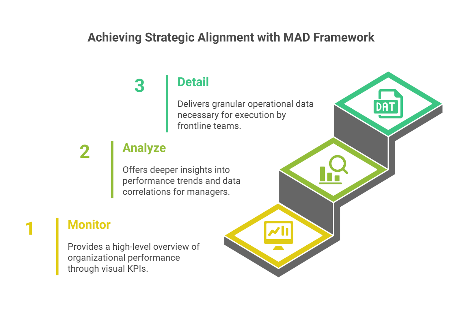
The MAD framework follows a layered information delivery system where each level expands on the previous one, offering deeper insights and granular data as needed. As a result, users can navigate between monitor, analyze, and detail views based on their needs. Let’s review how:
- Monitor: The Monitor layer offers a clear snapshot of business performance, helping executives track revenue, churn, and operational efficiency. Visual scorecards and charts present insights at a glance, while alerts highlight critical trends or deviations. A streamlined design reduces clicks, making data easier to access and supporting faster, more informed decisions.
- Analyze: Managers and analysts rely on the Analyze layer to explore data through filtering, segmentation, and comparisons. This level helps them investigate KPIs across different dimensions, apply time-frame analysis to spot trends, and drill into details while maintaining a structured overview. Instead of relying on assumptions, they make data-driven decisions based on real performance insights.
- Detail: The Detail Layer provides real-time, transaction-level data that supports immediate decision-making and operational efficiency. Unlike higher layers that aggregate information, this level gives users full visibility into individual records, ensuring that every data point is accurate and actionable. It enables real-time status tracking, allowing teams to monitor ongoing transactions, track key processes, and respond instantly to changes. This layer also enables immediate action, allowing users to approve transactions, adjust workflows, or resolve customer issues without delays. Since all data originates at this level, it serves as the foundation for higher layers, ensuring that broader performance tracking and strategic insights are built on precise, up-to-date information.
Optimize Your Dashboard for Clarity and Efficiency
A well-organized dashboard reduces cognitive fatigue, improves usability, and allows users to focus on critical business metrics without distractions. Every element should serve a purpose, guiding users to insights without overwhelming them.
6. Prioritize Key Metrics
Displaying too much data at once dilutes the impact of important insights. Focusing on 5-7 key metrics per dashboard can help minimize the likelihood of users being overloaded with information.
Too many charts, tables, or KPIs can overwhelm users, making it harder to spot key insights at a glance. A well-structured dashboard should highlight only a few essential KPIs at the top, giving users an immediate snapshot of performance. Additionally, using conditional formatting in tables—such as color-coded indicators—helps users quickly distinguish between good and bad trends, enabling faster and more informed decision-making.
7. Use Whitespace to Improve Readability
A cluttered layout forces users to work harder to locate relevant data. Whitespace helps group related insights, providing visual separation between sections. This simple design technique makes it easier for users to process information step by step instead of being overwhelmed by a single, dense screen.
A simple color-schemed, well-spaced, well-segmented data dashboard enhances usability by organizing data logically, allowing users to navigate smoothly without searching for key details.
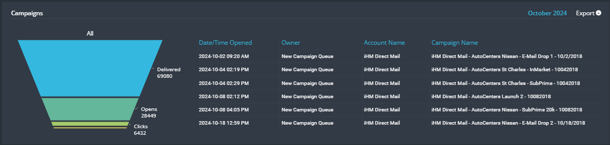
8. Choosing the Right Chart for Your Data
Not every dataset should be visualized the same way. The right chart makes trends easy to spot, prevents misinterpretation, and simplifies complex data. The wrong one can distort insights or overwhelm users with unnecessary details. Every chart in a dashboard should serve a clear purpose, helping users extract meaning without confusion.
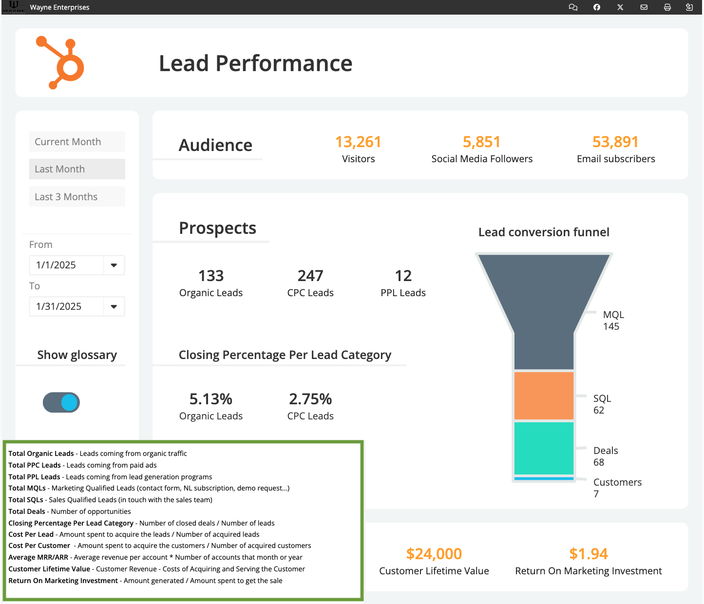
Consider adding a user guide to your dashboard to keep insights clear and consistent. A quick reference for key metrics, definitions, and formulas helps prevent confusion and keeps all users on the same page.
9. Maintain a Consistent Layout
Inconsistency disrupts the user experience. Standardized fonts, colors, and alignments create a familiar structure that reduces the time needed to locate data. Users should be able to scan a dashboard and immediately recognize key sections without confusion.
To further enhance usability, consider using custom color palettes to maintain visual consistency across dashboards, reinforcing patterns that users can quickly recognize. Additionally, allowing users to save personalized settings—such as preferred filters or default views—helps streamline their experience, reducing the time spent adjusting the dashboard to their needs.
A clean, uniform design improves navigation, reducing the learning curve for users while reinforcing a cohesive look and feel across all dashboards.
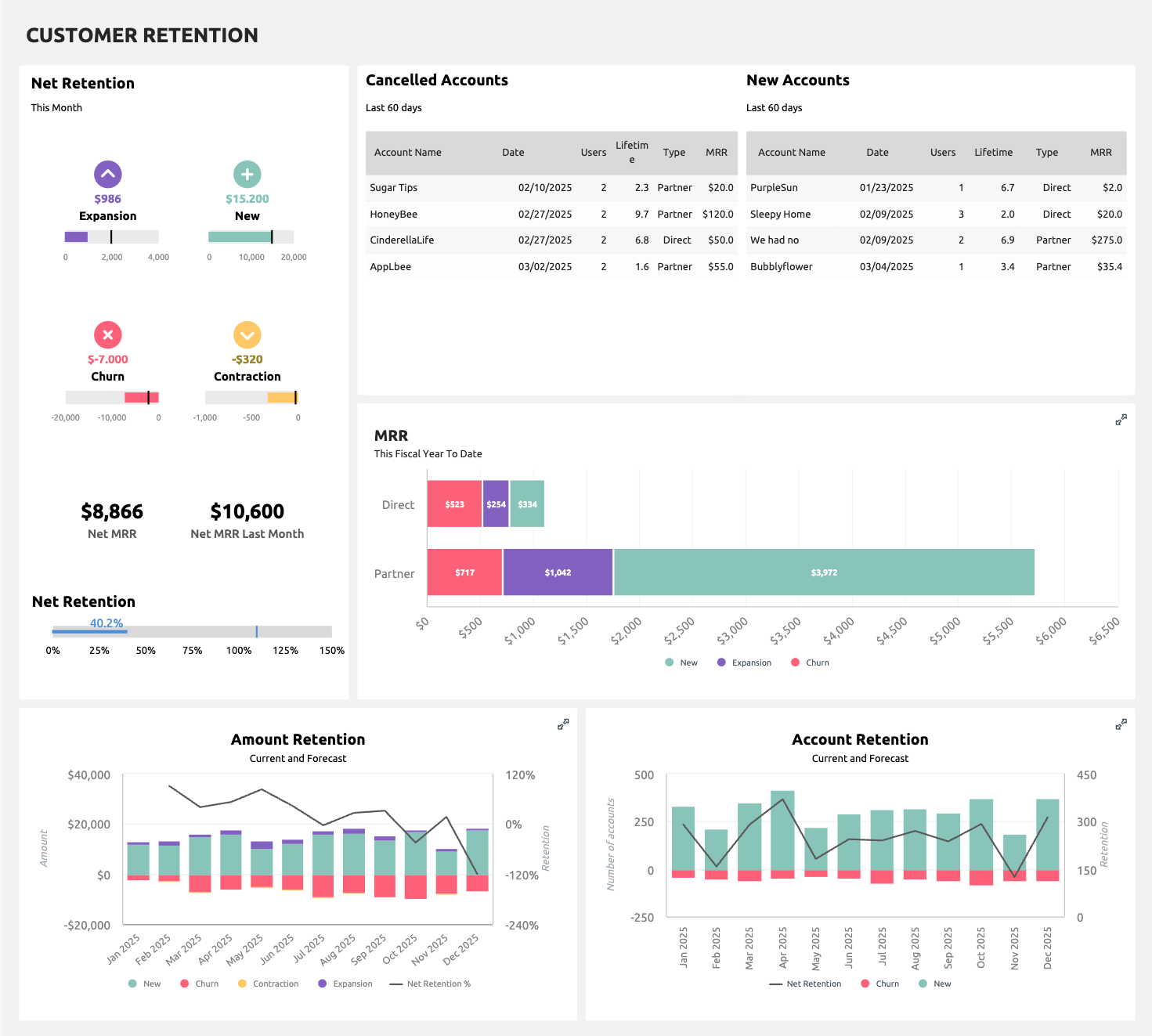
For example, in the Customer Retention dashboard below, consistent color coding is used—churn is always pink, contraction is yellow, expansion is purple, and new accounts are green. This standardization allows users to instantly recognize patterns and trends across different sections, making it easier to interpret insights without having to reorient themselves each time they interact with the dashboard.
10. Remove Unnecessary Visuals
Aesthetic complexity often reduces effectiveness. Flashy animations, 3D charts, and excessive color gradients distract rather than enhance insights. The best dashboards prioritize clarity over decoration, using simple visual elements that highlight important trends without competing for attention. Removing unnecessary visuals keeps users focused on data-driven decisions instead of visual distractions.
Design Dashboards for Greater Engagement
Thoughtful design principles like focal points, the rule of thirds, Gestalt, and CRAP (Contrast, Repetition, Alignment, and Proximity) can help improve readability and engagement. These techniques ensure important data stands out while maintaining a logical flow that guides users through the information.
11. Make Dashboards Interactive: Give Users Control Over Data
Static dashboards restrict users to pre-set views, limiting their ability to explore beyond predefined insights. In real-world decision-making, flexibility is essential. Interactive features give users the control they need to refine their analysis, focus on key data, and uncover deeper insights tailored to their needs.
Make your dashboard more intuitive by allowing users to adjust their view based on relevant parameters. Filtering options for time range, region, or product category help them focus on the most relevant insights without unnecessary distractions.
Hover tooltips keep the interface clean by displaying additional details only when needed. Instead of cluttering the screen with excessive information, users can access key data by hovering over specific points.
Drill-down capabilities take this further by enabling users to click on high-level metrics for detailed breakdowns. This creates a seamless flow from summary data to granular insights.
Improve navigation by linking charts and graphs to relevant datasets or reports. This allows users to switch between views without disruption. AI-powered search can further enhance exploration by letting users ask questions and retrieve specific insights dynamically. These interactive features make data analysis faster, more intuitive, and more effective.
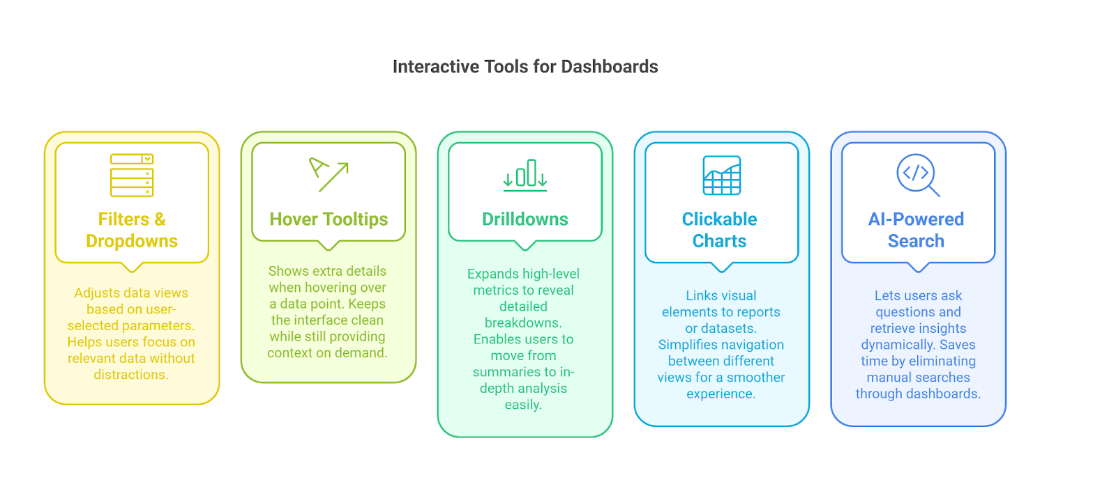
Interactive dashboards improve usability by:
- Letting users adjust views based on relevant filters – Users can personalize their experience by applying filter widgets to focus on the most relevant data. Learn more about filter widgets here.
- Keeping screens clean by displaying details only when needed – Instead of cluttering dashboards, you can use dynamic content displays to reveal more details on demand. See an example with Koda Shoes.
- Encouraging engagement through drilldowns into specific data points – Interactive drilldown charts allow users to explore data hierarchies without leaving the dashboard. Discover how to set up drilldowns.
- Speeding up analysis with AI-powered search for quick answers – AI-driven queries enable users to ask questions and get instant insights, reducing the need for manual exploration. See how AI-powered search works.
However, too many interactive elements can complicate navigation instead of improving it. Keep controls simple and intuitive. Use tooltips and prompts to guide users, ensuring that interactivity enhances usability rather than adding confusion.
12. Focal Points: Directing Attention to Key Metrics
Users don’t read dashboards from top to bottom. Instead, they scan for important details. Bold fonts, contrasting colors, and well-placed visuals naturally catch their attention. Clear focal points help them quickly find key metrics without sorting through unnecessary details.
- Use larger text, bold formatting, or color contrast to draw attention to high-priority metrics like revenue, churn rate, or customer satisfaction scores.
- Position important insights from the top left to the center of the screen to improve visibility and accessibility.
For instance, a financial dashboard highlights quarterly revenue in a large, bold format in the top-left section. Supporting data, like regional sales trends, appears in adjacent sections to provide context while keeping the primary focus clear.
13. The Rule of Thirds: Structuring for Easy Navigation
The rule of thirds divides the dashboard into nine equal sections with two vertical and two horizontal lines. Placing key metrics at the four intersection points makes them easier to notice and process.
- Position key metrics where users naturally focus to improve readability and make data easier to interpret.
- Avoid centering critical metrics, as slightly off-center placement creates a more engaging layout and naturally directs attention.
- Arrange supporting visuals like trend charts and breakdowns around primary KPIs to guide users through the data in a structured and intuitive way.
For example, instead of being in the middle of the screen, a monthly sales trend graph is positioned in the upper-left third. Additional insights, such as customer segmentation or performance comparisons, are placed nearby to create a seamless flow of information.
14. Combining Gestalt Principles with the CRAP Methodology
Combining Gestalt principles with the CRAP methodology creates a structured and visually effective approach to dashboard design. These principles work together to improve clarity, usability, and the overall user experience, ensuring that dashboards are both intuitive and informative.
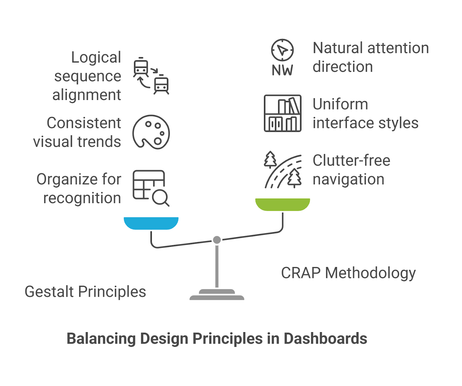
Gestalt’s proximity and continuity principles prevent clutter by grouping related data, while CRAP’s alignment and contrast rules ensure that information is structured logically and remains visually clear.
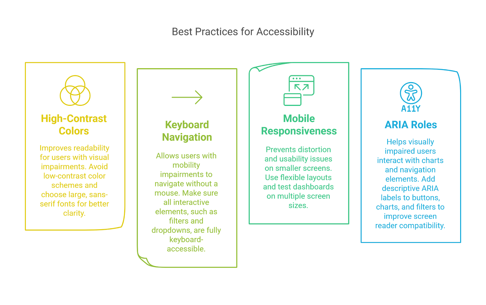
15. Ensure Dashboards Are Accessible
A well-designed dashboard should be usable by everyone, including individuals with disabilities and those accessing it on different devices. Poor accessibility limits engagement and excludes users who rely on assistive tools. A dashboard that supports accessibility and mobile responsiveness ensures a wider reach and a better user experience in all environments.
- Uses clear, legible text and high-contrast visuals for users with visual impairments.
- Supports full keyboard navigation for those who cannot use a mouse.
- Adjusts to different screen sizes without losing functionality.
- Follows web accessibility guidelines, including ARIA roles for screen readers.
Test dashboards with real users, including those using assistive technologies and mobile devices. Identifying accessibility gaps early improves usability and makes dashboards more inclusive for all users.
16. Refine and Improve: Ongoing Optimization
A dashboard should continuously evolve to meet user needs. Regular testing and updates ensure that it remains effective and user-friendly.
- Conduct user testing to gather feedback before deployment and identify potential usability issues.
- Incorporate feedback loops to refine the dashboard continuously based on user insights.
- Analyze usage data to track feature engagement and make adjustments to underutilized elements.
- Follow industry best practices to stay aligned with the latest dashboard design trends.
- Adapt layouts and interactions based on real-world user behavior to improve overall usability.
Building User-Friendly Dashboards with ClicData
As a data analyst, your responsibility is to shape how decision-makers interact with data. A dashboard should present information and make insights easy to interpret and act upon. When designed well, it becomes a tool that drives clarity, efficiency, and smarter business decisions.
ClicData provides a flexible platform for designing, customizing, and automating visually clear and highly functional dashboards. Its easy-to-use interface and extensive data visualization options help analysts create dashboards that are easy to navigate, interactive, and accessible on different devices.
Following best practices and using the right tools can help you build dashboards that enhance decision-making, improve user adoption, and support business growth.
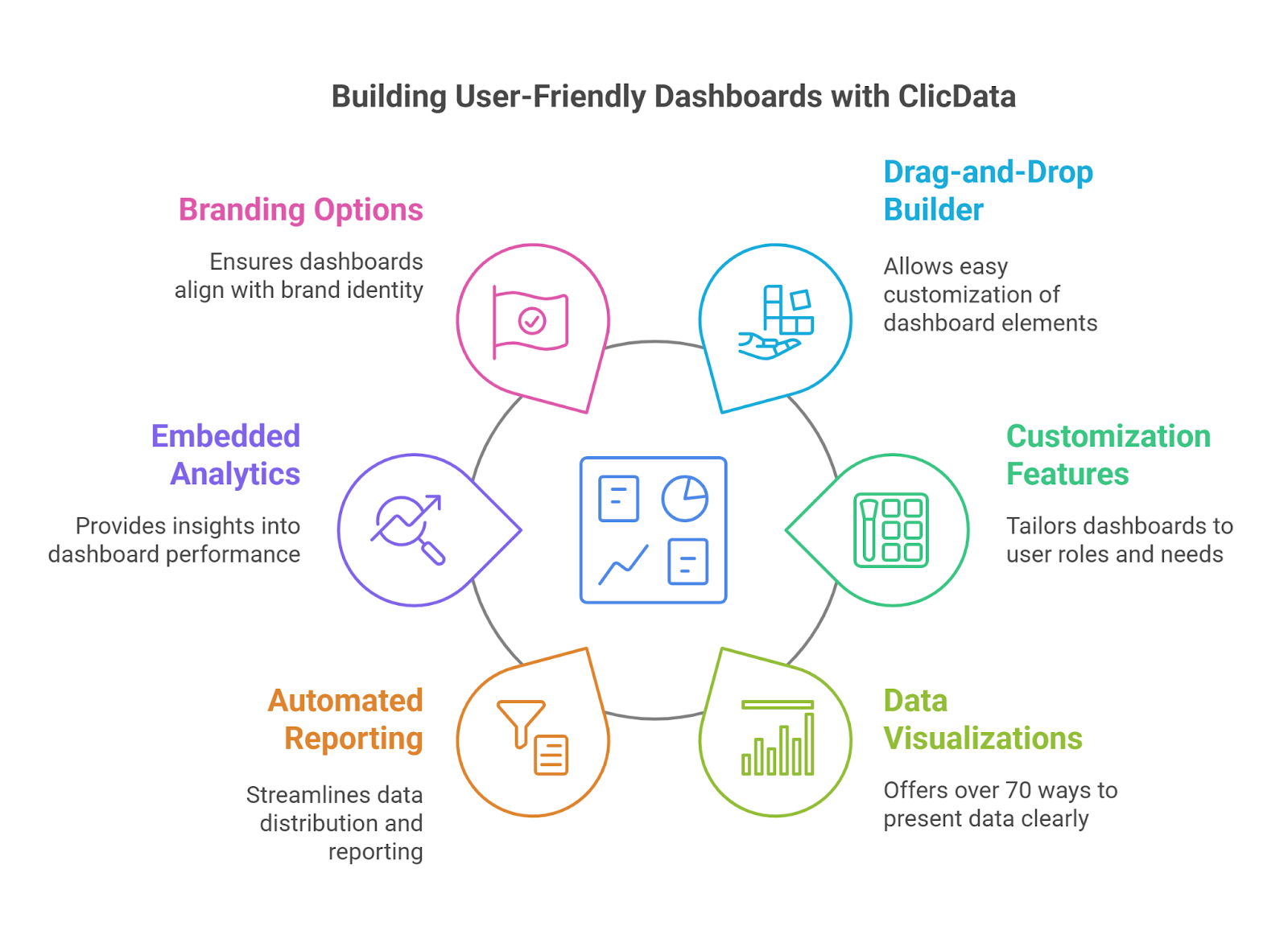
Drag-and-Drop Dashboard Builder
ClicData’s drag-and-drop interface gives users full control over the dashboard design. Fonts, colors, layouts, and visuals can be adjusted to match branding and business requirements. Dashboards automatically adapt to different screen sizes, ensuring accessibility on desktops, tablets, and mobile devices. Secure embedding options allow seamless sharing across platforms.
Customization and Interactive Features
Dashboards can be tailored to different user roles so each department sees the data relevant to them. Interactive elements such as drill-downs, filters, and dynamic views allow users to explore data in greater detail. Users can refine their analysis by adjusting parameters like date ranges or category breakdowns, making insights more useful for decision-making.
Versatile Data Visualizations
More than 70 visualization options allow users to present data clearly. Charts, heatmaps, scatter plots, and KPI indicators highlight trends and performance metrics in an easy-to-understand format. Custom styling with CSS provides additional flexibility to maintain a consistent look and feel across dashboards.
Automated Reporting and Data Distribution
ClicData offers structured reporting capabilities to streamline data distribution. Users can create reports with custom sections, page breaks, and formatted layouts. Reports can be exported as PDFs to maintain a professional appearance for presentations, compliance reporting, or stakeholder updates.
Embedded Analytics and Mobile Access
Dashboards are fully responsive, allowing teams to access key insights on any device. Automated updates keep dashboards current without manual intervention. Secure sharing features, including password protection and role-based access, enable controlled distribution of sensitive data.
Custom Branding and Personalization
With ClicData’s White Label feature, you can customize every aspect of your dashboard to match your brand identity. Adjust the domain, fonts, and colors to create a seamless user experience that feels like an extension of your organization. Whether the dashboards are for internal teams, clients, or partners, maintaining brand consistency helps improve adoption and engagement. A fully branded dashboard reinforces professionalism and makes the platform more intuitive for users.
Try ClicData and start designing data-driven, user-friendly dashboards today.