One of the most important steps in understanding and communicating trends in your data is by visually representing it; that’s why graphs have been used for centuries. William Playfair is credited with inventing many data visualizations in the 17th and 18th centuries, which are still in use today including the line, bar and area charts.
However, choosing the correct graph or indicator to best communicate your information can be tricky. In this and following articles, I will cover some of the most common charts in use today and some use cases where an adjustment to the chart or an entirely different chart might be a better illustration of your data.
Number Indicators
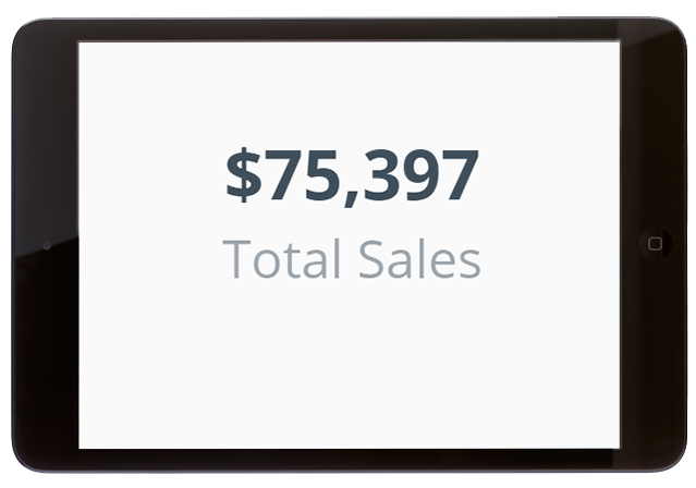
These are a simple way to represent an aggregated total over a period of time. Annual Sales? Perfect. Number of Support Tickets this week? Great! Leads contacted this month? Yup that too!
If you are providing an executive summary to high level management, they probably don’t want to get bogged down in the weekly fluctuation in grain prices in western Europe. They want to see the big picture and how it’s affecting their bottom line. Keep it simple and use a number indicator.
Symbol Indicators
When employing Number Indicators in reports and presentations, it can be helpful to give additional context to the figure being displayed, let say for example sales are $1M this year. That’s great; the company is doing really well, right? However, what if the previous year’s sales were $1.5M?
How can we best represent the data at a high-level while still providing enough context to give meaningful insight into our performance?
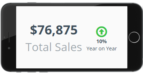
Symbol Indicators are a great companion to Number Indicators. Not only can we keep the visualization simple and high level, but we can also illustrate concisely whether this final figure is up or down on a comparative period. The combination of numbers and symbols give some more context to the business’ performance but retain the succinctness to be immediately consumable.
Here are some tips on using symbol indicators in concert with number indicators for comparative purposes:
- Comparative time periods should be meaningful, if you are running a weekly report it probably makes more sense to compare weekly figures than monthly or quarterly.
- Time periods should be clearly labelled in reports and dashboards to avoid ambiguity or confusion.
- Color formatting can be used to give an easily and immediately understandable non-numeric message. Make sure to use standard color scales to indicate good, bad and ok performance (i.e. think traffic lights: red = bad, green = good).
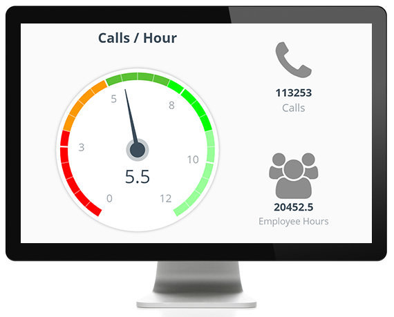
Gauge Charts
Perhaps your reporting needs are a little more nuanced than simply indicating whether a metric or goal has been achieved or not. A symbol indicator will illustrate an improvement in sales, but it may not be the best way to communicate the scale of improvement.
Gauge Charts are a good way to indicate if a metric is reaching its benchmark. Similar to a number indicator, the Gauge is a simple and concise way to represent a snapshot of your data at a given point in time. With the scale of the Gauge, we can indicate whether a goal is barely being achieved or blowing the benchmark out of the water.
Let’s say, for example, we have a phone team. Imagine the phone team has a benchmark of 6 outgoing calls per hour. With some simple metrics, we can easily calculate the calls per hour for any point in time: (# of actual calls)/((# of Employees) * (# of Hours)*(6 calls)).
Whether you are designing a report for high level executives or team leaders, it is important to visualize your data in the most clear and concise manner possible to avoid misinterpretation of metrics or losing your audience. It is also very important to think about the story you want to tell with your data, what can be learned and what action can be taken from these learnings.
ClicData can provide Expert Services to help you visualize your data more effectively. Dashboards can be built for you or consultancy can be provided to get your data to tell a story.