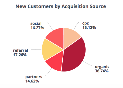
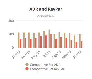
BI digital dashboards are user interfaces that graphically depict the metrics of your organization’s performance, both currently and historically. They can be specialized and customized to provide information specific to certain departments—like sales, accounting, HR, or IT. Or, they can be more encompassing, providing your high-level executives with quick overviews of performance metrics from throughout the organization and the insights and information they need to refine and accelerate their decision-making.
Setting the Foundation
For your dashboards to work at their best, they should have the support of enterprise-wide connectivity and real-time capabilities. If your BI dashboards are supported by intelligent data warehousing—data from your numerous platforms that’s consolidated into an intelligent, secure data warehouse—you can benefit from insights informed by data from across the organization. With auto-refresh and auto-notify features, you can tap into up-to-the-minute, fresh analyses and reports any time you need them. That means that with the click of a mouse or a tap of a finger, you can get a real-time snapshot of the status of your projects, products, employees, ROIs, and innumerable other possible metrics. Those will help you and everyone else be more productive and make better decisions.
But the message of those insights is only as powerful as the messenger can deliver it. If your dashboards aren’t easy to interpret, if metrics are depicted with poorly-chosen graphics and visualizations, or worse—if you don’t answer the key questions that your users need to get answered—the benefits of these powerful tools will be lost or diminished.
To be truly effective, your BI dashboards need to be focused and user-friendly. They need to match the technological expertise of your user—whether they be a novice or a geek—and present the data in a way that is easy to digest and that inspires informed response and action.
Five Questions to Start Building Time-Saving, User-Friendly, Productivity-Enhancing Dashboards
Setting up dashboards for an executive, a department, or an organization requires you to ask a lot of questions. As a manager or executive yourself, you want to know how you can make reporting more efficient for everyone. What actually matters? How can your dashboards analyze your data and visualize it to supply insights and actionable information that makes a difference to your—and your organization’s—productivity? Here are five fundamental questions to get you started.
1] What is the goal of the dashboard?
What job or set of tasks will the dashboard help people accomplish? What answers do they need at a glance? What metrics do they want to see grouped together? Find out the specifics of why the dashboard will be useful to the person, the team, and the organization. Goals will differ from department to department. While a marketing department might need to see lead generation, campaign performance, and return on marketing investments, the sales team might need to know more about revenue profitability, upsell rates, closures per team member, and conversion. Consider what information will be most effective to keep them current and to inspire them to action.
2] What’s the profile of the dashboard user?
Consider several factors about the users of the dashboard to help you design it to be of optimal performance for them.
First, consider their role in the company. Then ask, What decisions do face? What questions do they need answered to make those decisions? Focus on providing information that makes it as easy as possible to answer those questions.
Second, consider their work environment. In what setting will they want to access the dashboard? Will they need to get sales metrics on the road on their mobile? Or will they be looking at their desktop reviewing returns? The context will help you make decisions about how to present the data in ways that are easiest for them to consume when needed.
Third, how data-savvy are they? Find out how proficient there are with playing with numbers and working with data. Do they want to drill down and understand the numbers behind the returns? Are they familiar with the data that supplies the key performance metrics? Do they need tooltips and other embedded explanations and narratives? Try to match the user’s level of inquiry and comfort.
3] What types of charts will suit the data and your users best?
Skipping over this important step of choosing the most suitable data visualization options among charts, graphs, and indicators will only end up costing you and your team time and could contribute to confusion—the exact opposite result from what you are trying to accomplish with your sophisticated dashboards. Here’s a quick run through of how to select the best chart for your various data purposes:
To compare values:
Charts work very well to compare values and metrics. Lows and highs are easily recognized and discerned at a glance. Furthermore, you can quickly and easily create a chart using online design tools. For comparing data points, use any of the following charts:
- Bar chart
- Column chart
- Pie chart
- Line chart
- Scatter Plot
To show relationship of the parts to the whole:
These charts help you depict how the metrics compare to other metrics but adds an additional point of information: how the parts compare to the whole. Another way to look at it is as a way to convey the composition of things such as costs, time, expenditures, size, and so forth.
- Pie chart
- Stacked bar
- Stacked column
- Tree chart
- Area chart
- Waterfall chart

To help you understand trends:
Certain charts can give you insights about how certain events performed over a specific time period, including the rises and falls of trends. They include:
- Dual-axis graph
- Line graph
- Stack graph
- Column

To quickly convey single metric returns:
Sometimes a simple display of a metric is all that’s needed. Presenting the value with a simple digital display, or within a gauge that shows the context of minimum and maximum can be quite effective.
- Numeric
- Gauges
4] What features should you put to work?
While to most people, dashboards are virtually synonymous with charts and graphs arranged on the screen, there are a number of behind-the-scenes elements that can enhance their usability and depth and give the user more control and value.
A selection of interactive elements can be used to help users customize their view of the data and get the information they most want most quickly. These advanced visualization features help to make the results of volumes of complex data easier to understand and navigate through.
- Filter. Use filters to let users limit the aperture into their data to a specific category or range, such as area, department, time period, or range of expenses. This allows an entire department to use the same dashboard yet individuals and teams can narrow the scope of their inquiry to the data that’s only relevant to them.
- Drill down. The ability for users to drill down from a higher-level metric to see the detail behind the data gives them context and further information. The beauty of it is that you don’t have to see that detail until and unless you want to.
- Annotations. When you need to provide a little extra narrative to provide context, formulas, sources, legends, or other guidance, an annotation feature can make your dashboards easier for new users to gain self-sufficiency quickly. Answers to the questions they have are already built in.
- Alerts and notifications. Dashboards don’t have to only be passive providers of key performance metrics that are available to view at your convenience. Alerts and notifications features can make sure to inform you when benchmarks are reached, when time frames have ended, when sales are closed, or whatever event you want to be notified about.
- Comparison. In addition to comparing metrics within a dataset, it can also be enlightening to be able to view multiple comparative datasets side-by-side.
- Export. Give your dashboards double duty by providing the ability to print information or to export it to usable formats like Excel and CSV.
5] How will it be shared?
BI dashboards are most useful if they can be shared with team members, managers, peers, and at meetings. Consider in what context the data will be shared with others. Whether your data consumers will be project managers, sales reps, IT teams, or business executives, your dashboards needs to be easy to use for everyone. In some cases, filters can be used to limit access appropriately.
Want to know more? If you’re a consultant, business analyst, or marketing manager, you might want to read about how good looking dashboards can make you look good. Want to know more about working with key performance indicators? Learn how to get the most out of your dashboard KPIs.
