In 2019, ClicData released many unique features to expand its functional horizons while also accommodating the needs of end —with more to come. Out of the many cool features released this year, we have compiled the Top 5 Features of 2019 as we believe these features can increase the visual impact, effectiveness, and readability of your dashboards.
#5 – Interactive button group widget
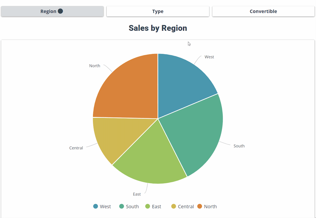
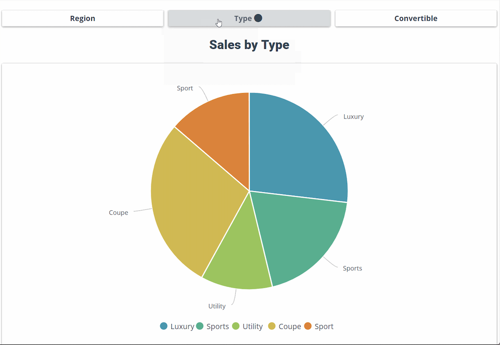
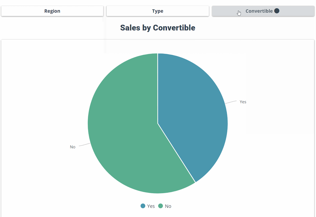
Before the button group widget was introduced, many end users relied on visual widgets for on-click functionalities (e.g. bar chart) to pass values to other widgets for filtering or to incorporate conditional with visibility. With the button group widget, users can now create a set of buttons and assign on-click functionality with more ease than before.
The example below demonstrates the button group widget changing the visibility of certain charts (that contain different metrics) with the simple click:
#4 Filter Panel
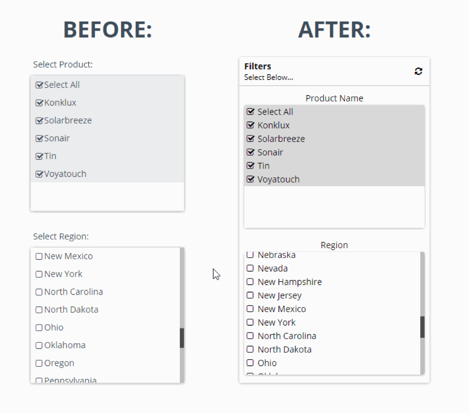
Traditionally, end-users would use a list widget to filter other list widgets. However, end-users were forced to create a filtering hierarchy, where the selected values in the top-level list would filter all lists below it. The constraint with this traditional method is that the lower-level lists could not filter preceding lists in what we call; one-directional filtering. To address this constraint, ClicData now has the filter panel widget; a widget that incorporates multiple interdependent lists in order to make filtering omni-directional.
The provided example demonstrates our traditional method vs the new Filter Panel. You will notice the traditional setup does not allow for the product list (top-level) to be filtered by the region list (bottom-level), where this is made possible with the filter panel:
#3 – Column chart with target bands
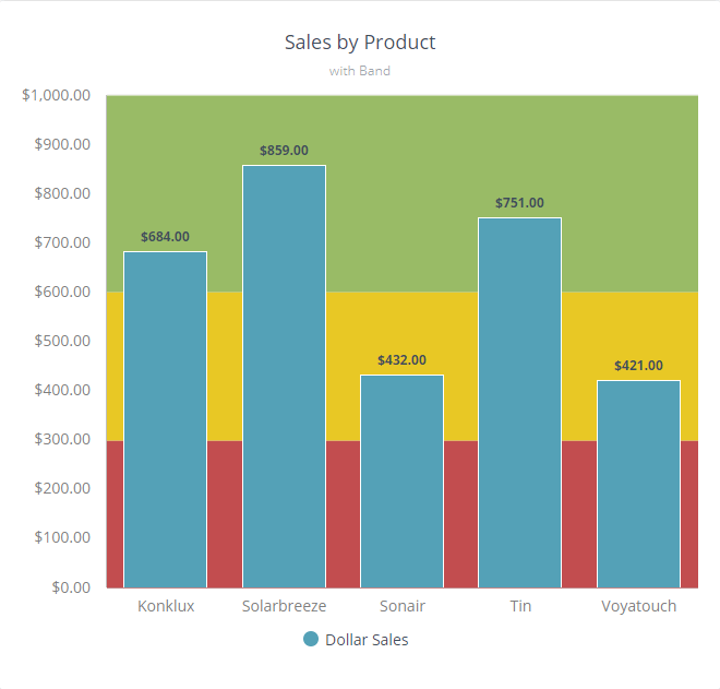
Looking to implement a threshold line or a range on your dashboard? Now you can achieve this on your visual charts using our lines & bands feature —found in the format tab. Previously, users would achieve this by developing complex formulas in the form of calculated columns, whereas now this logic can easily be implemented using our interface. If utilized appropriately, the lines & bands feature is a great cosmetic feature, giving end-users a general idea of how the business is performing at a first glance. Attached is an example of a column chart which shows total dollar sales per product, where the lines & bands feature was used to categorize each product’s sales performance (i.e. low, medium, high as red, yellow, and green respectively):
#2 Drill down table with conditional formatting & contextual columns sorting
In a rush? Looking to obtain business insights ASAP? With our conditional formatting feature —found in the format tab of each widget— in addition to contextual column sorting —found in sort & filter tab—, you can dynamically assign a color and order to each cell based on logic. By incorporating these two features simultaneously, you will be able to fetch a quicker (yet richer) idea on how your business is performing, whether it be sales performances, business costs, etc.
To illustrate the benefits of this feature, the example below consists of a raw material distributor where its sales performances are broken down by country then by product:
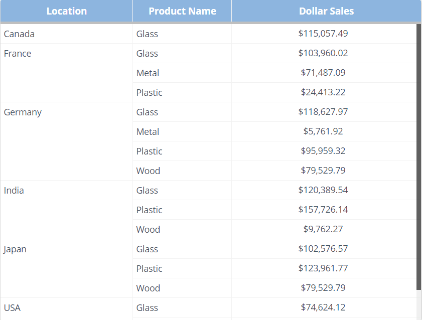
While the sales insights you are looking for is available, chances are you will have a hard time digesting key insights from the table above, as opposed to a table with conditional formatting and contextual column sorting as seen below:
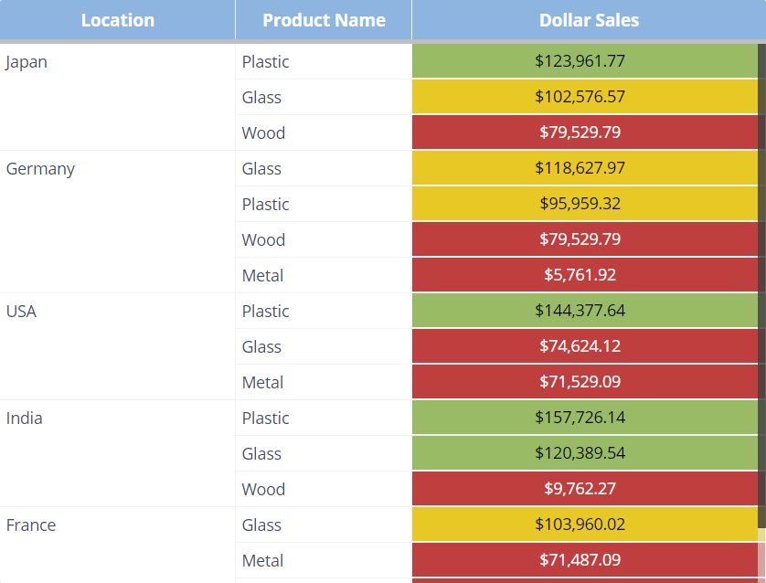
In the above case, we use conditional formatting in a Drilldown Table where it is categorized into 3 categories:
- Red -> Poor (0 – 79K)
- Yellow -> Average (80K – 119K)
- Green -> Good (120K+)
Then immediately follow this up with contextual column sorting (in descending order).
Upon first glance, you would notice that Plastic is outperforming other materials by dollar sales, in countries such as Japan, the USA, and India.
#1 Custom region map
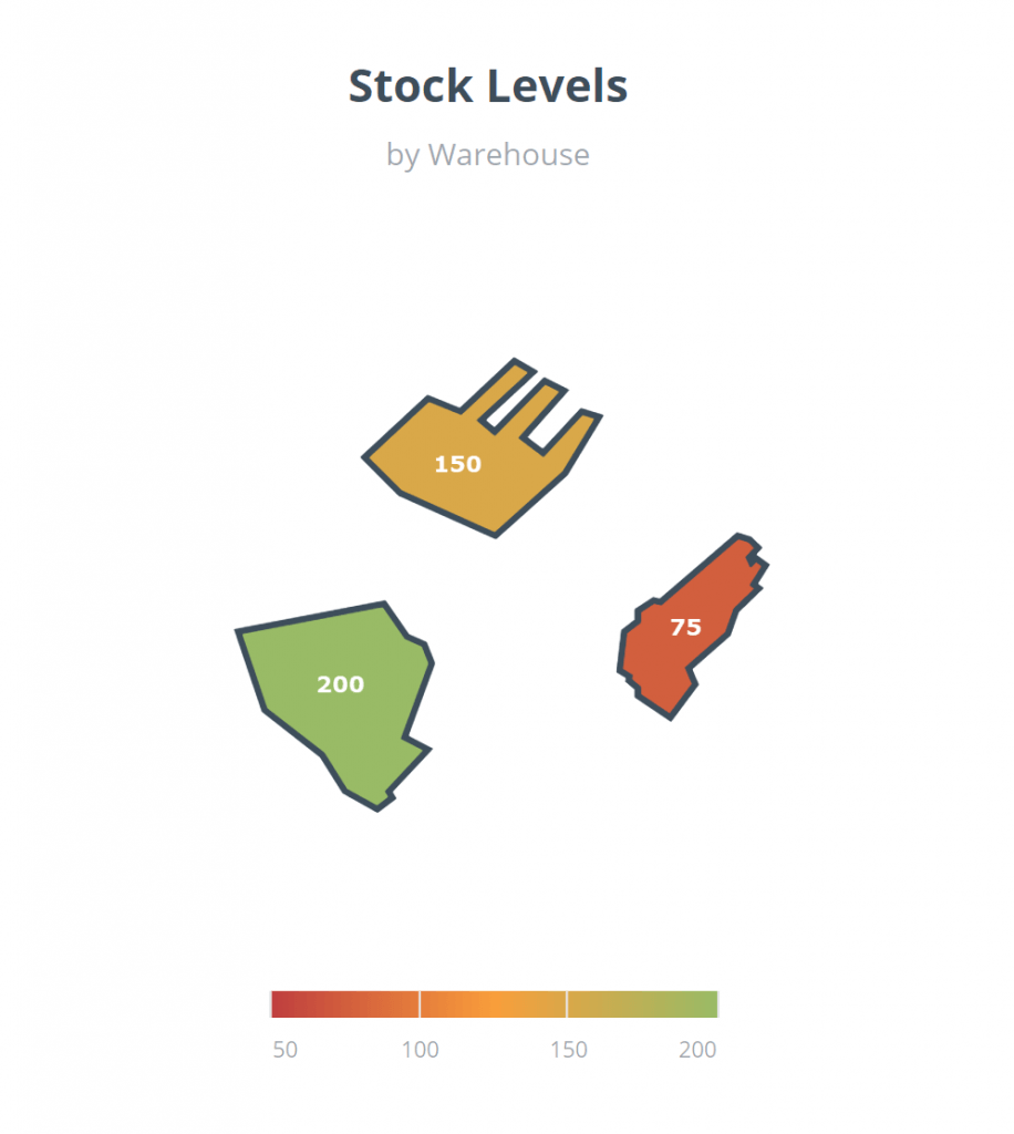
A previous constraint with our region map was that users could only visualize geographical data using our preloaded maps (i.e. Countries and Continents). As many users looked to have visualizations beyond these maps, we have implemented the ability to upload custom region maps, where users can draw their own objects and plot data accordingly. For example, say a business owner owns storage spaces in which they would like to keep track of unused storage space —custom map visualized using https://geojson.io. With this drafted map, we can export it —as a .kml file— then upload it on the region map’s properties.
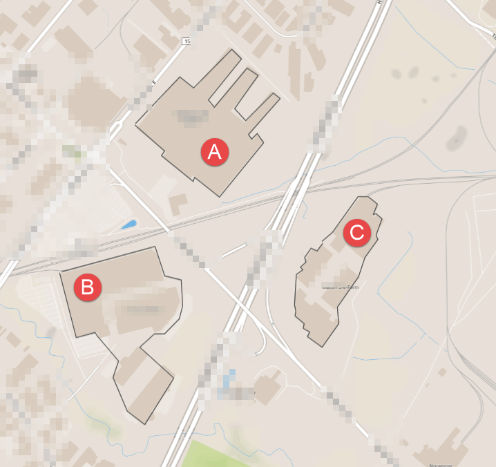
Once the map has been imported, we plot our storage data to find out that location B has the most space with 200 units available, location A follows with 150 units, lastly location C with 75 units. Furthermore, conditional formatting was implemented in order to give these key insights at a first glance —like Feature #2.
And many, many more!
These are the top 5 features that our customers enjoy using to build their dashboards. But we released many, many more features to enhance your business reporting. We also focused on data processing and transformation, new connectors, user and folder management, mobile dashboards, and data visualization widgets.
You can also find our Product Roadmap for 2020 on our website. We already have a lot of exciting and innovative features planned for next year. Trust me, you can’t wait to see our new data transformation feature! #ExcitedMuch
Read also: The future of Business Intelligence and ClicData in 2019-2020
What?! Don’t have an account yet?
That’s an easy fix! You can signup now for a free trial and get access to all our features for 14 days. If you have any feedback, suggestions –or kudos!– please let us know.
