As more and more businesses become data-centric, so have their communication style. Businesses have embraced data, yet there is so much of it, flowing in at such a fast pace, that it’s extremely hard to digest without intuitive pictures, charts and call-outs. This onslaught of data has transformed visualization tools from a nice-to-have, to a must-have tool for managers. After all, complex KPIs and endless rows of numbers are usually understood far easier in a visual format (infographics didn’t gain in popularity for no reason!).
So, where do you start? And how do you know which visualizations to go with? Read on to see the top data visualization types that business people prefer.
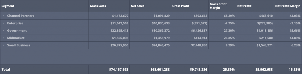
1. Pivot tables
Pivot tables are a fast way to summarize large amounts of data. Considered one of the entry-level “advanced” data skillsets for Excel users, pivot tables are just a lightning-fast way to grasp quick takeaways from vast amounts of data. Viewers can sort the data however they choose by focusing on specific values and data elements. Business intelligence dashboards deliver the fast, intuitive nature of pivot tables to you, without the hassle of creating charts from scratch each and every time. Pivot tables are ideal to aggregate numbers using categories, sometimes nested categories, allowing for a drill-down into smaller and smaller categories.
2. Gauges
Gauges are a quick way to grasp the context and actionable insights in just a few seconds. Just like the gas gauge on your car, dashboard gauges can be crafted to let you know when certain metrics are performing well or poorly. Gauges typically come with a range of colors in the background from a positive color to a negative color or vice versa depending on if a higher number is a positive indicator or not. An alternate to a gauge is a single numeric indicator simply stating a percentage or a value.

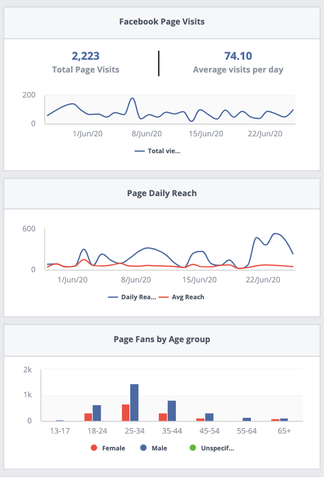
3. Bar charts and line graphs
Bar charts are business folks’ go-to for comparing. From year over year numbers to how certain categories of products are outselling the rest; bar charts offer a powerful visual to allow comparison data to come to life. Additionally, line graphs are the gateway to understanding trends and “seeing” growth and change over time.
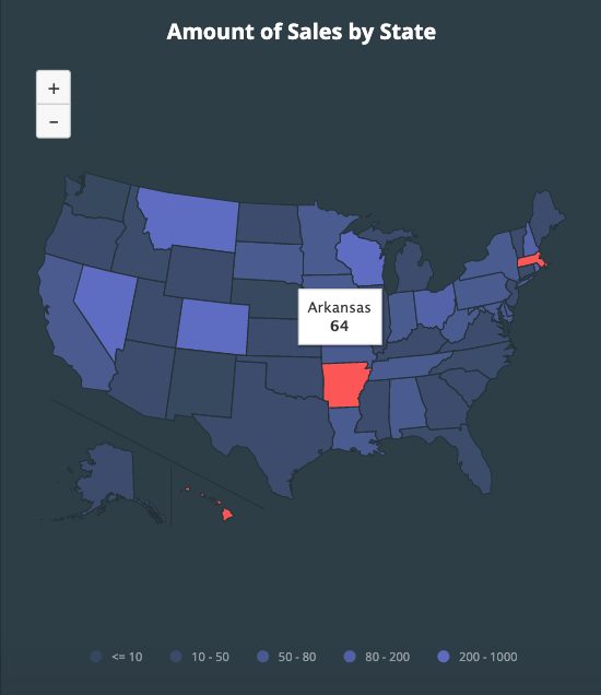
4. Maps
Maps are great to visualize data across regions, geographical (world, national, regional, city) or perhaps points of sales or store areas. Typically they are color-coded to indicate a positive or negative value.
In addition to the above visual elements, business users expect better interaction with their data. These visuals tell a story in such a way that words (or those pesky Excel pivot tables) never could. Interactive visuals invite viewers in and engage them. They invite conversation. Static visuals such as infographics pack a heck of a lot of data into a compact visual, with plenty of room for creative expression but are potentially more simplistic.
Data storytelling will change the way you do business.
While data visualization may seem frivolous to some—and amazing to others—you have to consider the long-term use of your data. If you’re collecting data to make informed business decisions and to get critical messages across to your employees and customers, then data visualization is a worthy investment. The idea of taking massive data sets and creating an “Ah-ha!” moment that stems from a visual is brilliant; using visuals to enact change and drive business transformation is even better.