We treat dashboards as the ultimate source of objective truth. When a leadership team sits down for a quarterly review, the charts projected on the screen aren’t just viewed; they are implicitly trusted. However, the uncomfortable reality of data visualization is this: dashboards are not neutral. Instead, they actively influence perception, shape narratives, and dictate action.
A dashboard is essentially a visual argument, but when that argument is poorly constructed, such as when dashboard design flaws creep into the reporting layer, it results in fundamentally flawed business decisions.
Small visualization mistakes can create massive organizational risks because dashboards shape how performance is interpreted. When color, scale, or context are poorly handled, the same underlying data can signal urgency where none exists, obscure emerging problems, or make weak performance appear stronger than it is. In the world of business intelligence dashboards, clarity is a financial necessity.
This article explores the psychology behind data interpretation, explaining exactly why misreads happen, not just how to fix them
The Hidden Costs of Dashboard Misreads
When we talk about bad data, we often focus on the pipeline: broken integrations, missing values, or duplicate records. But what happens when the underlying data is perfectly accurate, yet the visualization of that data is flawed?
Inadvertently, executives may blindly trust the visual, allowing it to influence decisions even if the visualization fails to show the full picture. .
According to research by Gartner, poor data quality and interpretation cost organizations an average of $12.9 million annually. Other industry evaluations on data management suggest that poor data interpretation and the resulting flawed strategies can cost companies anywhere from 15% to 25% of their potential revenue.
Why Misreads Happen: The Role of Cognitive Load
Misreads rarely happen because executives don’t understand their business. They happen because of cognitive overload.
In psychology, “cognitive load” refers to the amount of working memory resources used to process information. When looking at a dashboard, a user experiences two types of load:
- Germane Load: The mental effort required to understand the actual business insights, and how much the audience already knows on a particular topic.
- Extraneous Load: The mental effort required to just decode the interface.
When a dashboard is cluttered, poorly labeled, or visually inconsistent, the extraneous load skyrockets. The brain becomes exhausted trying to decipher how to read the chart, so it lacks the bandwidth to understand what the chart is actually saying. As recent studies on BI dashboard design have shown, this visual clutter leads directly to decision fatigue, increased processing time, and a significantly heightened probability of costly misinterpretation.
The Real Business Risks
When visual analytics are designed without regard for cognitive load, the business impact is severe:
- Distorted Decision-Making: Leaders may misjudge performance or misprice offerings based on optical illusions created by poor charting.
- Erosion of Executive Confidence: When stakeholders notice that a chart is misleading, even accidentally, they begin to question all the data. Lengthy meetings are suddenly derailed by arguments over “whose numbers are right” when clear visualizations of where the data came from are missing.
- Operational Inefficiencies: Analysts spend hours fielding questions and manually re-explaining data that should have been instantly clear.
To mitigate these risks, data teams must approach dashboard design through the lens of human psychology. So where’s the best place to start? One of the most visual elements: color.
Color: The Good, The Bad, and The Confusing
According to MIT research, neuroscientists have shown that the human brain can process an entire image in just thirteen milliseconds. Before an executive has even read the title of your chart, their brain has already processed its colors and assigned emotional meaning to them.
Because of this deeply ingrained psychological response, inconsistent or thoughtless color usage is one of the fastest ways to create confusion and misinterpretation.
How Inconsistent Color Creates Confusion
Imagine a dashboard where the marketing team uses green to represent “Organic Traffic” and blue for “Paid Traffic.” But on the very next tab, the sales team uses green to represent “Closed Won” deals and blue for “Lost” deals. The user’s brain subconsciously carries the meaning of green (“Organic/Good”) into the next tab, creating immediate cognitive friction when the rules suddenly change.
Furthermore, we are culturally conditioned to associate specific colors with specific actions. Red means stop, danger, or loss. Green means go, safe, or profit.
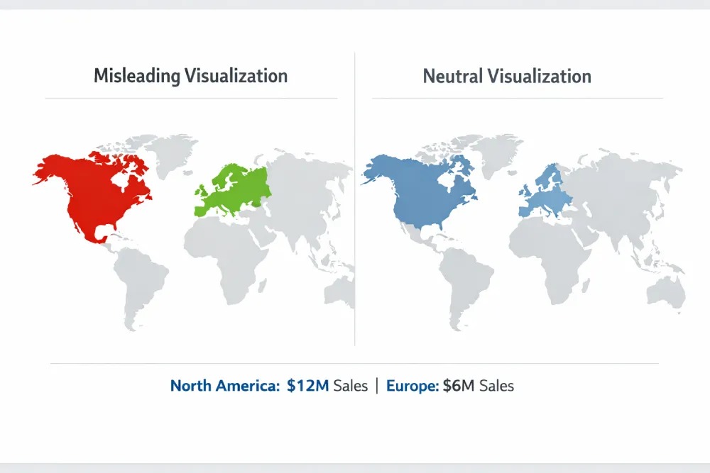
The Danger of “False Urgency”
One of the most common misleading charts is one that utilizes a highly saturated color palette for categorical data. For example, if you are showing sales by region, and you randomly assign bright red to North America and bright green to Europe, the viewer will instinctively assume North America is in trouble, and Europe is thriving, even if North America has double the sales. This is called “false urgency,” and it forces the user to actively fight their own psychological instincts to understand the data.
Best Practices for Color in Dashboard Design
- Define Meaning and Stick to It: If a specific hex code of blue means “Current Year Revenue” in one chart, it must mean “Current Year Revenue” across the entire reporting suite.
- Use Intensity for Value, Not Category: Use sequential color palettes (light blue to dark blue) to show numerical intensity (like a heat map). Reserve distinct, contrasting colors only for distinct categories.
- Design for Accessibility: Approximately 8% of men and 0.5% of women have some form of color vision deficiency, like color blindness. Relying purely on a red/green contrast to indicate good/bad performance will render your dashboard completely illegible to a portion of your audience. Always use secondary indicators, like directional arrows or varying brightness, alongside color.
The ClicData Advantage:
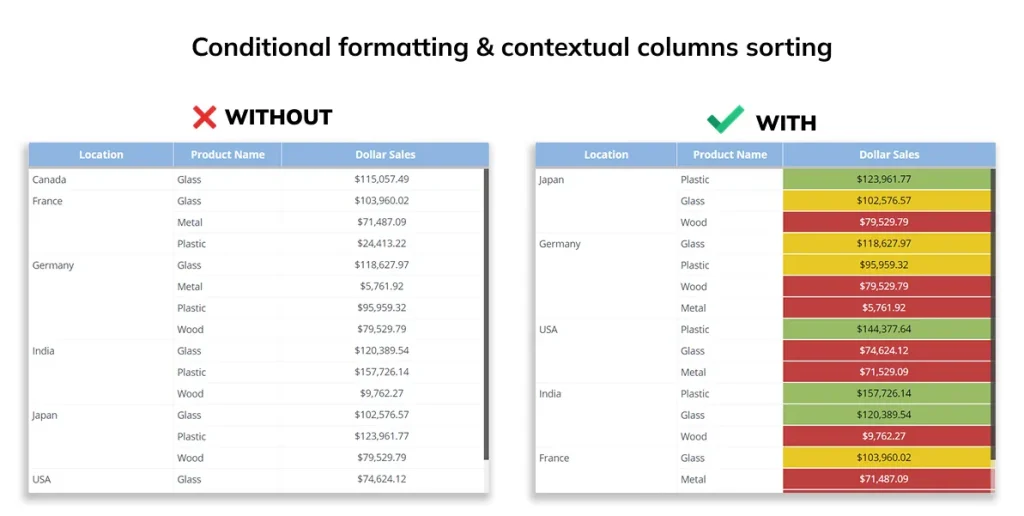
Many BI tools lock designers into rigid color defaults that can create confusion. With ClicData, you have the flexibility to define clear, consistent color standards across your dashboards.
You can apply custom, brand-aligned color palettes globally so that the same colors always represent the same metrics. Our conditional formatting also allows you to automate color changes based on real data thresholds—for example, turning a metric red only when it legitimately drops below a defined value. This helps eliminate manual color errors and reduces the risk of creating false urgency in your dashboards.
Scale: How Axis Manipulation Distorts Reality
If color influences the emotional response to a dashboard, scale dictates the perceived magnitude of the data. In data visualization, the visual size or physical space a data point occupies on a screen directly informs the viewer of its importance. When you manipulate the scale of a chart, you manipulate the viewer’s perception of reality.
How Scale Influences Perception
The human eye is incredibly adept at comparing lengths and distances. When we look at a bar chart, we expect the physical length of the bar to be directly proportional to the numerical value it represents. If Bar A is twice as long as Bar B, we assume the value of A is double the value of B. However, poor choices in scaling can completely break this proportional trust, leading to severe data interpretation errors.
Red Flags: Truncated and Dual Axes
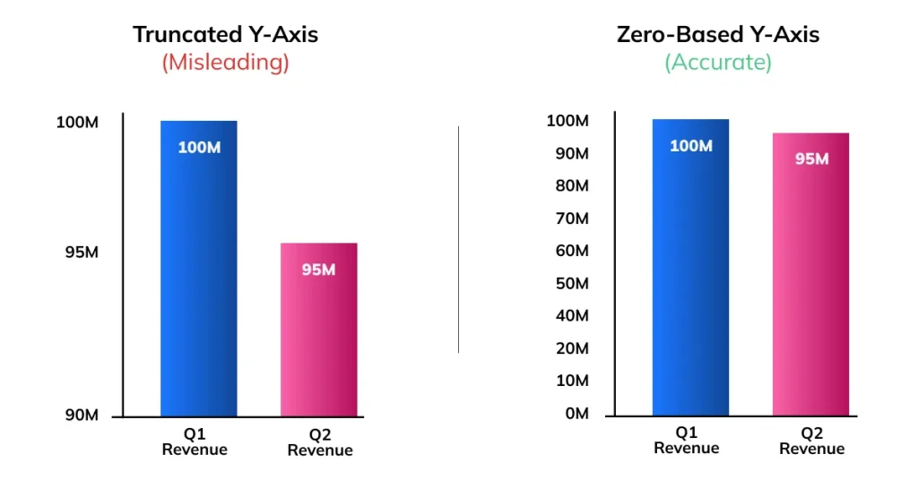
1. The Truncated Y-Axis: This is perhaps the most notorious culprit in misleading charts. If a company’s revenue drops from $100 million to $95 million, that is a 5% decrease. However, if the dashboard designer truncates the Y-axis to start at $90 million instead of $0, the $95 million bar will look half the size of the $100 million bar. To the executive glancing at the screen, a manageable 5% dip looks like a catastrophic 50% plummet. Panic ensues, and bad strategic pivots are made based on a visual lie.
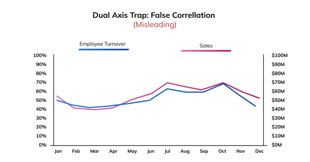
2. The Dual Axis Trap: Dual-axis charts (charts with two different Y-axes on the left and right sides) are easy to misuse and often misinterpreted. By playing with the scales of the two axes, a designer can make two completely uncorrelated metrics look like they are moving in together, falsely implying causation. For example, a company could plot “Employee Turnover Rate” on the left axis and “Global Sales” on the right. The axes can be scaled so the trend lines overlap, creating the illusion that sales correlate with turnover.
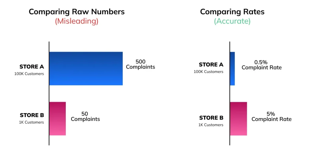
3. Lack of Normalization: Comparing absolute numbers when you should be comparing rates can distort interpretation. For example, a chart showing that “Store A had 500 complaints and Store B had 50 complaints” makes Store A appear far worse. However, if Store A served 100,000 customers and Store B served only 1,000, Store B actually has a much higher complaint rate. Without normalizing the data to a common scale (such as complaints per customer or percentage of total transactions), the comparison becomes misleading.
The ClicData Advantage:
Misleading scales often happen because analysts try to force complex data into a simple chart type that doesn’t fit. ClicData prevents this by offering over 60 specific visualization dashboards. Whether you need to display critical accounts payable KPIs, customer profiling and segmentation, or cash flow, ClicData provides the exact tools required to tell the truth visually.
Context: The Danger of the Standalone KPI
If color and scale dictate how we see the data, context dictates what the data actually means. One of the most dangerous things you can put on a business intelligence dashboard is a massive, standalone KPI metric that simply reads: “Revenue: $2.4 Million.” To an untrained eye, $2.4 million might look like a great number. On its own, this number is completely meaningless, as it fails to provide the context to determine whether it is good or bad.
Why Context is Essential
A number without context is just a raw fact; it is not an insight. Dashboards are meant to be decision-support tools, enabling an executive to know the trajectory of the business, not just its current location. Missing context forces the user to rely on their own memory or gut feeling to fill in the blanks, which introduces bias and drastically increases the risk of a misread.
Adding Value Through Comparison
To transform a static metric into an actionable insight, a dashboard must provide comparative context. This typically takes three forms:
- Time Comparisons: Showing year-over-year (YoY) or month-over-month (MoM) changes. Knowing that $2.4M is a 15% increase from last quarter changes the interpretation instantly.
- Benchmarks and Targets: Comparing actual performance against forecasted goals or industry benchmarks. Earning $2.4M is a failure if the board was promised $4M.
- Segmentation: Breaking down high-level KPIs into manageable segments. Context requires knowing where the $2.4M came from. Is one product line carrying the entire company while three others bleed cash?
The Challenge of Delivering Context
The reason many dashboards lack context isn’t that analysts don’t know it’s important. The challenge often lies in gathering context because it’s technically difficult. Typically, this requires joining current operational data with historical databases, external benchmark spreadsheets, and disparate CRM systems.
The ClicData Advantage:
This is where ClicData’s powerful backend truly separates it from superficial visualization tools. Through sophisticated Data Flows, ClicData allows data teams to seamlessly merge, cleanse, and transform multiple disparate datasets before they ever reach the visualization layer.
You can easily pull in historical data from a legacy system, join it with live CRM data, and calculate complex YoY benchmarks within the platform. By handling the heavy lifting of data modeling in the background, ClicData enables designers to effortlessly surface deep, rich context on the front end, giving executives the full story at a single glance.
Actionable Guidance: Designing for Clarity
Understanding the psychology of misreads is only the first step. That insight must translate into clear design standards that prioritize clarity. If your goal is to reduce cognitive load and build trust in your visual analytics, follow this actionable best practices checklist:
1. Embrace Whitespace
You do not need to cram as much information as possible into a single screen. Use ample whitespace (negative space) to separate distinct thoughts and give the viewer’s eyes a place to rest. If a chart doesn’t directly support the core business question of that specific dashboard tab, remove it.
2. Simplify Typography and Text
Avoid lengthy, jargon-filled, acronym-laden, or overly complex titles. Instead, aim for concise and straightforward titles, like questions or declarations, that are easy to understand. Orient your text horizontally; forcing users to tilt their heads to read vertical axis labels increases cognitive friction.
3. Limit the Number of Visuals per Screen
The human brain relies heavily on short-term working memory, which struggles to hold more than 7 pieces of information at once. If your dashboard has 15 different charts on a single screen, you are guaranteeing cognitive overload.
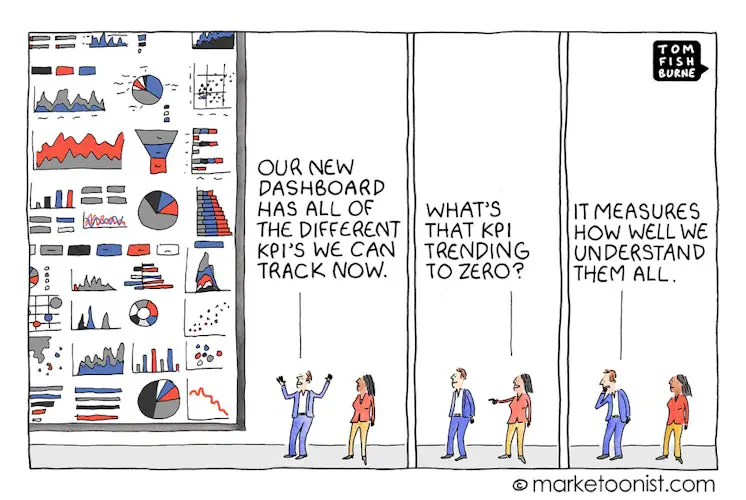
Suboptimal Dashboard Design

The ClicData Advantage:
Drilldown capabilities also allow executives to click a high-level KPI (like “Global Sales”) and seamlessly explore the supporting data (like “Sales by City”) only when they need it. This keeps the top-level view focused and easy to interpret while still providing the depth analysts require.
Conclusion: Dashboards as Decision-Support Tools
Visual design directly impacts business outcomes. When we treat dashboards simply as “reporting outputs,” we prioritize making them look impressive over making them effective. However, when we recognize that dashboards are decision-support tools, clarity becomes our ultimate metric of success.
By respecting the psychological power of color, maintaining mathematical integrity in your scale, and anchoring every metric in deep business context, you can prevent the costly misreads that derail strategies and drain revenue.
Ready to stop dashboard misreads and start driving confident decisions?
Book a ClicData demo or explore the platform on your own with a free trial today.