Franchise alignment breaks down not because people don’t understand the strategy, but because they can’t see how it connects to their own performance metrics.
That gap is the friction point most multi-location franchise organizations never solve. The franchisor optimizes for brand consistency and system-level growth. The franchisee optimizes for unit-level profitability, cash flow, and return on invested capital. Neither is wrong; they’re solving different optimization problems with different time horizons.
But when both sides work from different spreadsheets, different refresh cycles, and different definitions of “margin”, trust erodes.
Initiatives stall.
And the system drifts.
According to the International Franchise Association, franchising is projected to exceed $936.4 billion in output in 2025, with multi-unit operators controlling more than 50% of all franchised units in the U.S. The stakes are high, and so is the complexity.
This guide shows how a centralized franchise performance dashboard gives franchisors and franchisees a shared view of performance, so alignment stops being a compliance conversation and starts being a visibility-driven one.
Balancing Brand and Unit-Level Performance in Franchising
Before we talk about dashboards, we need to talk about priorities. Franchise systems bring together two stakeholders who look at performance differently—one focused on portfolio-level outcomes, the other on day-to-day operations and unit performance.
The franchisor portfolio
When you’re accountable for the performance of an entire franchise network, every decision has system-wide consequences. You’re not just looking for growth—you’re looking for signals that tell you whether the brand is executing consistently and scaling in a healthy way.
That creates a decision lens focused on a small set of system-level indicators:
- Brand consistency at scale: Customers expect the same experience everywhere, regardless of location.
- Same-store sales growth: A clear signal of whether the system is improving, not just adding units.
- Speed of execution: How quickly pricing changes, product updates, or new technology can be rolled out across the network.
- Pipeline health: Whether the franchise remains attractive and scalable for new developers.
- Royalty predictability: Stable, recurring revenue from fees.
The real risk at the franchisor level isn’t a single underperforming location—it’s losing visibility into where execution is breaking down until inconsistencies have already spread.
The franchisee operator
From the operator seat, the decision lens is different. You’re running a business day to day, often with your own capital and livelihood tied directly to the outcome. Performance isn’t theoretical—it shows up in staffing schedules, cash flow, and whether an initiative actually pays back.
That lens is shaped by unit-level realities:
- Unit-level profitability: Cash flow, margins, and take-home income.
- Return on invested capital: Whether an initiative pays back within the ownership horizon.
- Operational simplicity: Fewer systems, less complexity, and execution that works with limited staff.
- Local market realities: What works in one market may not work in another.
- Autonomy: The flexibility to make decisions that fit the realities of a specific location.
The underlying question isn’t whether change is necessary—it’s whether it will materially improve the business, and whether the impact will be visible soon enough to adjust.
The Franchise Visibility Gap Between Brand and Unit Performance
The challenge isn’t that franchisors and franchisees want different outcomes—it’s that they’re rarely looking at the same data when decisions are made.
That’s where systems start to break down. Franchisees hesitate to invest when initiative impact feels abstract or brand-level, while franchisors struggle to see how execution actually varies from one location to the next.
When corporate says “this new pricing strategy will improve margins,” the franchisee hears “this will cost me time and money—and may or may not help my business.” There’s no shared language, no shared dashboard, and no way to see whether the initiative actually moved unit-level economics.
That’s not a compliance problem.
That’s a visibility problem.
Without a shared view of performance, both sides are forced to make decisions based on partial signals. Franchisors see aggregate results but struggle to understand what’s actually happening at the location level. Franchisees feel the operational impact of initiatives but can’t easily see whether those changes are working relative to the rest of the system.
Consider a real scenario: a franchisor rolls out a new scheduling system designed to reduce labor costs by 2–3%. Six months later, adoption is uneven and feedback is mixed. Without unit-level visibility, corporate can’t tell whether low adoption reflects resistance—or whether the tool genuinely doesn’t work in certain market conditions. Franchisees, meanwhile, don’t have a clear way to see whether the change improved their own labor efficiency.
With a shared performance dashboard, that ambiguity disappears. Both sides can see which locations improved labor efficiency post-rollout, which didn’t, and where the variation comes from—shifting the conversation from whether the initiative worked to why it did or didn’t.
That’s the role a well-designed BI performance dashboard plays: not enforcing compliance, but creating the shared visibility needed to make better decisions at scale.
Why franchises need a performance dashboard
Multi-unit operators are shaping the future of franchising. According to FRANdata, the number of operators with more than 50 units has surged by 112% since 2019, and MUOs dominate a majority of units across major franchise segments, including QSR, beauty, and sit-down restaurants.
At that scale, multi-unit franchise operations can’t be managed by exception anymore. Leaders need centralized franchise reporting that surfaces the right questions early—before small issues turn into system-wide problems.
A centralized franchise performance dashboard—what we call a Multi-Location Performance & Profitability Command Center—gives franchisors and franchisees a shared, real-time view of performance across locations, including:
- Which locations are operationally strong and which are underperforming
- Whether locations are following pricing and staffing standards
- What drives franchise profitability at the unit level
- How to scale multi-location franchise systems without losing control
While the examples in this guide focus on restaurant franchises, the same franchise analytics and BI framework applies across verticals: fitness studios tracking membership retention and class utilization, hair salons monitoring chair revenue and rebooking rates, and home service franchises measuring job completion times and customer acquisition costs.
The metrics change; the need for franchise data visibility remains the same.
What a franchise performance dashboard needs to show
When everyone sees the same numbers, trust improves, decisions accelerate, and franchise scalability follows. But that only happens if the dashboard itself is designed to answer the right questions.
Let’s walk through what a franchise performance dashboard looks like in practice—not to showcase a “perfect” dashboard, but to highlight the questions an effective one needs to answer, and how the same data supports different decision-makers across the system.
he examples below are drawn from a demo dashboard built in ClicData for a fictional restaurant franchise, BiteCraft, with five locations in a single metropolitan area.
Let’s walk through what a franchise performance command center actually looks like in practice. The goal isn’t to show a perfect dashboard; it’s to show the questions an effective dashboard answers—and how the same data serves different users across the system.
The examples below are drawn from a demo dashboard built in ClicData for a fictional restaurant franchise, BiteCraft, with five locations in a single metropolitan area.

Global Filters: Zoom from Brand to Unit
The filter panel lets users move between date ranges, locations, and comparison modes (for example, this year vs. last year, or a location vs. the brand average).
Franchisors ask: Is the brand healthy?
Franchisees ask: Is my store healthy?
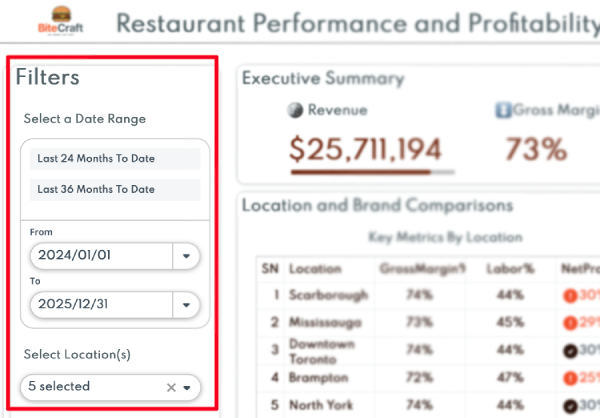
Same dashboard. Different questions—answered by different filters.
Pro Tip: Design filters so a regional manager can answer “How are my five stores performing compared to the brand average?” in one click. If they have to export to Excel, you’ve already lost the point of the dashboard.
Executive Summary: The Six Numbers That Matter
Looking at the performance dashboard example, the top strip contains the most important information: Is the franchise healthy and scalable?
| Metric | Value | Why It Matters |
| Total Revenue | $25,711,194 | Top-line health |
| Gross Margin | 73% | Operating efficiency before labor |
| Total Meals Served | 665,713 | Volume and demand signal |
| Average Order Value | $39 | Pricing power and upsell effectiveness |
| Labor Efficiency | 56% | Labor cost as % of revenue |
| Same-Store Sales Growth | 0.55% YoY | The best proxy for system momentum |
These aren’t just numbers, they’re early warning signals. A gross margin dip might signal supply chain issues. Same-store sales growth tells you whether the system is actually growing or just adding units.
Location benchmarking: where performance gaps live
| Location | Gross Margin % | Labor % | Net Profit % |
| Scarborough | 74% | 44% | 30% |
| Mississauga | 73% | 45% | 29% |
| Downtown Toronto | 74% | 44% | 30% |
| Brampton | 72% | 47% | 25% |
| North York | 74% | 44% | 30% |
Brampton is the outlier. Same gross margin as the others, but labor is 3 points higher, and that’s eating into net profit. Without this view, that gap might go unnoticed for months.
Variance analysis: deviations from brand average
Two charts compare each location to the brand average. Brampton’s revenue is nearly at the average (-0.14%), but profit variance is -12.54%. That’s a cost structure problem, not a demand problem.
This turns a vague concern (“Brampton is struggling”) into an actionable diagnosis (“Brampton has a labor cost issue we can address”).
Trends and Momentum: Spotting Performance Drift Early
Year-over-year trend charts show whether performance is improving or compressing:
- Revenue trend: +0.6% → stable
- Net profit %: -5.1% → margin compression
- Labor costs: +3.0% → the likely culprit
This is where the IFA’s findings hit home: 34% of franchisors report labor costs as their biggest challenge. If you’re not tracking labor at the location level on a monthly basis, you’re flying blind.
Pro Tip: Set alerts for when any location’s labor cost exceeds the brand average by more than two points for two consecutive months. Early intervention beats emergency triage.
Location Performance Score: A Composite View of Unit Health
A composite score rolls up margin, efficiency, and growth into a single number, indexed against brand targets, where 50% represents expected performance. The current system average of 36% signals room for improvement across the network—but more importantly, it gives individual operators a benchmark to track their own progress. A franchisee can say, “I was at 28% six months ago; now I’m at 34%,” without parsing five separate metrics. That’s motivating. That’s coachable.
Let’s map the dashboard back to the specific, real-world problems it’s designed to solve—on both sides of the franchise relationship.
How a Franchise Performance Dashboard Solves Common Pain Points
What matters here isn’t that the dashboard has more charts. It’s that the same data answers different questions, depending on who’s looking at it. For franchisors, it provides system-level oversight and early warning signals. For franchisees, it translates corporate initiatives into unit-level impact they can actually see.
The tables below show how a shared performance dashboard turns common franchise pain points into clear, actionable insights—without adding reporting burden or forcing one side to adopt the other’s lens.
For Franchisors
| Pain Point | How the Dashboard Solves It |
| Limited visibility across operations | A real-time, centralized view of performance across all locations |
| Inconsistent performance | Location-level benchmarking highlights gaps and outliers |
| No visibility into staffing efficiency | Revenue-per-employee and labor percentage metrics |
| Manual, time-consuming reporting | Automated daily refresh eliminates manual spreadsheet work |
| Initiatives don’t translate to unit-level ROI | Variance analysis links corporate initiatives to unit-level economics |
For Franchisees
| Pain Point | How the Dashboard Solves It |
| The benefits of initiatives feel abstract | Unit-level profitability metrics show actual financial impact |
| No way to benchmark against peers/competitors | Location comparison shows where performance stands relative to peers/competitors |
| Reporting is a time sink | Automated dashboards replace manual Excel exports |
| Corporate asks feel top-down | Shared data creates a common, objective language for discussion |
| Hard to justify investments | Data-backed evidence supports ROI decisions on new initiatives |
What Effective Franchise BI Looks Like in Practice
Here’s the pattern that works:
1. Start with the questions, not the data
Before you build anything, write down the five questions each stakeholder group asks most often.
Franchisor questions:
- Which locations are underperforming relative to potential?
- Are we executing initiatives consistently across the network?
- Where are margins compressing, and why?
Franchisee questions:
- How do I compare to my peers?
- Is this initiative actually helping my bottom line?
- Where should I focus my time this week?
Build your dashboard to answer those questions in fewer than three clicks.
2. One Definition Per Metric
The fastest way to destroy trust is to have “revenue” mean one thing in a franchisor report and another in a franchisee P&L. Define every metric once:
- Gross margin = (Revenue − COGS) / Revenue
- Labor % = Total labor cost / Revenue
- Same-store sales growth = (This period revenue − same period LY) / same period LY
Document these definitions. Make them accessible. And make sure the dashboard enforces them. If you want to go deeper on metric consistency, this guide on modular SQL shows how to structure queries so definitions never drift.
3. Refresh Frequently Enough to Act
Stale data is worse than no data at all. It creates false confidence. For franchise operations:
- Daily refresh for sales, labor, and inventory metrics
- Weekly rollups for P&L and margin analysis
- Monthly refreshes for performance scores and trend reports
Automated refresh means no one has to remember to pull a report. It’s just there—every morning, current.
4. Make It Accessible
Franchisees didn’t sign up to become data analysts. They signed up to run a business. That means:
- No pivot tables. No hidden filters.
- Clear labels. No abbreviations that require a decoder ring.
- Mobile-friendly views for operators who live in the store, not at a desk.
If a franchisee can’t understand the dashboard within 30 seconds, it won’t get used.
5. Connect Visibility to Action
A dashboard that just shows numbers is a reporting tool. A dashboard that drives decisions is a performance system. Build in:
- Thresholds and alerts: Labor cost exceeds 48%? Flag it.
- Drill-down paths: Click a lagging location to see what’s driving the gap.
- Action prompts: “Brampton’s labor is 3 points above average. Schedule a review.”
The goal isn’t to produce charts. The goal is to produce decisions.
Scaling Franchise Operations Without Losing Control
The IFA projects 851,000 franchise establishments in the U.S. by 2025, up 2.5% from 2024. Growth is the goal—but growth without visibility creates chaos.
Here’s how a centralized dashboard supports scale:
- Confident expansion decisions: Before opening a new location, benchmark projected performance against similar existing stores. Instead of guessing, you’re extrapolating from data.
- Faster onboarding: New franchisees get a dashboard on day one. They see what “good” looks like and how peers are performing.
- Consistent rollouts: When you launch a new initiative—pricing changes, new products, or tech upgrades—you can track adoption and impact across every location in real time.
- Early warning systems: Underperformance shows up in the data before it shows up in complaints, allowing intervention with help instead of blame.
Common Mistakes to Avoid
Even well-intentioned dashboard projects fail when they ignore how franchisees actually work. These patterns kill adoption:
- Building for compliance instead of insight: If the dashboard feels like surveillance, franchisees disengage. Frame it as a tool to improve performance, not to catch mistakes.
- Too many metrics: More metrics ≠ more insight. Pick the six to eight that drive decisions and hide the rest behind a details view.
- Ignoring mobile: Franchisees are in the store, not at a desk. If it doesn’t work on a phone, it doesn’t work.
- No feedback loop: Give franchisees a way to flag data issues or request views. They know their business better than anyone.
- Set and forget: A dashboard isn’t a one-time project. Schedule quarterly reviews to ask, “Is this still answering the right questions?”
The Payoff: From Competing Narratives to Shared Truth
The real value of a franchise performance dashboard isn’t the charts. It’s the conversation it enables. When a franchisor says, “We need to address labor costs,” and the franchisee can see that their labor percentage is 47% versus a 44% brand average, the conversation shifts.
It’s no longer opinion versus opinion. It’s shared data driving shared decisions.
That visibility does three things:
- Builds trust: Franchisees stop feeling like corporate is working from hidden numbers.
- Accelerates decisions: Less time debating facts, more time solving problems.
- Enables scale: What works at five locations can work at five hundred when everyone sees the same picture.
Franchise alignment isn’t a compliance problem. It’s a visibility problem. Solve visibility, and alignment follows.
What to Do Next
Franchise systems don’t fall apart in boardrooms. They drift apart one location at a time—one misaligned initiative at a time, one “my numbers say something different” conversation at a time.
Franchisors who struggle with scale often say the same thing: the network looked healthy from the top, but unit-level issues were compounding underneath. By the time they surfaced, trust was already damaged.
And franchisees don’t resist investments because they’re difficult. They resist when they’re asked to fund initiatives that help the brand while hurting their P&L. Without shared data, every corporate ask feels like a leap of faith.
When both sides work from the same dashboard, the dynamic shifts.
Alignment stops being a compliance conversation and becomes a visibility one.
Franchisors spot drift early enough to coach instead of mandate.
Franchisees see exactly how initiatives hit their numbers—and push back with data, not frustration.
That shared view isn’t a nice-to-have anymore. It’s the infrastructure that lets franchise systems scale without eroding trust or losing control.
If you’re managing multiple locations and still reconciling performance across spreadsheets, book a 30-minute demo with the ClicData team. See what a centralized command center could look like for your operation—and whether it finally closes the visibility gap you’ve been working around