When customers first open an account with us on ClicData, they often ask us for example dashboards to help them get started. Our response is typically to point them to our Dashboard Examples & Templates page on our website and let them know they can easily use their own data with them if they want to.
But some customers actually need to build their dashboards from scratch to include specific KPIs, so our Dashboard Ninjas offered to put together this guide to help our readers and customers so they can quickly get valuable data at their fingertips and to make smarter business decisions.
You should follow a strategic dashboard design approach to create an intuitive, usable, and useful user interface.
Establish the Business Goals to Achieve with the Dashboard
The core purpose of a dashboard is to establish a relationship between users’ needs and what you intend to achieve with the dashboard.
You need to understand that all data available is not equally valuable in the analysis process. Then, consider data sets and metrics that will address the goals you want to monitor or achieve with your dashboard.
The best place to start when designing a dashboard is to ask yourself questions about the purpose you intend for it along with questions about how to keep your users engaged so they get the most benefit from it. You need a clear understanding of what you want to achieve with the dashboard to make it easier to select your KPIs.
Some questions you’ll need to answer include:
- What questions do you want to answer with your dashboard ?
- What metric do you want to measure?
- Who’ll measure the metric you choose?
- After how long will you measure the metric?
Simplify the Dashboard
The whole purpose of your dashboard is to quickly and easily provide a clear understanding of the performance of key aspects of your business. The best dashboards are ones that look simple enough yet they drive the focus of their users to the most important indicators.
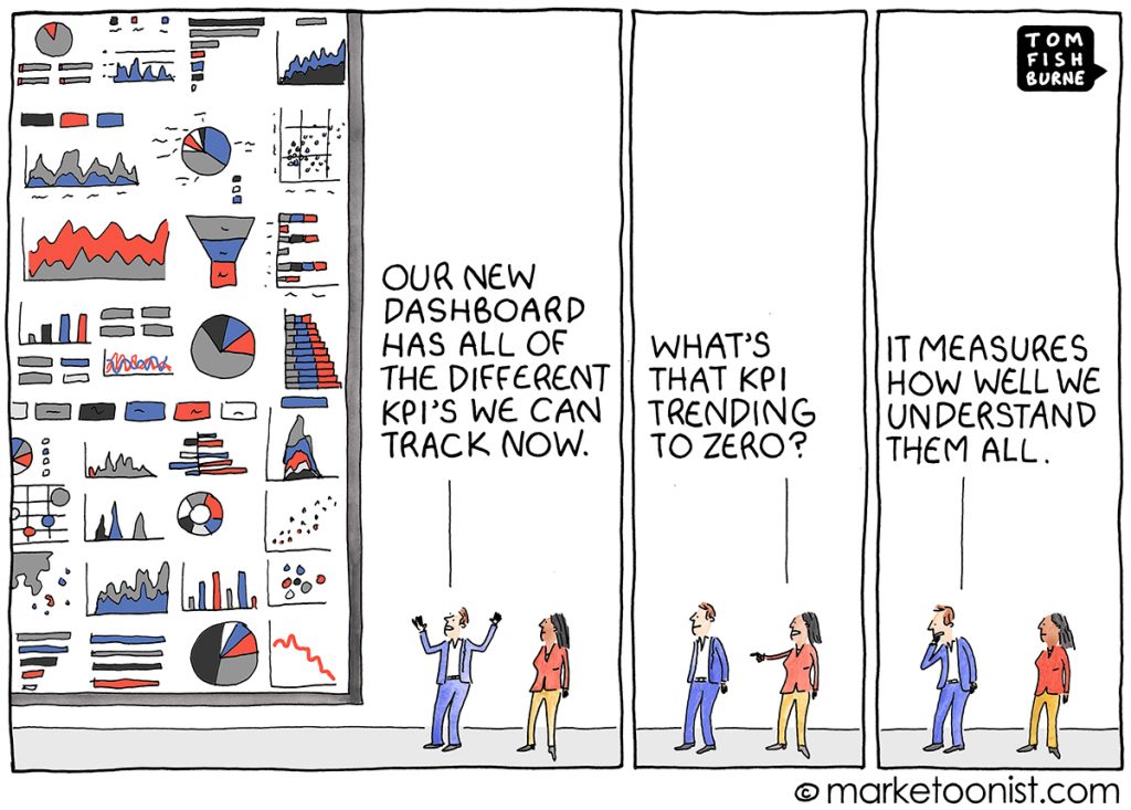
As you build your dashboard, it’s just too easy to fall into thinking that “more is better” or to get lost in indicators, data relationships, numbers, and more. The Marketoonist illustrated the “KPI Overload” perfectly in this short cartoon:

One of the best practices a dashboard designer can focus on is simplicity. The frames, backgrounds, gridlines, effects — all these options are critical sometimes, but only when there is a reason to use them.
Pay attention to labels, font size and color, and legend. No feature should hide your charts.
Avoid wasting space with useless decorations such as unnecessary pictures.
You can use shadows to highlight areas of the dashboard to give more depth. However, keep it simple by not overshadowing but only applying it when necessary.
While the designing work should be a thorough process, the end-users should see a simple dashboard highlighting the main points.
You should understand that the human brain only processes four types of information at a time. Overcrowding your dashboard with everything — gauges, charts, numbers, and more — overwhelms users and goes against dashboards’ purpose.
ClicData recommends: To keep your dashboards crystal clear, don’t include more than 10 KPIs per dashboard!
Consider Your Audience
The best dashboard design should offer a complete picture of data behind your dashboard and prioritize information depending on what users need to see. The metrics you display on your dashboard should combine to deliver a holistic story to the user.
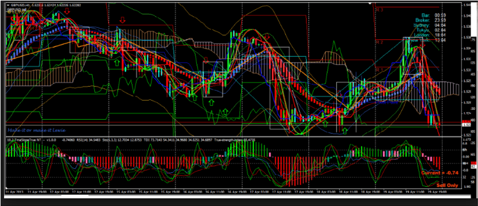
For example, no one would expect you to understand this graph at first glance:

To appeal to the users’ brains, you can include some story-like features in your dashboards to:
- Ensure that users are familiar with your KPIs and check for weak or too complex data representation
- Concentrate on your data’s critical elements and themes to help your audience comprehend easily
- Use terms, metrics, KPIs glossary, labels, legends, and graphs that the users are familiar with to simplify the understanding
In some cases, you’ll have to use text to explain data and prevent users from misinterpreting data on your dashboard and making wrong decisions.
You’ll undoubtedly want to incorporate your brand’s color palette into your dashboard. Beyond that, it’s important to pay attention to all the colors you use in your charts and indicators.
When you choose colors, remember that certain colors don’t mean the same thing for everyone. They vary according to the region and cultural background of your audience. For example, red represents a danger in the Western part of the world, but it is used for wishing someone good luck in China.
Select Relevant Metrics
A great dashboard has your business’s relevant key performance indicators (KPIs). After establishing your goal and considering your end-users, it’s easier to select the best metrics to add to your dashboard design.
The metric you select will shape the direction of your dashboards as they’ll display visual insights depending on a specific business area.
Choose the Right Type of Chart
Select the right data visualization types. Choosing the wrong choice or a missing chart can destroy all your effort. Your first step to choosing the right chart type is understanding the nature of the information you want to display.
Charts and visualization for dashboards come in four categories depending on the intention of visualization. The visualization might intend to show:
- Relationship
- Comparison
- Distribution
- Composition
You need to understand the aim of the metric before choosing the type of chart. Let’s quickly highlight the most common types of charts and their core function.
- Line charts: excellent for displaying a pattern of change.
- Bar charts: great for quickly comparing items in the same category.
- Pie charts: aren’t excellent because of low precision — users have difficulty comparing the sizes of the pie slices.
- Gauge charts: are excellent visualization tools to provide context because they’re easy to interpret.
- Sparklines: have no lines, so users can’t note individual value — however, they’re excellent when you have a lot of metrics and only want to show trends.
- Bubble charts: aren’t fit for dashboards because they require a lot of mental work from their users, even when it comes to reading simple data in a context.
Depending on what you intend to communicate, select a chart that suits your goal.
Avoid Cluttering Your Dashboard
Dashboards shouldn’t be static pages with one event. For instance, users might need one high-level KPI dashboard to access a more in-depth dashboard with a one-click button.
ClicData allows you to integrate interaction between charts and let users dig deep into the depths of data insights. More importantly, ClicData has the white label feature to embed the dashboard into their internal portal. For such purposes, you can use:
Dynamic Dimensions
The dynamic interaction between charts lets users access more data without sacrificing space and clarity on the dashboard.
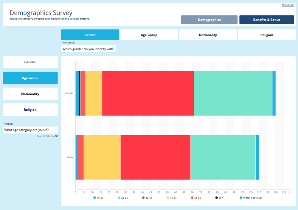
In the dashboard below, we set up dynamic interaction to display all the data from a survey in a single chart. It allows users to drill down into the data without having to display every combination on a separate chart on the dashboard.

Learn more on how to use the dynamic dimensions on ClicData
Linking Multiple Dashboards
it is sometimes very useful to build multiple dashboards and link them together in web-like navigation.
For instance, your marketing department might require a:
- Growth in revenue dashboard
- Gross profit dashboard
- Inventory turnover dashboard
- Average time for conversion dashboard
While every dashboard would be separate, you might want to link them to ease access during marketing updates.
Similarly, your employees might need over 10 KPIs. You might want to create different dashboards but link them to understand easily.
Embedding Dashboards in Applications or Websites
Most dashboards are built for internal users and are meant to be kept private and protected. But some customers desire to go public with their dashboard by embedding them into their customer portal or even their websites.
Our white label feature lets you embed dashboards without any mention of ClicData, making them fully yours!
Choose your format: TV screen, desktop, mobile, or tablet
In order to keep your dashboard users engaged with your reporting, they need easy access to the dashboard. In other words, you need to adapt the dashboard to the device they’re using.
Will your dashboard be displayed on the office TV screen for everyone to see? Will it be used on a computer during a weekly team update? Or do you want people to access it via their mobile during their commute? How people access your dashboards will determine the dashboard formats you choose.
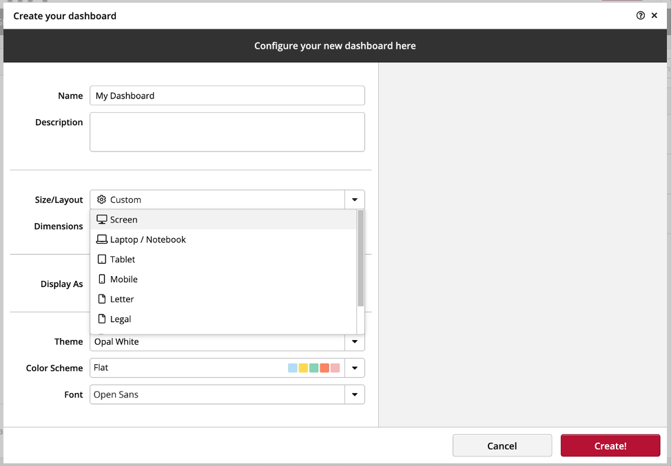
With ClicData, you choose your format during those first steps of creating your dashboard :

ClicData recommends: if you need to design a dashboard for multiple device sizes, use the mobile-first approach and build a canvas for wider screens.
Build Stunning Dashboards For Your Teams With ClicData Dashboard Designer
We’ve covered a lot of technical dashboard design details. Concluding with a quick checklist to help you design an intuitive dashboard. Here are the seven most important principles to remember:
- Your designing task starts by establishing the core purpose of your dashboard.
- For clarity purposes, simplify your dashboard design as much as possible.
- When evaluating your design, consider your end-users.
- Configuring your dashboard around the right metrics matters more than other aspects.
- Go easy on visualization charts — too many types create heavy mental work for end-users.
- Ensure the dashboard is clutter-free.
- Select the type of dashboard depending on the analytics purpose.
You are now well-informed about the fundamentals of dashboards. It’s time to put these tips into practice and build your first dashboards with ClicData!
