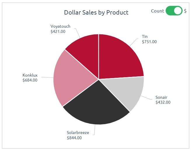
A pie chart is a circular graph divided into slices to represent numerical proportions. Each slice’s size corresponds to the value or percentage it contributes to the whole.
When to Use Pie Charts
- Show part-to-whole relationships
- Highlight one dominant category
- Represent static data with few components
Best Practices
- Use no more than 5–6 categories
- Label clearly or use legends if space is limited
- Don’t use for time trends or complex comparisons
Pie vs Donut Charts
Pie charts use a full circle, while donut charts leave a blank center. Donuts provide better label placement and often look cleaner in dashboards.
Pie Charts in ClicData
- Create standard or donut-style charts
- Control slice order, color, and tooltips
- Combine with slicers to compare subgroups dynamically
Pie Chart FAQ
When is it better to use a pie chart instead of a bar chart?
Use a pie chart when your goal is to emphasize proportions within a single category and highlight which component dominates the whole. If you’re comparing values across different categories or need precision, bar charts are clearer and more accurate.
Why are pie charts often criticized in data visualization?
Pie charts can be misleading when there are too many slices, when slices are similar in size, or when exact values matter. Our eyes aren’t great at judging angles, so comparisons become harder as the chart gets crowded. Use them sparingly and only when the message is obvious.
How many categories is too many for a pie chart?
More than 5 or 6 slices usually reduces clarity. If you have more categories, consider grouping small ones under “Other,” or switch to a bar chart. Overloaded pies dilute the visual impact and confuse the viewer.
Can pie charts display changes over time?
Not effectively. Pie charts represent a static snapshot. To show how parts of a whole evolve over time, use stacked area charts, bar charts, or small multiples. Repeating pie charts for each time point tends to clutter rather than clarify.
How do I handle small values in a pie chart without losing visibility?
Small slices can become nearly invisible or unreadable, especially if their values are close to zero. To improve readability, group minor categories into an “Other” slice, or use data labels instead of relying on visual size alone. If multiple small values are important, a bar chart may better preserve the details.

