Dear Users,
This week we have updated ClicData to its latest release, v3.13!
So what does the latest iteration of your favorite dashboard application has to offer?
New Pivot Table & Trend Lines
ClicData has a brand new, fully customizable, pivot table to help you sort your data! It also includes a lot of cool features such as a heat map, display of totals and subtotals, full color customization and much more!
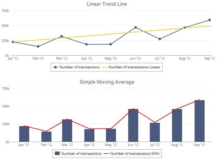
As an add-on to your current charts, you can now add trend-line such as moving average, linear trend, histogram and many others.
New Widget Maps – GPS Location
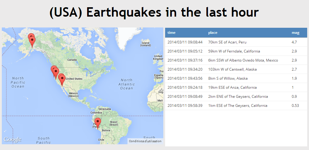
Let say you need to track multiple items on a map, in real-time or not, and you want it to be done with the ease of use of Google Maps…
Well, now you can do so in ClicData with our new map widget! A good example is worth a thousand words so just click on this dashboard below, fed with live data from the US government… and imagine you could do the same with… the position of your client deliveries for examples, pretty cool right?
New Connector: Smartsheet
Smartsheet users, you can now use our brand new connector to get your data directly from Smartsheet to your ClicData dashboards! You will be able to build analytics over your smartsheet projects.
And for those who don’t know, Smartsheet is an online project management and team collaboration SaaS application which is pretty similar to spreadsheets and that includes built-in cloud-capabilities for sharing, adding attachments, integration with file storage services and Gantt charts.
Log into your ClicData account right now to try out those exciting new features!
Happy Dashboarding!