If a picture is worth a thousand words then how many images are needed to represent 2.5 quintillion bytes? That’s the number of bytes of data that IBM estimates is created around the planet every day.
Short answer? A whole bunch.
Data can tell a varied and complicated story as it reports on historical progress and performance or predicts trends and outcomes. And with all that data, it’s difficult to get the most relevant results across to busy C-level execs who don’t have the time bandwidth to read through information-dense reports.
That’s where graphical communication and data visualization come in to present findings, trends, performance metrics, analysis and more to anyone in the enterprise — from decision-makers to department leaders, to stakeholders. The beauty of data visualization is that you can harness the data and make an impact with it much more quickly, more succinctly and more effectively than without it. Studies show that a good percentage of people are more responsive to visual information than plain text. Data visualization that includes infographics, simple imagery, and creative charts helps you summarize your data and engage your reader.
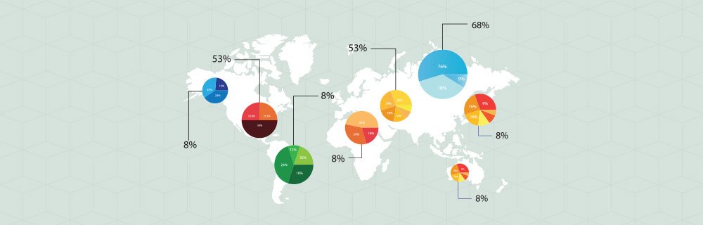
Infographics represent data in a graphic format to make the data easily understandable at a glance. They can improve comprehension since the visual treatment enhances your viewer’s ability to see at a glance the patterns and trends that matter most. You can highlight key points from your research with infographics in entertaining or interesting ways.
Infographics give your audience a quick peek at the upshot of the story, and often increases the perceived value of the presented data. In other words, don’t be surprised if your manager wants to learn more or see more detail about the information you’re providing.
Creative Charts improve your audience’s command of the data by making it easier to grasp the relationship between data sets. Imagery of any kind engages the right hemisphere of the brain, which can immediately absorb the metrics of relativity between things. It’s the part of the brain that recognizes instantaneously that if the bar on the left is taller than the one on the right, it is representing ‘more’ of whatever is being measured. However, it’s always important that the variables, elements and values in charts are clearly labeled and results are confirmed with written text.
Finally, simple imagery can be used within reports of almost any length to break up the monotony, add personality, or provide a visual reference point.