Hotter than hotcakes, the biggest buzz-phrase for the decade may just be Key Performance Indicators or KPIs. That’s because empowered by the quickening pace of digital marketing and Big Data, business leaders are learning to sort through the tangle of KPI options and make a quantum leap in organizational efficiency and effectiveness.
KPIs: The Success Benchmarks
Above all else, key performance indicators (KPIs) are those business metrics used to evaluate and monitor the factors that are crucial to the success of an organization.
Ultimately, they help assess the progress towards strategic enterprise objectives, steering the ship straight when the seas are calm, or providing direction to tack right or left when the waters contain obstacles to circumvent. They also provide a quick view of operations and activities in time and over time. KPIs differ from one industry to the next, and from one organization to the next, but always provide custom-tailored insights for virtually any level of your enterprise.
Why KPIs Need Data Viz
Data has become such an abundant and indispensable resource within large enterprises anymore that we simply call it “Big Data.” As such, it can easily be overwhelming and difficult to analyze. That’s where data viz comes in.
Through metaphor and graphic elements, data viz transforms these significant metrics into an intuitive and richly-informative format that allows department heads, executives and stakeholders alike to quickly absorb the numbers, the impact and the relevance of the data they’re viewing.
A tremendous amount of nuance can be communicated with data visualization. Aligning the right graphic with the appropriate data, you can highlight the important reads of your data and help others focus on the story the numbers have to tell — the deltas, the comparisons, the successes, and failures. Ultimately, data viz offers a more efficient means to review returns and assess results of analysis than the tedious reporting of yesteryear.
Count in meaning
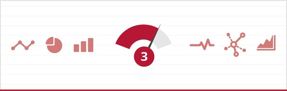
Having data visualization’s power to distill information in such an effective way at our fingertips, we still can’t let the bells and whistles of cute graphical images so tempt us to overlook the right function of the metaphors we use. Dashboards are designed to display a tremendous amount of information in a limited space— often, a single screen — and so that space needs to be used well. Stephen Few, founder of Perceptual Edge and author of Information Dashboard Design, reminds us that even the dashboard metaphor itself is a bit of a stretch.
After all, the dashboard of a car and an executive dashboard share the task of allowing you to monitor something but the metaphor breaks down if we take it too seriously. The cool factor will soon fade if you don’t have the depth of information you need to understand the returns you’re seeing in your gauges, pie charts and 3-D columns. Dashboards should be designed to display your data as clearly, accurately, meaningfully, usefully, and efficiently as possible. Gauges rarely do that.
ClicData offers an extensive and constantly expanding, a library of smart data visualization tools that are as easy to use as copy-and-paste. Discover the power of ClicData for your organization.