Dashboards remain one of the most powerful tools for aligning data with decision-making across modern organizations. According to the 2024 State of Business Intelligence report by Dresner Advisory Services, over 87% of organizations now use dashboards as their primary interface for analytics.
But good dashboards don’t just happen overnight.
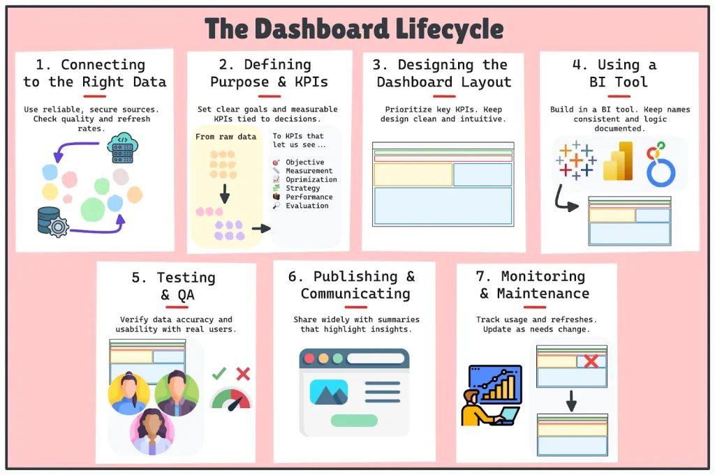
Dashboards have a lifecycle, consisting of multiple stages from connecting to the right data, defining purpose, building, testing, launching, and iterating.
This guide breaks down each stage of the journey, providing practical advice at every step, from raw data to insights ready for the boardroom.
Let’s dive in!
Why Dashboard Thinking Matters
Most people think of a dashboard as a set of beautiful charts. However, a dashboard is a decision support system.
It is there to clarify, not overwhelm.
It is there to align teams, not confuse them.
Dashboards when built in a rush, without purpose, solid data, or validation, usually fail quietly. Data gets misused and misinterpreted, stakeholders lose trust and confidence, and the next thing we know… the dashboard is sitting unused and collecting dust.
This is why lifecycle thinking matters. Each phase of the process allows an extra layer of reliability and relevance. When executed properly, the dashboard lifecycle helps to create assets that:
So let’s take a look at the basic stages of building a dashboard.
Stage 1: Connecting to the Right Data
Your dashboard is only as good as the data behind it. Before anything else, make sure you’ve connected to the right, reliable, and relevant sources.
This might seem straightforward, but it’s a foundational decision that shapes everything that follows. A poor data choice early on can ripple through every stage of the build.
This means that you should know exactly where your data lives, be it a database, an API, or a spreadsheet. Once you have located the data, there are a few things to consider:
- Is access secure and stable?
Make sure authentication is in place and avoid relying on local files that can vanish or change without warning.
- How often does the data refresh?
Understand the update cadence (hourly, daily, weekly), and whether it happens automatically or requires manual action.
- Is the dataset governed and documented?
When available, prioritize official, clean, and well-maintained data over one-off extracts or legacy reports.
- What’s the quality of the data?
Many companies store inconsistent, incomplete, or poorly formatted data that can’t even be used reliably. If the data isn’t clean or structured enough to extract meaningful insights, building a dashboard on top of it will only waste everyone’s time.
“Poor data quality is responsible for an average of $12.9 million in annual losses per organization.”
During this stage, understanding the principles of clean, secure, and governed data is important. This is why I encourage you to go check the Data Lifecycle Management guide, as it walks you through the complete journey of data and reinforces how crucial your data foundation is for reliable dashboards.
Pro Tip: Before building, run quick summaries (counts, null checks, date ranges) to spot issues early. A broken KPI later on usually starts with a messy field upstream.
Stage 2: Defining Purpose and KPIs
This is arguably the most important step, and the one most teams skip. Before you build anything, first ask:
What business decision is this dashboard trying to support or answer?
That means starting with conversations, not code.
Talk to your stakeholders. Understand their pain points.
Create a one-page dashboard brief that includes what you want to achieve with the dashboard, who the audience is, and the key questions the dashboard needs to answer.
KPIs should never be chosen based on what data you have. They should always be specific and measurable, and closely linked to the decisions the audience needs to make. It’s what makes the dashboard useful, rather than pretty.
Yet in a 2023 HBR study, only 29% of business leaders said their KPIs were linked to strategy, highlighting just how common (and costly) KPI misalignment is. So this is way more common than we think!
Pro Tip: If a KPI isn’t tied to a decision, it doesn’t belong. Every metric should answer a “so what?” question. If stakeholders can’t act on it, reconsider whether it’s necessary.
Stage 3: Designing the Dashboard Layout
Once we have a clear purpose for our report, it is time to consider the layout. Before you jump into your BI tool, sketch out where you want the information to flow.
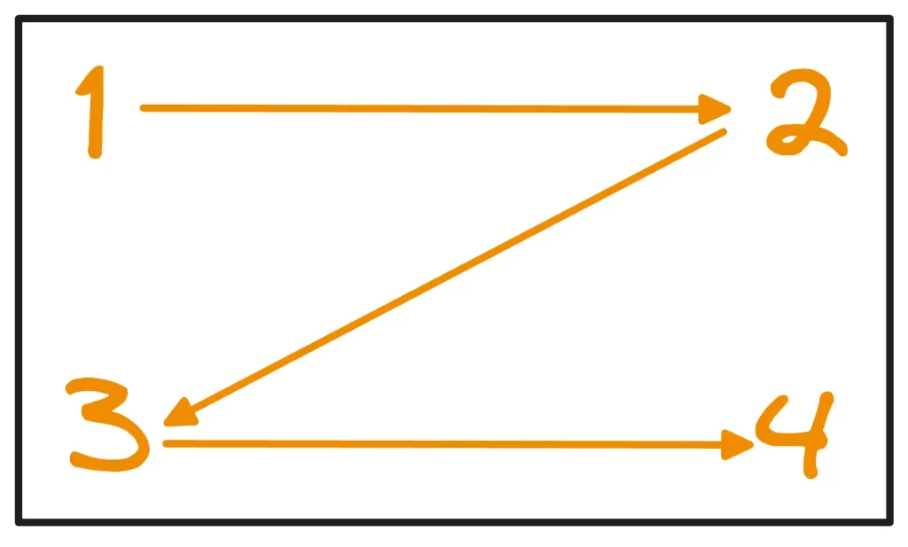
Start with your most important KPIs at the top. Our brains tend to scan dashboards in a “Z” pattern: Starting at the top-left, moving across to the top-right, then diagonally down to the bottom-left, and finishing at the bottom-right. Structuring your layout around this natural flow helps guide users’ attention where it matters most.
Another key principle is that a dashboard’s layout should follow a clear grid, providing structure and order. Elements should be positioned according to their importance, with the most critical information given prime placement. As a result, the most common dashboard structures are:
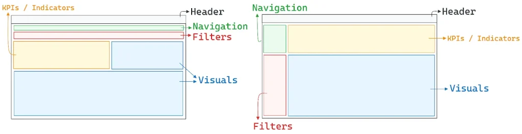
Once you’ve laid these out, you can show breakdowns, trends, and context. Each visual should have a single question to answer. Don’t add a pie chart because everyone else is!
Think about interaction.
Do users want to filter by date, region, or product?
Do you want users to be able to drill down on categories?
If so, we should add filters and drilldowns to allow our users to play and interact with our report.
Lastly, consider usability. You need to think about whether to include mobile access and accessibility. Make sure to use clean fonts, readable labels, and a consistent visual style for all of the charts!
Pro Tip: Design with the 5-second rule: Can someone get the main takeaway in five seconds? Use layout, whitespace, and visual hierarchy to guide attention; don’t make users hunt for meaning.
Stage 4: Building the Dashboard in a BI Tool
At this point, you are ready to start building out an actual dashboard using a tool such as ClicData, Power BI, Tableau, Looker, or Superset. Now it is time you connect to your data sources and wrangle those sources as necessary.
As you build out your dashboard, you will create calculated fields, date filters, conditional formatting, etc., to meet the previously documented logic described above.
As we just mentioned, good dashboards use modularity. Use common components where you can, stay consistent with naming conventions, and include documentation for any formulas or business logic that won’t be obvious as-is.
This stage is very much like writing code: be clean, be testable, and be easily interpretable for your fellow analysts.
Pro Tip: Instead of saying Measure 1, use a naming convention such as kpi_revenue_growth_qoq. Consistent and descriptive naming will make it a bit more time-efficient when debugging or collaborating with, or scaling to dozens of dashboards.
Stage 5: Testing and QA
Once the dashboard is complete, it is not yet finished.
You should start considering your dashboard as a product that your clients or users will be working with. This means it requires testing just like any other product would.
Testing starts with reviewing the numbers. Compare meaningful metrics with raw queries or Excel exports.
At this stage, it’s also worth doing a quick sanity check yourself to see if the numbers pass the “common sense” test. For example, if you’re building a sales dashboard and it shows more closed deals than deals created, or if a daily order count is far higher than what the business could realistically handle, then something is clearly off. These simple checks can catch obvious issues early and save a lot of back-and-forth with stakeholders.
Make sure that filters are working, and check visual features (axes, tooltips, labels) so they behave as expected, too.
Then, test with users. Ask real stakeholders who would use the dashboard to try it out and provide feedback. You will often find problems that were unexpected: missing metrics, unclear labels, or assumptions you made that the data should be interpreted differently.
The testing process is not just about finding bugs.
It is about creating trust.
Curious how to ensure your dashboard data is truly accurate?
The article Data Validity Explained provides a clear breakdown of what “valid data” really means, complete with examples.
Pro Tip: Run a sanity check: compare against another source (SQL query, Excel sheet, or stakeholder report). Even well-modeled dashboards have silent logic errors. Cross-validation produces trust.
Stage 6: Publishing and Communicating
The following step is the distribution. Just as we said previously, dashboards are like a product.
What happens when people do not know that a given product exists?
They will not be using it. Now it is time to let the world (or your team) know it exists.
Depending on the organization you work for, the dashboard might be embedded into an internal website or portal, emailed/printed and distributed as a report, or secured using BI software.
Make sure you’re careful with access permissions and user credentials, especially if the data within the dashboard can contain sensitive information.
A great dashboard doesn’t deliver a chart; it delivers a story. Always include a short executive summary or data digest to help remind viewers what to focus on, how the numbers were calculated, and what changed since the last refresh or update.
When sharing your dashboard in a team meeting or presentation, the focus for the audience will be the insight, not the chart. Share the insight with the users and then share the highlight and data to show how their insights were derived.
Want to see what a modern, end-to-end dashboard stack looks like in practice?
The blog post How ClicData Redefines the Modern Data Stack shows how ClicData unifies data ingestion, transformation, automation, and dashboarding into one streamlined flow—helping you avoid tool sprawl and speed up delivery.
Pro Tip: Use every dashboard launch/release date to summarize the changes in 2 sentences and an insight in 1 sentence. Doing so can be a key leverage for users adopting a new report, but it provides little insight as to what is different in the report.
Stage 7: Monitoring and Maintenance
Dashboards aren’t static. Over time, business needs shift, KPIs evolve, and data pipelines change. If your dashboard doesn’t evolve, it will fall out of use.
That’s why it’s important to build in a maintenance routine. Monitor whether the data is refreshing correctly. Track which filters or pages users are actually engaging with. Version your updates and keep a changelog when metrics are added or altered.
Set calendar reminders to check on each dashboard quarterly. Ask: Is it still answering the right questions? Is it still trusted? Is it still used?
The answers will tell you whether it needs to evolve, or be retired.
Pro Tip: If a dashboard hasn’t been viewed in 60+ days, ask why. Low usage might mean the questions it answers are outdated—or that people don’t know it exists. Both are solvable.
Common Mistakes to Avoid
Even experienced teams can fall into familiar traps when building dashboards. Here are some of the most common missteps:
- Skipping the discovery phase and assuming the goals
- Overloading the dashboard with too many visuals or colors
- Building on untrustworthy data without refresh logic
- Forgetting to test, leading to broken or misleading insights
- Launching dashboards without context or documentation
Each of these can be avoided by following the lifecycle model, and respecting each stage.
Dashboards Are Grown, Not Just Built
A superb dashboard doesn’t stop evolving when it goes live. It evolves as your organization evolves. It adapts to new questions, new users, and new business realities.
If you treat dashboarding as a linear project, you will reinvent the wheel each time. By thinking about dashboards in a lifecycle approach, each project becomes part of a long-term system of insight.
Use this guide as a prototype. Refer back to it every time you create a new dashboard. And remember: every great dashboard starts with a great question – and earns its relevance by helping answer it over and over again.
Looking to zoom out and connect your dashboard efforts to a larger strategy?
Don’t miss Building a Solid Data Strategy: A Practical Framework. It provides a broader lens on how people, processes, and technology need to align for long-term data success, including dashboards.