The wrong chart doesn’t just look bad, it changes what people believe the data says.
When a trend appears flat on a pie chart or a comparison gets buried in a dual-axis mess, stakeholders don’t just misread the numbers. They make the wrong call, ask the wrong questions, or stop trusting your dashboards altogether.
A 2024 BARC study found that 58% of companies base at least half of their business decisions on gut feel rather than data.
The problem isn’t always data quality.
Sometimes the chart just made the insight impossible to see.
This guide gives BI teams a practical framework for selecting charts that make the right answer obvious and the wrong answer hard. No design theory, no personal preference, just clear decision rules tied to the questions your data needs to answer.
Chart Choice Is a Decision Quality Problem
Chart selection looks cosmetic at first glance. Pick the one that looks nice, fits the space, feels familiar.
Right?
However, we should always keep in mind that the chart type is structural, not decorative.
What happens when you choose a chart? You control how stakeholders interpret trends. You determine whether they can accurately compare values. You decide if outliers will be visible. A bad choice reduces clarity and distorts perception in ways that affect decisions.
The Trust Tax of Inconsistent Visuals
Sales shows revenue trending up on a bar chart. Finance shows the same metric trending down on a line chart. The numbers might be identical, but the visual language creates confusion. Stakeholders start second-guessing everything.
According to Gartner, poor data quality costs organizations an average of $12.9 million annually. Some of these “data quality” issues are actually visualization quality issues, the data is fine, the chart made it unreadable.
Charts as Translation Layers
Your BI platform stores structured data. Stakeholders need answers to business questions. Charts translate between those two realities.
Accurate translation speeds up decisions. Garbled translation wastes time re-explaining what the chart was supposed to show. Good dashboards don’t rely on the viewer to interpret intent. The right chart makes the correct conclusion clear and the wrong conclusion hard.
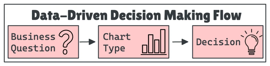
Match the Question to the Chart
Most chart mistakes happen because the analyst chose based on habit, not intent. Start with the question first.
Comparison: Which Category Is Largest?
You’re comparing product lines, regions, teams, which are discrete named categories where magnitude matters. Bar charts show magnitude differences clearly because humans compare lengths more accurately than areas, angles, or colors. Horizontal or vertical both work.
Don’t use them for continuous time series data; that’s what line charts are for. Skip 3D bars; they distort perception. Sort bars by value (largest to smallest) unless there’s a natural order.
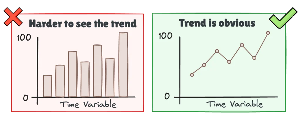
Trend Over Time: How Is This Changing?
Customer churn. Website traffic. Sales pipeline. Metrics where direction and velocity matter. Line charts show directionality and slope. Acceleration or deceleration becomes easy to spot.
Skip line charts for discrete categories. Area charts with multiple overlapping series create confusion unless they’re stacked. Always start the y-axis at zero for area charts. For line charts, starting at zero is optional if the data range is narrow and context is clear, but be explicit about the scale.
Building time-based dashboards that executives will rely on? Our guide on modular SQL for consistent KPIs shows how to keep your trend metrics reliable across reports.
Distribution: How Are Values Spread?
Deal sizes, response times, pricing ranges, and continuous data where you need to understand spread, shape, and outliers. Histograms group continuous data into bins to show frequency distribution. Box plots show median, quartiles, and outliers in a compact format.
Skip pie charts or bar charts for distribution questions; they can’t show spread or shape. Choose bin sizes carefully: too few bins hide detail, too many create noise.
Composition: What Makes Up the Whole?
Budget allocation, revenue by product category, support ticket breakdown, and situations where you need to show how parts contribute to the whole. Stacked bar charts show part-to-whole relationships clearly. Avoid pie charts with more than 3-4 slices; angles are hard to compare.
Avoid 3D pie charts entirely; they distort proportions.
Relationship: Are Two Variables Connected?
Ad spend and lead volume, employee tenure and satisfaction scores, scenarios where you’re looking for correlation between two continuous variables. Scatter plots reveal linear relationships, clusters, and outliers immediately.
Skip scatter plots for categorical data or when one variable is time. Add a trendline if correlation is the point, because without it stakeholders might miss weak but meaningful relationships.
Question Type Summary Table
To make this easier to scan, the table below summarizes the recommended chart types by question. Use it as a quick check before you build anything: start with the question you’re answering, then pick the chart that makes that answer easiest to see.
| Question Type | Best Chart | Use When | Avoid For |
|---|---|---|---|
| Comparison | Bar, Column | Comparing discrete categories by magnitude | Time series, distributions |
| Trend | Line, Area | Tracking change over continuous time | Categorical comparisons |
| Distribution | Histogram, Box plot | Understanding spread, shape, outliers | Part-to-whole relationships |
| Composition | Stacked bar, Pie (2-3 slices max) | Showing how parts make up a whole | Precise value comparisons |
| Relationship | Scatter plot | Finding correlation between variables | Time series, categorical data |
Common Mistakes and Their Consequences
Pie Charts for Complex Comparisons
Building a pie chart with 8+ slices to show product mix or budget allocation creates a problem. Human eyes struggle to compare angles and arc lengths. Viewers can’t tell if “Marketing” is 18% or 22% without hovering.
Use a horizontal bar chart sorted by value instead. One dashboard showed department budgets across 12 categories. The pie chart version required tooltips to understand anything. The bar chart version made the top 3 budget drivers apparent in 2 seconds, and budget discussions shifted to focus on those three areas instead of getting lost in details.
Want to prevent these issues at the source? Our guide on building reliable data pipelines covers how to structure your data so charts stay consistent and trustworthy.
Time Series on Bar Charts
Using a bar chart to show monthly revenue over the past year makes trends harder to spot. Bars suggest discrete comparisons, not continuous trends. Stakeholders focus on individual bars instead of seeing the slope.
Line charts solve this. A quarterly sales trend shown as bars made it hard to see the seasonal dip that happened every Q1. Switching to a line chart revealed the pattern immediately.
Starting Axes Above Zero
Truncating the y-axis to make small changes look dramatic distorts perception of magnitude. A 2% change looks like a 50% swing when the axis starts at 95 instead of 0.
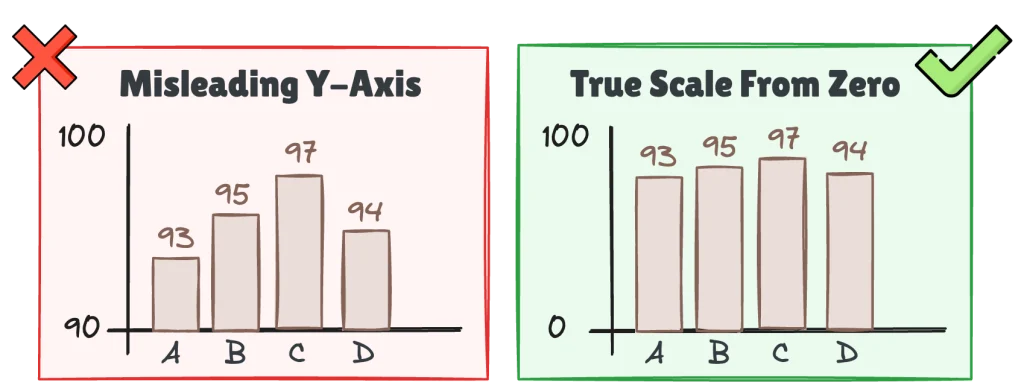
Start at zero for bar charts and area charts. For line charts, use judgment: if the data range is narrow and context is clear, non-zero starts are acceptable, but always label the axis clearly.
Dual-Axis Charts That Imply False Correlation
Related to the previous section, plotting two metrics on different y-axes looks tempting. Revenue and headcount “trending together” on one chart seems efficient. It’s dangerous. You can adjust the scale of each axis to visually align any two trends. This creates misleading conclusions.
Better approach: use two separate charts stacked vertically. Or normalize both metrics to a common scale like percentage change from baseline. One dashboard showed ad spend and lead volume on dual axes. The scales were tweaked so the two lines looked perfectly aligned, suggesting direct causation. Separating them revealed that leads lagged spend by 3 weeks, a critical operational insight the dual-axis chart hid.
Overloading with Too Many Series
Fifteen product lines on a single line chart. Ten categories stacked in a bar chart. Visual clutter overwhelms the viewer. Isolating specific trends becomes impossible. Making comparisons becomes impossible. The chart becomes decoration.
Limit to 5-7 series maximum.
Need to show everything?
Use filters. Use small multiples, separate charts for each category. Highlight the top 3-5. Group the rest into “Other.”
Practical Rules BI Teams Can Reuse
Turn these principles into team standards. Document them, share them, enforce them during dashboard reviews.
- Chart type follows question type. Before building a chart, ask what business question this answers. Comparison questions call for bar or column charts. Trend questions need line or area charts. Distribution questions work with histograms or box plots. Composition questions use stacked bars or pies (2-3 slices only). Relationship questions require scatter plots.
- Fewer is better. Limit dashboard charts to 5-7 per page. Limit series per chart to 5 maximum; three is ideal.
- Label everything. Every chart needs a clear, specific title that states the metric and time period. “Monthly Active Users, Q4 2025” not “User Activity.” Add axis labels with units. If stakeholders need tooltips to understand the chart, it’s underdesigned.
- Consistent visual language. Use the same chart type for the same metric across all dashboards. Use the same color scheme. “Sales” is always blue? Don’t swap it to green in different reports. Consistency reduces cognitive load.
- Test the five-second rule. Show your dashboard to someone unfamiliar with the data for five seconds, then ask what the main takeaway is. Can’t answer? Your chart is too complex.
- Avoid chart junk. Remove gridlines unless they’re essential. Remove 3D effects, shadows, unnecessary borders. Every element should serve a purpose. When in doubt, default to the simplest chart that works.
These rules only work if your BI platform makes them easy to apply.
How BI Platforms Support Good Chart Choices
Good BI platforms enforce defaults that work. Bar charts for categorical data. Line charts for time series. Zero-based axes for bar charts. Sorted values for rankings. These defaults guide analysts toward correct choices without forcing them.
Standardization becomes easy when platforms support shared color schemes, reusable chart templates, and dashboard-level style guides. ClicData lets teams define visualization standards at the platform level. Every analyst starts from the same baseline. No reinventing wheels. No visual inconsistency.
Problematic choices get flagged. The platform warns when pie charts have too many slices. It flags dual-axis charts. It suggests alternatives when the selected chart type doesn’t match the data structure.
Governance works without friction. Teams can lock chart types for specific metrics. “Revenue Trend” must always be a line chart. Lock the template. But leave room for exploratory work where analysts can experiment.
The best BI platforms make the right choice the easy choice. They nudge analysts toward clarity without removing flexibility.
For a deeper look at how dashboards evolve from first build to long-term trust, check out our guide on the dashboard lifecycle.
Building a Chart Chooser Your Team Will Actually Use
Frameworks are only useful if teams adopt them.
Document it. Create a one-page reference sheet with the decision framework. Post it in your team wiki, Slack, or BI documentation.
Make it part of reviews. Add “chart type justification” to your dashboard review process. Before publishing, the analyst should be able to answer why they chose this chart. Answer is “it looked nice”? Push back.
Create examples. Build a library of “before and after” chart examples from your own dashboards. Real examples work better than generic tutorials because they make the improvement tangible.
Train new analysts. Make the chart chooser part of onboarding. Walk them through real dashboards and ask them to identify which charts work and which don’t.
Standardize in the platform. If your BI tool supports it, create locked templates for critical metrics. Lock the template but leave room for exploratory work.
Summary
Chart choice is a decision quality problem, not a design preference. The wrong chart hides the right answer. The right chart makes it visible.
Most visualization mistakes come from habit or aesthetics instead of matching the chart to the question. Fix that and half your dashboard problems disappear.
Start with three actions. First, audit your current dashboards to find charts that confuse stakeholders. Second, document your team’s chart chooser using this framework as a starting point. Third, make it enforceable by building chart type standards into your BI platform or review process.
Good charts don’t just look better. They make better decisions possible.
Want to see how governed dashboards and consistent visualizations work in practice? Book a 1:1 session with ClicData’s product team to explore how centralized BI platforms support chart standardization at scale.