Lo strumento di visualizzazione dei dati per cruscotti e rapporti
Trasforma i dati in informazioni utilizzando i nostri Dashboard per creare documenti interattivi e il nostro modulo Reports per PDF perfetti al pixel.
Più di un modo per trasformare i dati in informazioni

Cruscotti
Il cruscotto che è molto più di un cruscotto. È un documento di dati in tempo reale che puoi modificare con qualsiasi browser sul tuo computer Mac, Windows o Linux.

Rapporti
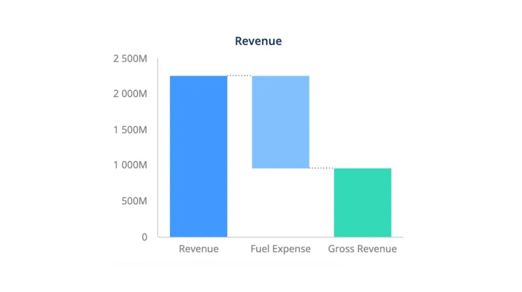
A volte un PDF è il modo migliore per ricevere i dati. Usa il designer di report per creare report straordinari con copertine, formati condizionali, grafici e sottotabelle.

Power BI ed Excel
Se preferisci usare Power BI o Excel come strumento di visualizzazione e reporting, allora usa i nostri plugin e ottieni dati istantanei ogni volta che apri i tuoi file XLSX o PBIX.
Il tuo cruscotto. Il tuo design . Il tuo stile.
Il nostro editor di dashboard non impone stili, posizionamenti o vincoli al tuo design e alla tua identità aziendale. Crea dashboard per cellulari, tablet, TV e browser con 10 temi e qualsiasi tavolozza di colori che puoi immaginare. In alternativa, puoi partire da uno dei nostri modelli pronti all'uso. Abbiamo oltre 110 modelli che si adattano a quasi tutti i settori.


Crea dashboard nel tuo browser
Non è richiesta alcuna installazione. Basta aprire il tuo browser preferito sul tuo computer Mac o Windows e iniziare a trascinare e rilasciare le visualizzazioni nella tua tela. Inizia a costruire in pochi secondi...

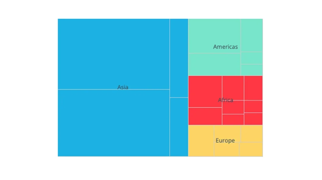
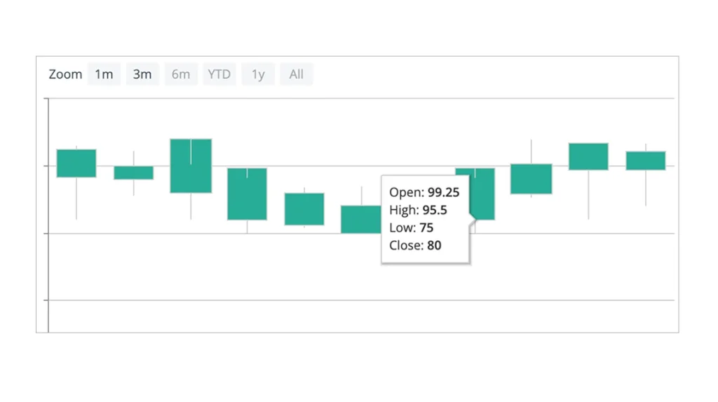
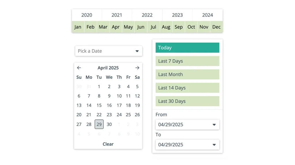
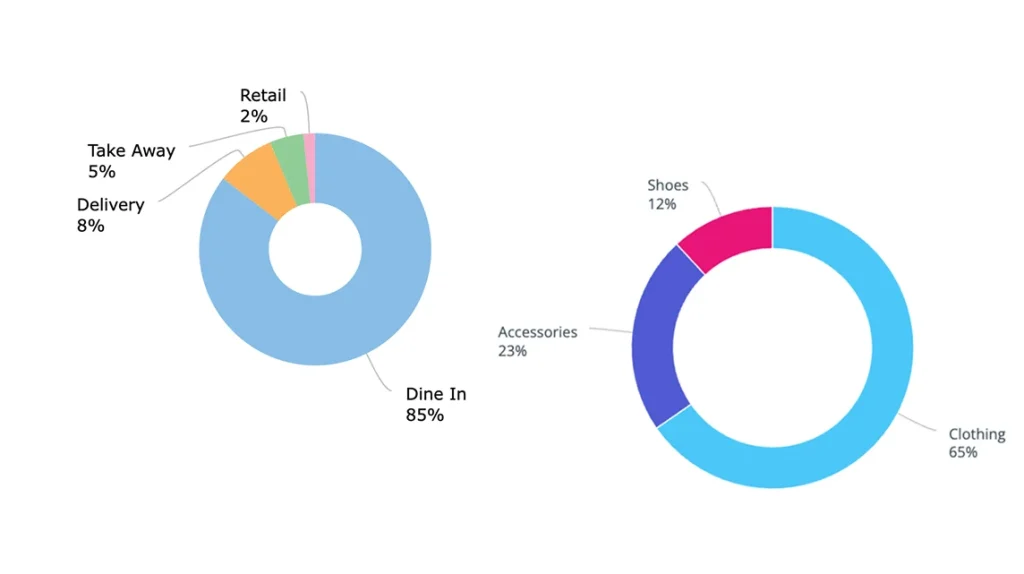
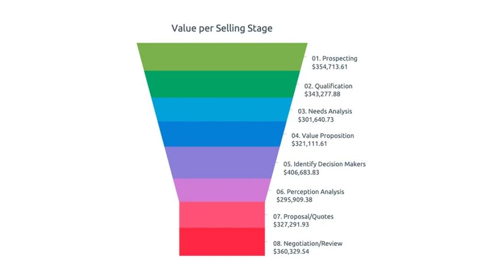
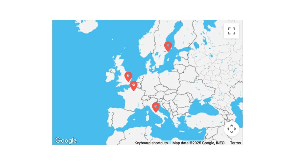
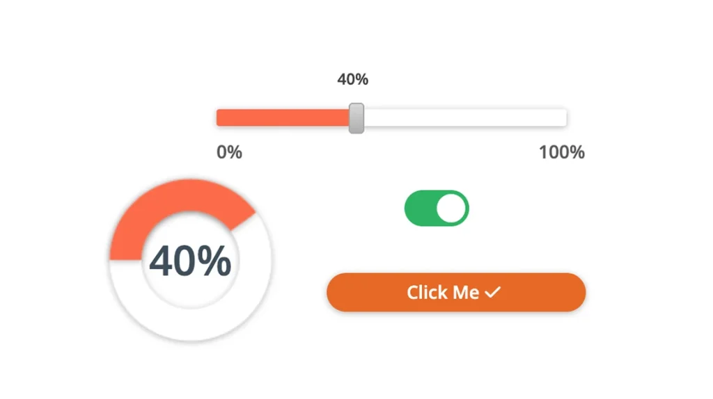
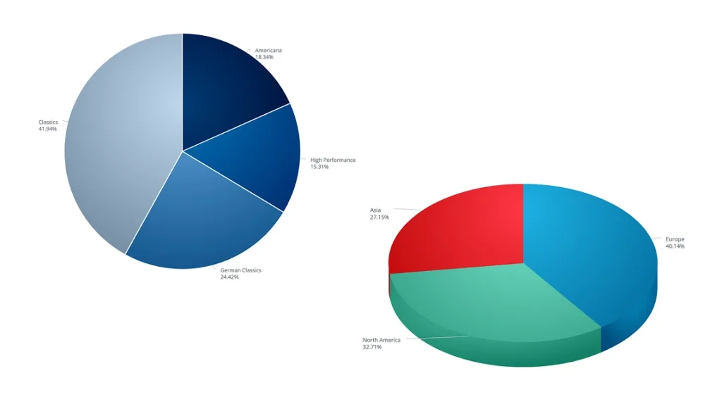
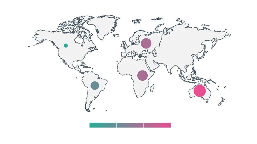
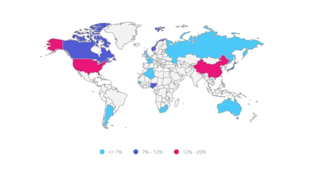
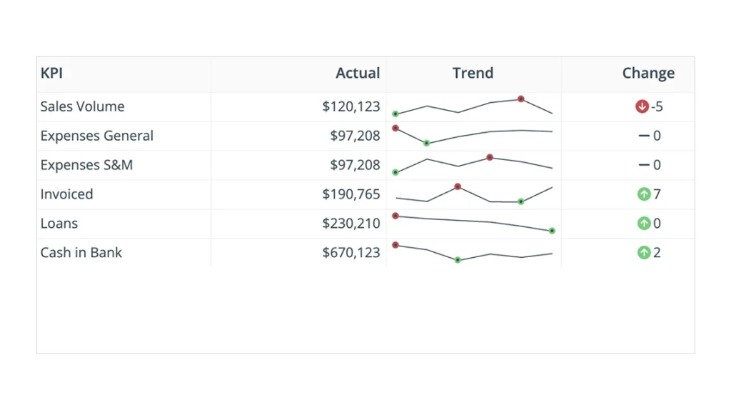
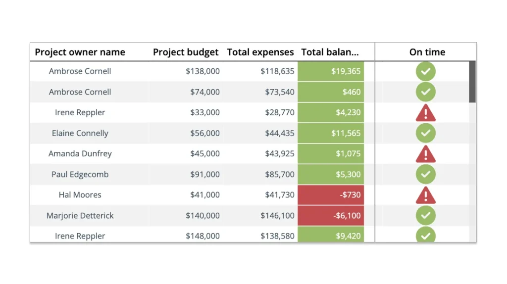
60+ Widget di visualizzazione.
Migliaia di possibilità
Basta trascinare e rilasciare uno dei nostri widget sul tuo dashboard e collegarlo a qualsiasi set di dati del tuo Data Warehouse. Dagli alcune opzioni di stile e aggiungi alcune interazioni come drilldown, navigazione e altro ancora.


Modelli di cruscotto pronti all'uso
Prendi spunto dalla nostra collezione di oltre 100 modelli di dashboard e report o usali subito semplicemente ricollegando i tuoi dati.
Vedi tutti gli esempi di dashboardIl costruttore di report multi-pagina perfetto per i pixel
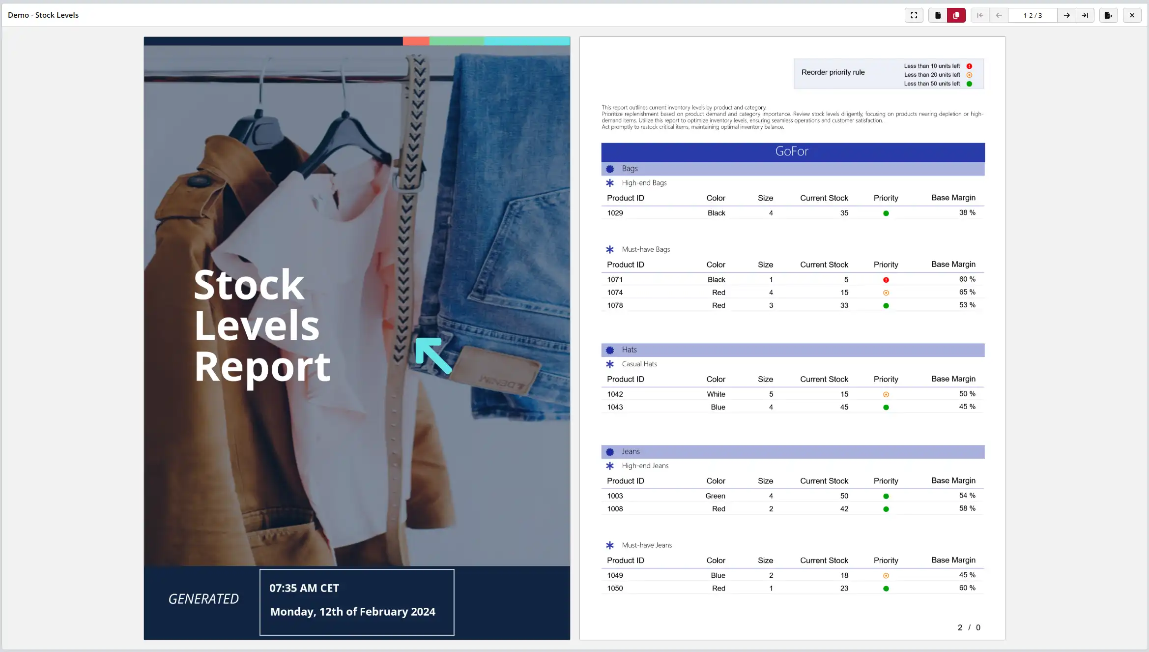

Il designer di report è un designer completamente online in grado di progettare report multi pagina che possono essere pubblicati automaticamente o manualmente in PDF. Può includere dati direttamente dai set di dati, colonne calcolate, indicatori, grafici, sottotabelle e funzioni di markup come linee, rettangoli ed etichette. Inoltre ha le seguenti caratteristiche:
- Formattazione condizionale (colore, carattere, visibilità)
- Set di dati multipli e collegamento di sottotabelle
- Controllo dell'interruzione di pagina
- Designer della prima e della quarta di copertina
- Gruppi di sezioni multiple
- Parametrizzazione e filtraggio in runtime
- Allineamento e scatto del designer
- e altro ancora...
Power BI
Aspetta! Power BI non è un concorrente?
La nostra missione in ClicData è quella di consentire alle aziende e ai loro analisti di utilizzare i dati nel modo più efficiente possibile. Se ti trovi bene con PowerBI (o con qualsiasi altro strumento), usalo.
Il nostro lavoro consiste nel fornirti i dati in un formato utilizzabile e se Power Bi è lo strumento giusto per te per visualizzare i dati, allora abbiamo creato un ottimo plugin per permetterti di accedere ai dati del tuo Data Warehouse ClicData direttamente da Power BI, risparmiandoti la fatica di esportarli o spostarli altrove.
Scarica il plugin Power BILa nostra missione in ClicData è quella di consentire alle aziende e ai loro analisti di utilizzare i dati nel modo più efficiente possibile. Se ti trovi bene con PowerBI (o con qualsiasi altro strumento), usalo.
Il nostro lavoro consiste nel fornirti i dati in un formato utilizzabile e se Power Bi è lo strumento giusto per te per visualizzare i dati, allora abbiamo creato un ottimo plugin per permetterti di accedere ai dati del tuo Data Warehouse ClicData direttamente da Power BI, risparmiandoti la fatica di esportarli o spostarli altrove.
Sappiamo che anche a te Excel piace tanto quanto a noi.
Ma ci sentiamo frustrati nel dover creare continuamente connessioni e incollare dati e assicurarci che le formule facciano riferimento ai nuovi dati, ecc. ecc. Lo sai perché ci sei già passato.
Immagina di creare un foglio di calcolo incredibile, pieno di formule, grafici e dropdown con i dati che hai esportato dai tuoi sistemi. Poi il giorno dopo incolli di nuovo i dati e ogni formula si rompe, compaiono errori ovunque o, peggio ancora, vengono calcolati dati sbagliati.
Il nostro plugin risolve questo problema collegando le tabelle di dati in Excel direttamente al Data Warehouse di ClicData. Basta aprire il foglio Excel, cliccare su Aggiorna e l'intero set di dati in tutti i tuoi fogli verrà aggiornato.
 Scarica il plugin per Excel
Domande?
Forse la risposta è qui e, in caso contrario, contattaci.
Ci sono limiti al numero di dashboard o report che posso creare e distribuire?
No. Costruisci tutto quello che puoi e condividilo con tutte le persone di cui hai bisogno. Puoi condividere con persone interne ed esterne utilizzando dashboard e report pubblici o protetti da password o con utenti nominati utilizzando username e password, persino incorporando dashboard e report in siti web e applicazioni.
Qual è la differenza tra un report e un dashboard?
Un report viene utilizzato quando la quantità di dati, di solito in formato tabellare, può attraversare più pagine o schermate e varia in numero di righe. Può contenere grafici e tabelle secondarie, ma di solito è destinato alla distribuzione in formato PDF ed è quasi perfetto in termini di pixel. I bilanci, l’inventario, i cataloghi dei prodotti, gli elenchi delle spese sono ottimi esempi di report.
Un dashboard ha una componente più interattiva, un’unica schermata che permette all’osservatore di avere immediatamente una panoramica di tutte le principali metriche di performance. Il dashboard offre all’osservatore la possibilità di navigare all’interno del cruscotto, filtrare, analizzare e tagliare i dati, nonché di navigare verso altri cruscotti.
Devo pagare per il connettore Excel o Power BI?
No. I nostri prodotti aggiuntivi sono inclusi gratuitamente e possono essere limitati solo dal piano che utilizzi o dalla quantità di dati di cui disponi.
C'è qualche limite al numero di fonti di dati che possiamo aggiungere al dashboard?
No. Puoi mescolare tutte le fonti di dati che vuoi all’interno dello stesso dashboard. Puoi includere i dati del tuo CRM, delle analisi web o persino dei sistemi di contabilità.
Connetti i tuoi dati. Automatizza tutto. Agisci.
Lancia i tuoi dashboard BI questa settimana — Possiamo aiutarti.
Inizia gratuitamente